Hey @MFKDGAF we previously shared the folders issue with the team so rest assured they are aware and glad Troy was able to respond to your Github issue as well.
Hi all, the updated browser extension 2025.1.0 is rolling out, so please feel free to continue the chat at: 2025.1.0 Browser Extension UI/UX Megathread once you’ve updated.

Just signed up…
Please, please give us the option to revert these changes
The old UI was already perfect, minimalist and extremely usable
This is a change for the worse in all ways
@grb, it may inadvertently cause more, because, as the undermentioned demonstrates, this Discourse instance doesn’t permit edits to old posts in slow mode:
This means that every time I want to correct something minor in an old post whose edit time hasn’t even expired, I have to post something new. An example is the undermentioned:
Specifically, I want to add to that I’ve reported this to GitHub, at:
However, if I want to add this, I’m forced to create a new post.
If I didn’t have something else to add this time, I merely wouldn’t have bothered, so the thread would lack this information.
If anyone reading this believes that circumvention is the obvious rationale for this defaulting to true, note the undermentioned anecdote from a forum moderator:
This sword too has two edges. By adding a new post to the bottom, I saw it. Had you simply edited a post 400 items back, I never would have seen it.
@DenBesten, yeah, but that was the point I was trying to make, actually:
-
Considering that the thread is in slow mode, I presume that solely long-form and informative updates are desired.
-
Additionally, considering that so many people are subscribed, I presume that not everyone wants to be notified about such a minor thing.
I gauged that it wasn’t worth posting about.
Hi everyone, just a reminder to include constructive criticism in your feedback, regarding what is or isn’t working for you for discussion.
Post that include death threats, or personal attacks on the Bitwarden team or other community members will be removed.
The community guidelines are available for review at any time.
The fact that people are sending death threats over an app redesign is insane.
@dwbit, I’d say just ban anyone who does that, with prejudice. There’s never justification for that behaviour.
So it’s been more than a month since the update. One would think I would get used to it… NOPE. If it was just a “different but equivalent” design, I would have got used to it, but it’s not. I constantly have to fight against it to get anything done. It feels like early pre-alpha. The good interface is completely transparent, you don’t even notice it. This interface is not it.
@iMouse If you want improvement, you should give them details.
Hi There Bitwarden Team,
I also want to share my feedback regarding the new UX and redesign. In short, I am disappointed. I am seriously thinking about going back to an older version. (If that were possible).
- I do not like that I now need two clicks to copy a password. Before I had the signs for username and password, now it is the copy sign, but then I need a second click to select the password actually. This is very uncomfortable.
- The Suggestions tab is now missing in the Browser extension. Instead Autofill suggestions are also seen in the “Vault” tab. This is not so nice, as I got used to actually have a means to quickly retrieve my “Favourites” from the Vault tab.
In my company something went wrong with the Autofill stuff and now I basically cannot find the keys I am looking for. I liked it the way it was before. - The search got really, really bad. One would think, that when typing more words to find exactly what I am looking for, would give me the exact result. But no, it seems like every word is filtered on its own. So something like “demo admin” now shows all entries where admin is present not only the demo entry. Very annoying.
Please improve your update further and make it faster to use again. This is a step backwards.
Thanks for your attention.
@Pitt Welcome to the forum!
Fortunately you don’t need that. Turn that on to get the separate copy buttons back: Settings → Appearance → “Show quick copy actions on Vault”
Maybe I misunderstand you here, but the “Favorites” section is between the “Auto-fill suggestions” and “All Items” in the new “Vault” tab. Or is it missing for you?
Without more details to that, it is hard to see if we can help. - If it were a certain “type” (cards, identities, …) you don’t find at the moment… - did you see the “types” filter at the top that can “sort” the Vault tab by types?
The search seems to be a science of it’s own (Lunr) and I’m also overwhelmed by that. But I think there is an easy solution for your problem… try to search like this: “demo +admin”. That should only show entries with “demo” and “admin”. Thanks to @grb for the correction on that part, as I was wrong here. Sorry.
@Pitt The new UI did not change anything regards to the search engine; the behavior was like this previously, too. @Nail1684’s response above has the right idea, but is inaccurate in the details.
To restrict your search to entries that contain both “demo” and “admin”, you must use an advanced search expression, with the following syntax:
>+demo +admin
The character > at the start of the search expression switches to advanced search mode, and prefixing a search term with the + character makes that search term mandatory. However, because advanced search mode only returns exact matches to your search terms (not substring matches), the above search expression will not find an entry named “demonstration administrator”. To include substring matches, you need to add a wildcard character at the start and/or end of the search term(s), as follows:
>+demo* +admin*
Also, please note that the advanced search functionality is only available in non-mobile apps.
Some users find the search function unintuitive, but this is how it has always worked. Three of the most active feature requests proposing changes to the search function are:
I like the GUI refresh, but the new way of organizing things/showing them in extension windows (all instead of previously in categories), etc. is a big regression. I can no longer look through my categories easily to find a password. It’s either list all 450+ login items as all items or list none at all. I really liked the previous design where it was broken down into categories/saved folders. Those are no longer displayed separately.
How do you ensure your management team finds another job and alienate your customers in the process? Turns out, there’s an app for that. Just like Sonos, this Bitwarden redesign is turning into a major issue that is starting to alienate a lot of customers.
Hopefully they fix it soon. 1Password has been calling my name for a while and this may be the reason I switch.
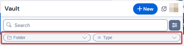
Probably you don’t mean it like it’s written there… so probably I misunderstand you here - but either “all” or “none at all” is not my experience, since the new filters at the top still allow for
- showing only items of one of your folders (if you set the “folders” filter to that folder)
- and/or for showing only one item type like login items, cards, identities… (if you set the “types” filter to that type)
![]()
I noticed one issue and one suggestion with Bitwarden on Safari. According to your “about” I have Version: 2025.1.0.
Both are related to changes in the look and operation:
First, I notice that the options for choosing “Identities” or “Cards” for autofill are not automatically available at times where they should be and where the old Bitwarden presented them.
Second: The new change means if you click on an item instead of on “Fill” it brings up the item to view and edit. My suggestion is to add a “Fill” button on this screen in addition to the “Edit” button in case a person wanted to do that instead and didn’t hit “Fill” by accident. Just another way to get the same place.
Welcome, @RunningDog to the community. Your two concerns are both addressed in the introductory post for the 2025.1.0 version of this conversation:
I think what you mean is matched by this feature request: Add Autofill button in "View Item" view for the browser extensions