LOL you know what I mean
The rounded rectangle is a design decision that I cannot live with. I’ve been using BW for almost a decade, and in that time my brain has been conditioned to look for things in a certain way. They have taken that away from me.
For the life of me, I don’t know why they can’t give us a theme choice dropdown in settings. Let the handful of people (and I’m being generous there) who like the new theme select it and continue to use it, but give the rest of us (the vast majority) the ability to go back to the theme we know and love.
This is a password manager. Style is largely unimportant. It’s a functional utility. It should be fast, secure, and easy to use. BW used to put function over form, now they’ve very obviously hired someone who flipped that over, and we the paying customers get no say. That’s my chief complaint.
I’m not opposed to new themes. Go ahead and make 50 of them. Put them in a drop down and let us decide. But give us the OPTION. How hard is that?
By forcing this design on us (which has also introduced functionality and performance issues as well) without any warning, without any choice, and now after more than 30 days and countless complaints, they remain silent and don’t even respect us enough to come here and talk to us? That’s cowardly. And weak. And I won’t stand for it.
No. That’s when I stop giving a company my money.
New UI for the extension is really annoying that it doesn’t have the autofill button in the details of the item.
I have a site with a lot of different users for each case, and I have notes about each user, so I need to go into the details to know if that is the user I want. But for filling in the details I have to go back to the list and search again for the user I need.
Why does the item details has less options than the list of items? It does not make much sense.
Cite please. The best barometer I have found is the vote count on this feature request, which currently has 12 votes.
Glad they’ve added some options to get this back to functional, but man going to each user and explaining how to fix the settings is exhausting after having to work through these threads to find all the tips and tricks to get it back.I’m glad to hear that they are adding the ability to hide the “All Items”
Has anyone found a way to improve readability? I even tried switching back to light mode (blashpemy) but its not any more readable. Colors are far too close to the background color to be readable and even in non-compact mode the text seems too small.
Overall, very disappointed in the redesign.
@DenBesten, note that, like myself, many have hit the limit of how many posts they can vote for. The reaction count is more representative, although I recommend that all except upvote and downvote reactions be discarded when tallying.
One can “unvote” for a feature request and then reassign it to something they find more important.
@DenBesten Really? That 12-vote poll is the “best barometer” you have? I’m going on all the comments here, plus dozens of my co-workers and friends who all use BW and share the same complaint.
Compared to the number of positive responses, I think “vast majority” is a perfectly reasonable statement. Unless you plan on dragging me into a a senate judiciary hearing, it’ll be reasonable enough for you too.
Usability issues (UX) in redesigned UI (2024.12.0) - #989 by DenBesten
@DenBesten, there’s no reason to use that over the reaction functionality when I can react to as much as I want, yet vote for so little. I’d spent a lot of my life reassigning votes if I did.
Usability issues (UX) in redesigned UI (2024.12.0) - #990 by Para
@para, it’s certainly the vocal majority.
Hi,
I’m officially annoyed enough to make an account, congratulations.
I’m actually a paid user of Bitwarden, have convinced literally every person I know who cares to use BW (about 10 right now) and I cannot process how incompetent BW has shown themselves to be over this.
Sonos literally just fired their CEO, and CPO over a bad app update.
This is not acceptable conduct
You have an incredibly locked in userbase, and all your competitors are worse, but they are fleeting advantages at best.
Please do the right thing and just apologise, rollback this godawful update, and do better in future.
@Jokavi Welcome to the forum!
Would you like to share some of those usability issues you need to be improved?
or how about just roll it back… stop putting road blocks up, and stop needlessly defending this very poor update
I agree with the “slow mode” comments, it reeks of Muskism. I just wanted to edit my comment, but had to set a timer so I could post this instead.
I can’t even reply to your comment and post what I wanted to so will prioritise helping people instead
For anybody still struggling, this is how I rolled back the update on Firefox (I stole this from somebody else):
Go to: Bitwarden - Free Password Manager version history
Go to the Version 2024.9.1 version and click “Download File”. It should install like a regular extension and over-write the newer version (This didn’t work for me, I had to uninstall new one first then install downloaded one). Then go to your extensions page and turn off auto-updates for Bitwarden.
From what I can tell, this file is portable so you can just use it everywhere you need to and save yourself the drama of having to jump through all of these hoops.
Hopefully by the time I need to update BW has cleaned up their act, or I will migrate to another service as is now the way in the 21st century
[ prior reference to a libelous post removed ]
There are a number of reasons I don’t feel “reactions” make a good barometer:
- They have inconsistent meaning. Some thumbs-up are to a comment that says “I miss clck-to Auto-Fill”, others on “I prefer click-to-view” and still others on “click to Auto-fill now optional”. Reading such a barometer requires in-depth analysis.
- They don’t easily tell you how many people share an opinion because there are multiple posts saying “please roll back”, risking bifurcating the count. Similarly, it risks over counting.
- Reactions focus on the loudest voice more than the popular opinion.
That said, vote totals are my barometer; that does not mean that they need to be your barometer.
App is practically unusable now. I wont be renewing my premium subscription. Disappointed they dont even offer an option to use the old style. Going to look at other options
Have to agree with this. This update shows that the BW product/dev team is just as bad as every other company with the hubris to do this, like Sonos. Not only does the new UI have bad workflows with the four filters up top, unnecessary All Items, etc., but the actual UI programming is bad. Elements pop in and move other things around, there is jank, the font is bad and not suitable for the primary app font, the loading circle pops in as a big one initially and then a small one. How this got past testing and everyone gave it a thumbs up I can’t understand. And why was it necessary? What was actually wrong with the old extension? As said elsewhere, even if rolled back/improved, this shakes my confidence in the team behind this and I can’t trust their motivations. Is there large investment coming in that they’re trying to show some value from? I don’t know, but this move quickly pushed me to KeePass, just want something stable that isn’t trying to be flashy or go overboard on branding.
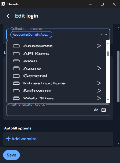
Assigning/moving items to Folders/Collections
I have my broswer extension set to extra wide but the drop down to assign a item to a collection is unusable (same with Folders). How am I suppose to see what the collections (or folders) are called in the red box below? Especially when there is no side-to-side scroll bar.

Can Bitwarden please update this view to use the filter view instead, like this?
These examples shown above are not from a personal account, these are from my work account. I am constantly getting berated with emails from staff stating that the product is unusable and I 100% agree with them.


Bugs: of course. But feature requests will be shut down very quickly on GitHub - and redirected to this forum.