You’re right I missed a part of that conversation. my baad
2 Likes
@resonant Welcome to the forum!
You can mute or ignore a user by clicking on their profile and clicking the button below the ![]() Message button in the upper right corner:
Message button in the upper right corner:

To quote Wolfgang Pauli, he’s “not even wrong”. But if you share Nelph0nd’s opinion, perhaps you can shed some light on the nature of your own objections against the new folder UI. The differences between the new and old UI when it comes to working with folders have been catalogued above (if I have missed any salient differences, feel free to add to the list). Which (if any) of those 9 issues are the deal-breaker for you, when it comes to folders?
1 Like
I’m genuinely perplexed by the responses in here to the folder comments.
This isn’t hard to understand. A folder is an organizational item, like a real world folder.
When you open a file cabinet, you aren’t seeing everything at once, you’re seeing the folders. Then you open them to see what’s in them.
That’s what it means to organize things: not just a jumble of shit in front of you, it’s an organizational structure. It exists to VISIBLY sort the content into user configurable spaces at the top level.
The way the new extension uses folders now is not in any way like an actual folder is supposed to function. They’re being used like tags.
What I’m seeing with this change, and with a lot of the comments in here that seem to be completely ignoring what’s being asked for, seems to align with a lot of nonsense being taught in development spaces lately pushing the idea that folder structure is dead, and searching is the only thing users should be doing. And that’s utter nonsense.
But if they’re totally set on this junk, the least they can do is allow us to save filters at the top level so we only have to click on one thing to get to those folder’s contents, instead of a stupid drop-down menu that cuts off the actual names of the folders.
5 Likes
And yet, if copies of all of the folder contents have been strewn into a pile (or even laid out in alphabetical order) on a desktop next to the file cabinet, are you saying (like Nelph0nd), that the folders in the cabinet do not exist?
This was never possible in the old UI. You still had to click over to the Vault view before you could click on folder names.
Thank you for voicing an actual rational objection. And this is even one that I had overlooked, so I have added it to my list of differences between folders in the new and old UIs (it is #5 on the list).
1 Like
There is a feature request for this. Go vote for it.
Thank you for this suggestion. Setting “wide” or “extra wide” mode can help mitigate impact of this, but I do agree with your observation that the menu itself ought to be full-width (or perhaps match the width of the contents), instead of just the width of the title.
1 Like
@klueman Thank you very much! That is understandable for me. I think I’m used to that difference in display already, because Windows Explorer does this (BTW, since when? - it’s definitely not new…) very similar as an additional possibility to change (a bit quicker) the folders:

I still hope, we all agree that not only (1) is a list of my Windows folders, but (2) is also still a list of the same Windows folders - because otherwise I would be lost again.
(that longer folder names and nested folders need an improvement in display and structure - totally agreed)
The copied password notification drop down should be removed as it breaks the user experience. I have attached a loom to show what I mean here: Google Chrome - 4 January 2025 | Loom. This is also affected when copying three things at the same time for example, username, password, otp. Bitwarden should have an option to remove notificatoins. Please Fix.
4 Likes
@klueman @grb @DenBesten I did a short test about the cut-offs, and I’m not so sure anymore, that it got worse with the new extension.
My old (Firefox) extension 2024.11.2 shows actually a few less characters…

… than the (Vivaldi) extension 2024.12.4 with standard width and no compact mode:

(and obviously the old extension got also a cut off in display)
PS: If the number of folder entries/items would still be there, it might be about the same character lengths - old and new. And personal note: though the “way” to reach the folders is different now, to me it looks still not that different (apart from all already discussed differences and deficiencies).
1 Like
I see. Based on the timing of your comment, I thought that you had been able to find meaning in his inscrutable posts about the folders issue.
With regards to the mods, you are being uncharitable. We are all individuals (humans, even) with our own viewpoints and personalities. If you read our comments with an open mind, you will find that we are not “parrotting” some party line. Some mods are neutral/open to the new UI, and others (myself, specifically) are vehemently opposed to the new UI. I can’t speak for the other mods, but when it comes to my own comments on this thread, they have been for the purposes of:
- Raising criticism about the new UI.
- Assisting users who may be having trouble with the new UI.
- Clarifying user complaints to identify actionable issues.
- Correcting misinformation.
- Ensuring that Community Guidelines are being followed.
1 Like
I saw that with the first versions too… Don’t know when that changed for me.
I just tested it again - in Brave and in Vivaldi, both times I have that wider folder dropdown list. But, I use “extra wide” (and “compact mode”) now as my default - for the screenshots I changed that right before to the default width (and non-compact mode). Maybe that’s a configuration which didn’t “reset” for me then?
PS: Do you have longer folder names? I don’t see them in your screenshot. Without having tested it: maybe the width varies now, depending on the actual folder name lengths?
1 Like
Can say, I tried the same. ![]()
And I can’t speak for @grb now, but “clarifying user complaints” means for me also, to ask for more details and sometimes “question” something. But not to negate any negative feedback, but to get to concrete points, that (I guess they still read it) the devs could work on.
“We have no folders anymore” is not a very concrete way to express what the devs could actually improve. That’s why we ask. (BTW, and I think, the dialogue helps potentially all of us, to maybe get new ideas etc. about the UI, why “I” (“you”…) like it or don’t like it, what could be improved etc. - so I see it also as a “feature requests creating possibility”.)
I would love to see an “extra tall” option too. I use notes extensively. Not being able to see but a few lines of notes at a time has been my main gripe with Bitwarden since I switched from Last Pass.
Who can promote this suggestion as a Feature Request?
The resizable notes section is nice, but you can’t ever see more than the height of the extension itself.
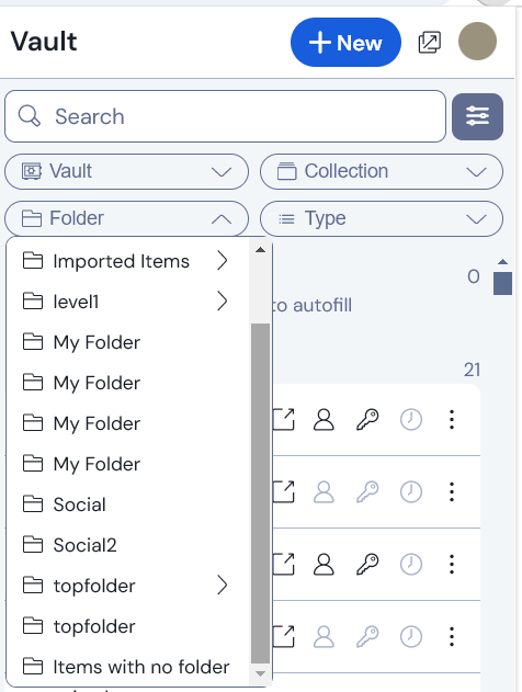
Yes, the width of the dropdown is adjusted according to the maximum length of the name of a top-level folder (displaying up to 34 characters in my most recent tests).
However, if your top-level folders have short names, this can cause the names of sub-folders to be cut off at 15 characters:

1 Like
Here is one issue with the new extension redesign: The “Extra Wide” appearance option is not respected when you click on the arrow next to your profile icon to “Pop out to a new window”. So even though the new window has much better height for listing the vault elements, the width is narrower if you had the “Extra Wide” appearance option selected.
EDIT: Thanks @FaviFake for the suggestion, I did find someone had already reported an issue with the width of the New Window: "Pop out to new window" window size is not wide enough · Issue #12526 · bitwarden/clients · GitHub
2 Likes
That doesn’t seem to happen on my end, you could search for a similar bug report or create a new one on GitHub! make sure to add as much information as possible to help the devs
2 Likes
Yeah, “thumbs up” for your details - but no thumbs up for that implementation decision for now. ![]()
1 Like
Better than a ![]() for shooting the messenger…
for shooting the messenger… ![]()
3 Likes
Can’t imagine, those kind of things ever happening here. ![]()
(BTW, very ancient tradition…)
![]()
And that one might also be somewhat related to the issue:
1 Like