Anyone, including you, can create a feature request.
3 Likes
There is already a relevant feature request (Customizable Window Size for Browser Extension), but it is a little more general than asking for an “extra tall” option. To create a feature request specifically for an “Extra Tall” setting, simply create a new topic in the Password Manager Feature Request category
2 Likes
I’m pretty sure nelph0nd just wants the folders showing in the vault, and not in a drop down menu. This could be easily fixed by letting us favorite folders, like you can with cards and id’s. Also it would be nice if there was an easier way to put sites in a folder.
2 Likes
Yes, but nobody knows why the dropdown menu bothers them (since it is evidently not any of the reasons one might think).
Those are both reasonable suggestions (although neither of these are functions lost in the redesign).
With regards to the latter, there is an open feature request (Drag and drop functionality).
1 Like
Welcome, @Waytoogo to the community!
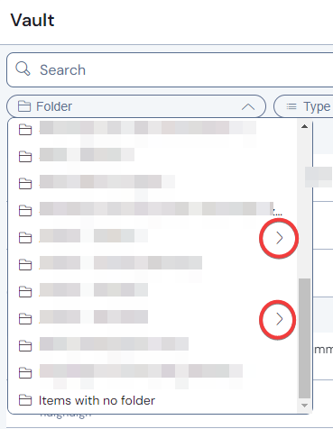
The web vault can bulk-move items to a folder. Just tick the items you want to move, then the kebab menu in the title-bar contains “add to folder”.
1 Like
I agree with the above. The old way Bitwarden did the navigation of the folders is what I prefer over the new way via the filter.
With the new filter way, it is harder to see the full folder name and when in a folder, there is an additional click to get in to the folder (if that makes sense).
I also do not use the search function much but instead, I navigate to the item I need via the folders view. Which is also why I use folders. Otherwise I wouldn’t use the folders and only use the search function.
4 Likes
Seems like you are referring to Issues #5 and #9 in my list of differences. Have I understood that correctly?
Finally, some actual clear and constructive feedback about the redesigned folder filters!! Thank you!!
This is the thing I think I never properly understood about folderphiles. I know this is unrelated to the redesign, but could you explain why, in your workflow, this method is faster than using search? I have so many questions!!
-
What do you want to accomplish after reaching the desired item? Do you want to edit them, view them, autofill them?
-
Or do you just want to see a list of items in a folder, without editing them? If so, why?
-
What is the criteria you use to organise your folders? The classic categories, like social media, banking, etc, or something more power user-y?
-
Why is this method faster than search? Is it because you might not remember exactly the name of an item? because you prefer using the mouse instead of the keyboard? because you can view multiple related items without doing repeated searches? because search results aren’t always reliable?
Again, this is completely out of curiosity, I’ve been wondering about people who mainly use folders for a long time.
Partially sense, I would say.
As you can see here Usability issues (UX) in redesigned UI (2024.12.0) - #820 by Nail1684 the width of the folder filter list varies, depending on the top-level folder so that actually (thanks to @grb once again), you can see a few characters more with the new UI. (but if the top-level folder names are “short”, that also cut’s off longer folder names in nested folders - I hope that get’s improvement)
And the clicks are the same. Example for a nested folder:
Old extension:
Click 1: change to “Vault” tab
Click 2: Top-Level folder (open)
Click 3: Nested folder (open)
New extension:
Click 1: Filter (activate)
Click 2: Top-Level folder (open)
Click 3: Nested folder (open)
Or did I get wrong what you meant? But even if - the same number of clicks to get into one nested folder.
(PS: Okay, I admit: if you stayed in the Vault tab - old extension - and had to navigate to various folders, then that first click is only one time necessary. → one click less → but I would think that this is not the main use case whole day)
And in the new UI, you actually can see, that there even is a nested folder:
(in the old UI, every folder showed that symbol, independent of if there was a nested folder or not - you can see that also in #820, upper screenshot)
PS: Sorry, I wasn’t that aware of @grb 's issue #9 - that complicates it with nested folders indeed and leads to one click more - and inconsistent behaviour.
Correct. I am referring to issues #5 and #9. Did not know you had compiled that list. That is the problem with this mega thread. It has been going on for so long we need a new condensed thread.
I believe that a new thread is planned for version 2025.1.0. I’ve been waiting on a fresh thread for posting a compilation of issues that I’ve identified.
1 Like
I know where every item is in my vault. To me, it is faster to navigate to the item than by searching because when I search it might bring up multiple items.
E.g. I have a folder called my websites and a folder called wife’s websites. If I search Amazon it will bring up 2 entries vs 1 if I navigate to it.
4 Likes
@grb To issue #9: Couldn’t that be fixed relatively easy, when a click on the folder would automatically produce the list of items down below - and still offer to choose the nested folder (and “View items in…” wouldn’t be necessary then)?
(in essence, the behaviour would be “consistent” again, because every click on a folder actually leads to a display of the items of the folder – only if you have a nested folder, that behaviour differs at the moment and a click produces two different outcomes overall)
The problem is that items and subfolders contained in the same folder can no longer be displayed at the same time. Therefore, either an extra click will be required to “view items” (current implementation), or an extra click would be needed to navigate into one of the subfolders (if the “view items” option is eliminated, and items are displayed as soon as a folder is selected).
I can’t find anything like what you are talking about. I’m on Firefox, so I don’t have the latest version.
It bothers them for the same reason it bothered me that the cards and id’s were not there. I wanted them present because I use them all the time. I was able to favorite my cards and id’s but not my folders, I have to click on the stupid drop down menu, why can’t they just be there like they always have?
3 Likes
@DenBesten meant the web vault / web app. That is independent of the browser. Just go in any browser to vault.bitwarden.com (or vault.bitwarden.eu) and login there.
I’m probably beating a dead horse here, but the folders are still present — you just have to click in a different location to get to them. There are other differences in usability, obviously, as I have already documented, but to say that the folders are not “present” is just not an accurate description of how the folder UI changed in the redesign.
This is all exhausting.
5 Likes
This is only shown on the browser extension’s “Vault” tab. Word from Bitwarden is that an upcoming release will allow the “All Items” section to be collapsed (i.e., hidden).