Customizable Window Size for Browser Extension

Update (Feb 2023):

Even though the v2022.12.1 release did scale back some of extraneous margins and padding that had been added in v2022.12.0, the updated UI is still makes less efficient use of space than it used to. Therefore, the use-case described below is still relevant. In addition, other use-cases are described in the topics linked below, and in responses down-thread.


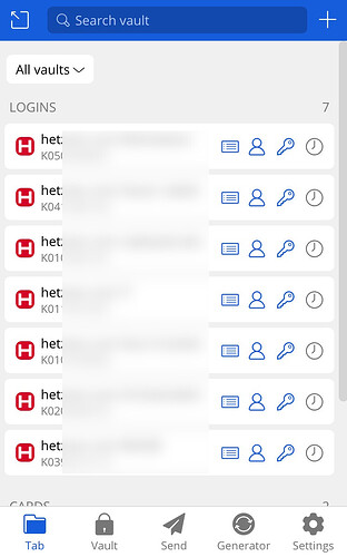
With the inefficient use of screen real-estate in the new UI redesign (from v2022.12.0), significantly fewer (30-50%) items can be displayed within the browser extension viewport, and long vault item names are truncated (showing around 20% less information). This means that a lot of scrolling is now required to access vault items, degrading the UX especially for power users.

To restore functionality and workflow efficiency (by eliminating unnecessary scrolling), there is now an urgent need for implementation of a resizable interface for the browser extension, so that the viewport size can be increased to make up for the space wasted by extraneous margins and padding in the box elements. Once the browser extension size has been customized, the new size should be persistent (i.e., it must be stored as a preference in the vault — or at least locally stored on each device); it would not be acceptable to have to resize the browser extension repeatedly (this would be no better than the current problem of having to scroll).

Although the pop-out version of the browser extension can be resized, this does not provide a work-around for the problem described above, because auto-fill and URL matching do not work in the pop-out.

Likewise, a number of existing Feature Requests* have previously proposed browser extension resizing, but the previous threads have been related to issues with specific browsers (e.g., extension size limitations in Safari, misreported browser dimensions due to fingerprinting resistance settings). Therefore, I’ve made this new Feature Request thread to clarify that this is now a universal need in all browsers, triggered by the UI redesign in v2022.12.0).
 

*The previous Feature Request topics referenced above are listed below:

https://community.bitwarden.com/t/safari-extension-how-can-i-extend-height-of-the-widget-ui/35165

1 Like

Thanks for the suggestion, on a side note, changes will be made to the padding in the updated browser extension UI.

@wowzers Welcome to the forum! I moved your request into an existing request asking for the same thing. Please click the “Vote” button at the top of the thread to cast your vote for this request.

Hi @wowzers, when I had a similar issue, I can tell you what I did.
I edited the account name (account.google.com in your case) to include something to differentiate each entry. This field is not the url so you can amend it.

Just something that helped me, HTH :+1:

1 Like

Thnakyou. Good suggestion

In the meantime a couple of other options to find the correct login quicker would be to right click on the login field and use the context menu to find the correct account or to pop out the extension (upper left arrow button) and then resize that window as much as you want. Hope this helps!

Feature name

Allow to customize and increase the width of the Browser popup/dropdown window because longer item names can’t be seen in full

I manage many accounts and passwords for the very same website. In my case it is about the passwords to a hosting company. I have the user/pw for the clients accounts. I want to name it accordingly, hence the name of the item in Bitwarden becomes sometimes quite long.

e.g. “Hosting Company Clientname Admin”

The result, I can’t see anymore which user it is I am accessing. I need to hover over each item to see the full name. It would be just best to make the windows a bit wider. And it would be even better if I can just set it myself e.g. with variable - narrower, narow, normal, wide, wider or with pixel values.

Workaround: rename all items, but I for better search, consistency, sorting I want to have those long names.

#feature-requests #app:browser #app:desktop

I like this idea and it has been suggested before:

In addition to resizing I would like the popup window to be drag-able (and remember the location).

My particular use case for this is entering selected characters from a keyword (e.g. “please enter 2nd, 5th & last character”). We now have a helpful UI for picking characters by position from a password, but if the popup window obscures the part of the page that requests the characters, you have to remember which characters are being requested before popping up BW. If you don’t, or forget, you have to cancel the popup and start again.

I’m sure there are other situations where a moveable window would be valuable, even just a personal preference for where it appears.

A resizable popup is definitely something that I will like to have, but what I love to have is a sidebar in chrome! I think it’s easier to do in FF.

Feature name

  • Resizable extension window for Firefox and Chromium

Feature function

I open the Bitwarden extension from Firefox or Chromium and the window is tiny and much like trying to view a landscape through a soda straw. When I attempt to resize it, there are no resizable edges or corners from which to do so.

Related topics + references

This feature request follows a closed bug report: Resizing of extension popup - closed but unresolved, linked to issue #1451 · Issue #3221 · bitwarden/clients · GitHub

2 Likes

Thanks for the feature request, I believe this is related to fingerprinting prevention, you can try disabling this in Firefox to see if it resolves the issue.

Or use the the sidebar in Firefox (my preferred method) to see the full view or pop-out the window.

Here’s the Github issue where we are tracking this: Firefox addon popup menu differs in size · Issue #1451 · bitwarden/clients · GitHub

1 Like

Thank you for that suggestion. I didn’t realize that “pop out” was an option. It solves a different behavior I found less than optimal. :slight_smile:

Also happening in Brave Nightly (1.46.2 Chromium 106.0.5249.40) on Manjaro 5.10.141 x86_64. This didn’t happen as recently as 6 weeks ago, so I’m not sure what is being lost with respect to display settings. My fingerprinting settings are disabled (Prevent sites from fingerprinting me → enabled; Block fingerprinting → Standard).

Resizing handles would solve all of these problems. “Popping out” the window just to make it bearable to work with is very inconvenient.

Also happening in Brave Nightly (1.46.7 Chromium 106.0.5249.55) on MacOS Big Sur 11.7. Again, did not happen as recently as 6 weeks ago. I was surprised to see the same behavior in MacOS.

I find this a very needed feature. On my Mac using Safari, the browser extension can be challenging to use as the window is very short and narrow. The popout is always needed if I want to do any editing or adding a comment.

1 Like

Can the size of the extension “window” be customizable (I have a pretty big screen at home and would like to capitalize on that).

At the moment, I have a few favorites and Identities and sometimes have to scroll to get to where I want.

That’s called a popup FYI :wink:

Wouldn’t popup be when arrow icon is clicked and we get a new window?