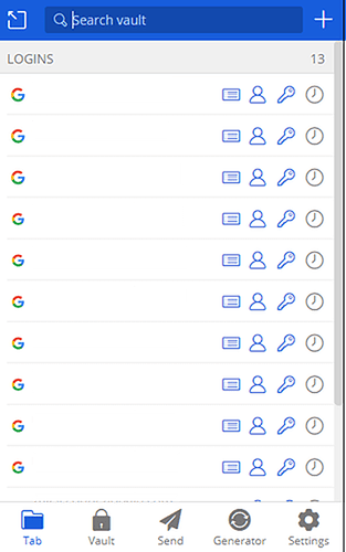
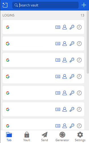
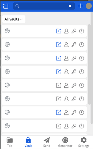
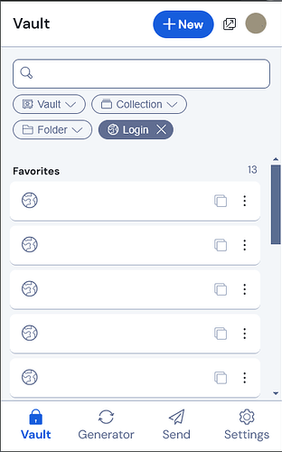
The evolution of Bitwarden design is quite concerning from an information density perspective, as illustrated by the screenshots below.
Before succumbing to the whims of “modern” design, the browser extension viewport could display 9–10 items. After the last “modernization” initiative, this went down to 8–9 items. In the new UI “refresh”, we are now down to a measly 5 vault items that can be accessed without scrolling.
In addition to loss of information in the vertical dimension, the new UI refresh has introduced unnecessary horizontal padding and a large text label on the new “Autofill” button, reducing the number of characters that can be displayed from around 25 characters in the pre-modernization designs to around 17 characters (for English-language UIs) or as few as 7 characters (for French-language UIs).
Personally, I don’t think this is progress. I reiterate my call for a compact mode, or barring that, at least an option to customize the browser extension viewport size.
2022.11.2 (Pre-“Modernization”):
2022.12.0 (First “Modernized” Design, Pre-Backlash*):
*Some (but not all) of the gratuitous margins and padding were scaled back following user backlash, resulting in the current design.
2024.10.1 (Current):
2024.10.999 (Beta Preview):
Updated to add most recent version:


