Terrance
(Terrance)
January 17, 2025, 4:17pm
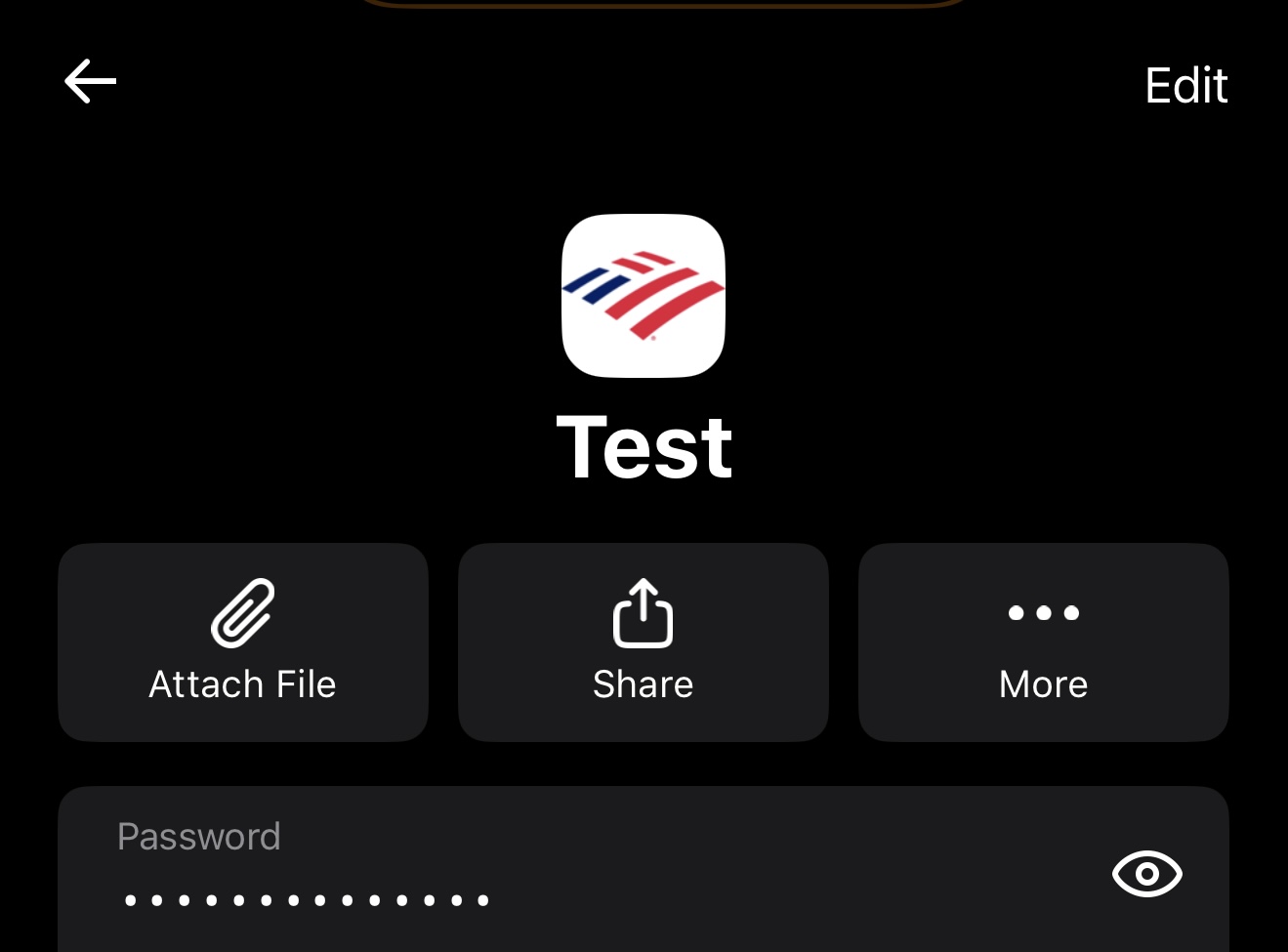
1
Publicly show important options on the item itself.
Photo of NordPass on iOS:
Photo of Bitwarden on iOS:
NordPass displays options at the top in a row, which is “attach file, share, and more”, without hiding these options behind a single tappable object.
In contrast, Bitwarden hides all these options at the top, next to the edit button in the three dots.
Addressing this issue could enhance usability.
How does this differ from this feature request:
So, oftentimes I need to go inside the card (especially, no pun intended, for credit card cards) to make sure it’s the one I want to use), but then I need to go back to the long list of cards/accounts to use the autofill.
Please add the autofill button inside the cards.
(Unless I am oblivious and it’s already there - I am not seeing it.)
Would you like yours to be merged into that one, so that the votes add up?
Terrance
(Terrance)
January 17, 2025, 4:32pm
3
This post has nothing to do with autofill. It has to do with the options displayed under the three dots that are hidden.
I am asking to make them visible like NordPass so that they are more prominently accessible:
Bitwarden on iOS:
NordPass on iOS:
I have no clue how it looks on Desktop or Android. But this is how iOS is treating those options. By hiding them.
Terrance
(Terrance)
January 17, 2025, 4:57pm
4
If you want to check out my other UI critiques and vote on them. You can find them here:
Scaleability of text.
Photo of NordPass on iOS:
[IMG_0417]
[IMG_0421]
Photo of Bitwarden on iOS:
[IMG_0418]
[IMG_0422]
NordPass presents the title in the center, with the title scaled differently from the password field and URL field. This design enhances the item’s recognition and legibility at a glance.
Presence of an icon in the item.
Photo of NordPass on iOS:
[IMG_0417]
[IMG_0421]
Photo of Bitwarden on iOS:
[IMG_0418]
[IMG_0422]
NordPass presents the website icon in the center, with the title scaled differently from the password field and URL field. This design enhances the item’s recognition and legibility at a glance.
Bitwarden does not. The icon is only visible in list form outside of the item:
[IMG_0426]
If you also desire the text scalability (that I mentioned), refer here t…
Improvements to the “My Vault” page on iOS and Android.
NordPass used as a reference of how it could look.
Photos of NordPass on iOS:
[IMG_0423]
Photos of Bitwarden on iOS:
[IMG_0424]
[IMG_0429]
[IMG_0430]
NordPass boasts a visually appealing and clutter-free interface. Instead of overwhelming the screen with unnecessary information, it effectively organizes categories in a clean and organized manner.
In my opinion, Bitwarden should adopt a similar approach. Instead of displaying items …
The other request is asking that the “autofill” button be added to view-item. As I understand your request, you are asking that favorite, clone and assign be added to view-item.
Seems like one request that all the actions be added to the view-item would garner more votes than either individually.
![image|497x500, 50%]
I seem to recall seeing an existing request that all the actions be added to view-item; I just can not find it at the moment.
1 Like
Terrance
(Terrance)
January 17, 2025, 5:06pm
6
Seems like one request that all the actions be added to the view-item would garner more votes than either individually.
Idk as they want a different thing then what I am suggesting.
I am more specifically talking about publicly adding hidden options in the item itself. and they want something with autofill.
I have no problem with the edit/fill button. So, I don’t know why you are pointing to edit and highlighting fill?
updated picture for clarity
1 Like
Terrance
(Terrance)
January 17, 2025, 5:14pm
8
Oh I gotcha now. Yeah it could be added there or above item details. For the extension.
Terrance
(Terrance)
January 17, 2025, 6:39pm
9
For the iOS/Android app, I like how NordPass presented it. Alternatively, I would like to see a design that fits Bitwarden’s aesthetic.