NordPass boasts a visually appealing and clutter-free interface. Instead of overwhelming the screen with unnecessary information, it effectively organizes categories in a clean and organized manner.
In my opinion, Bitwarden should adopt a similar approach. Instead of displaying items not in folders on the main screen and showing all user-created folders, it should prioritize showing what is necessary. Like Login menu, Card menu, Identity menu, Secure note menu, a Folder menu, and Trash
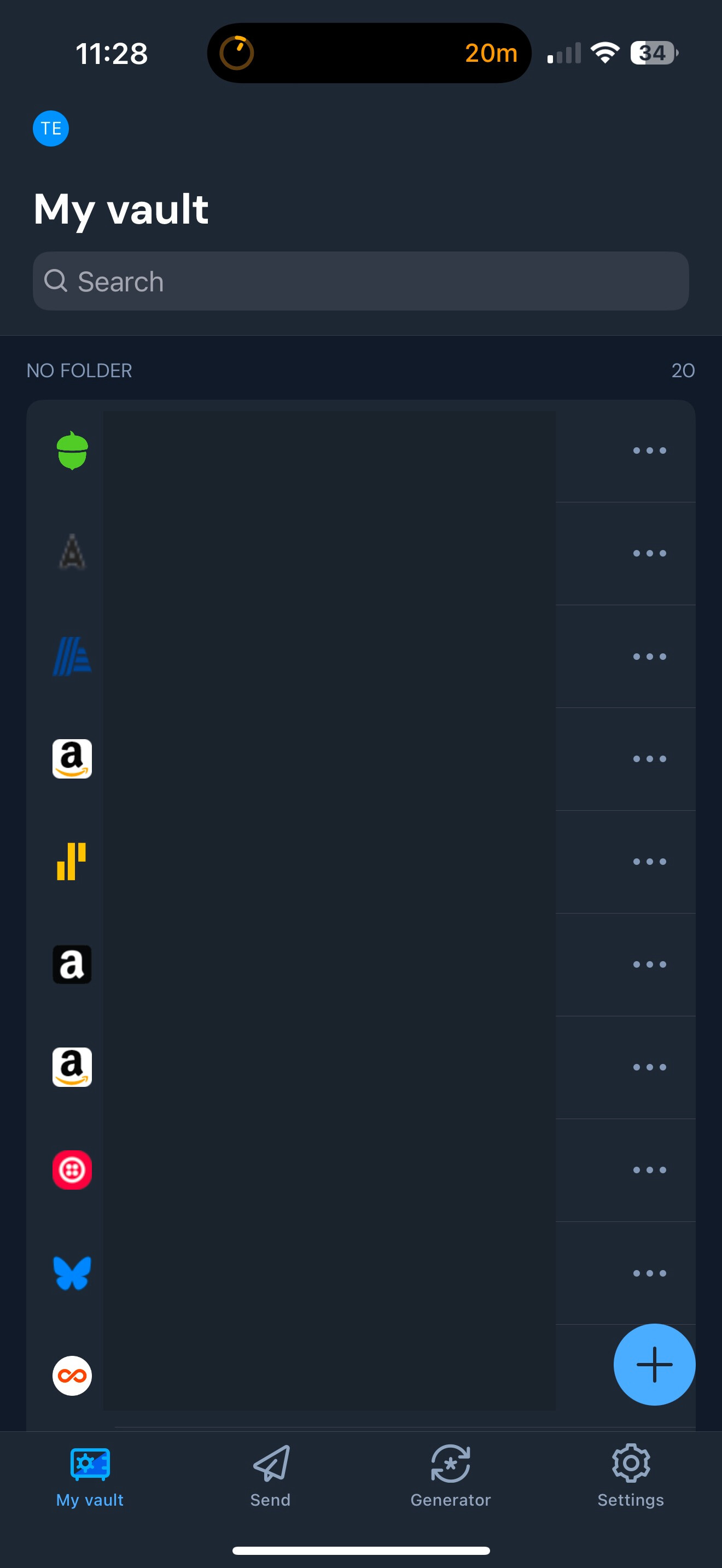
For instance, on the Bitwarden homepage, I have 28 folders listed in a row as seen in the photos above. After navigating through all the folders I created, I have to go past 20 items not in folders before I can finally reach the trash. This can be cumbersome and time-consuming depending on how many items/folders the user has.
If you want to check out my other UI critique and vote on it. You find it here:
It seems to me that these already function in the way that you want… just the title shows up and then when you click on them, the contents is displayed.
Login
Card
Identity
Secure note
Trash
Is that what you are looking for with the Folders and No-Folder panes?
I struggle to understand what you are requesting. Are you suggesting that you want the section called folders to consist only of a single line named “folders” and when you want to find a folder you tap Folders, at which time the list of folders is displayed?
Check out this reddit posting by a Bitwarden employee. In it he reports that Bitwarden is adding the ability to collapse the All Items section in the browser extension. That is, click on All items and they are shown; click again and they disappear.
Seems to me that you are asking a similar thing for Folders section of the mobile app.
Does that sound a reasonable solution that fits within Bitwarden’s current design language?
And now here lies the problem. I do not have Nordpass, so I do not know what they do when “folders” is clicked. Few others on this forum likely do either. That is why I am trying to express your request in “Bitwarden” terms and bitwarden design patterns that can reach a larger voting audience.
I believe that is possible, but unless the goal is to clone Nordpass, a video is not “actionable”, in that it does not state what you want changed and in terms that Bitwarden users (who would vote on the topic) would understand.