jidanni
March 3, 2023, 12:22pm
1
Better contrasting button states
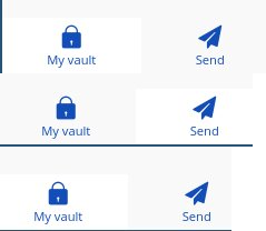
Here there is barely enough contrast to ensure differentiation in all lighting situations for all users.
opened 08:30AM - 26 Feb 23 UTC
closed 11:04AM - 27 Feb 23 UTC
bug
desktop
### Steps To Reproduce
$ bitwarden
Now click on Vault as seen in the image… , of the lower left corner of the screeen.
### Expected Result
The item we are currently using should look different.
### Actual Result
Nothing happens.
That's because we are already in the vault.
But as you see the color is the same as "send".
### Screenshots or Videos

### Additional Context
_No response_
### Operating System
Linux
### Operating System Version
Debian sid
### Installation method
Direct Download (from bitwarden.com)
### Build Version
Version 2023.2.0 Shell 21.3.1 Renderer 106.0.5249.181 Node 16.16.0 Architecture x64
### Issue Tracking Info
- [X] I understand that work is tracked outside of Github. A PR will be linked to this issue should one be opened to address it, but Bitwarden doesn't use fields like "assigned", "milestone", or "project" to track progress.
In fact it wasn’t until I put all 2 x 3 = 6 icons together until I realized it is the background that is slightly different. And only after sending a private message for someone to double check.
Anyway, how about instead of making white turn into “almost white”…choose something else .