Feature name
Option to disable high-contrast mode on Windows Desktop client
Feature function
On Windows visually impaired people easily blinded by light have to enable the “high contrast” mode. On Windows 10 it’s a simple toggle, on Windows 11 there are several high contrast themes to choose from.
This is NOT the Dark Mode.
This high contrast theme applies to ALL applications (Win32 or more modern ones) and is really helpful for the visually disabled to see better on their screens.
However, it’s frankly pretty ugly and makes a lot of apps unusable since some UI elements either disappear or are not displayed the same way. It’s a problem on MS’ side though.
The main issue is that on Bitwarden or on any app using Chromium/Electron, the app’s UI doesn’t look good even though the app’s dark theme is good enough as far as dark goes.
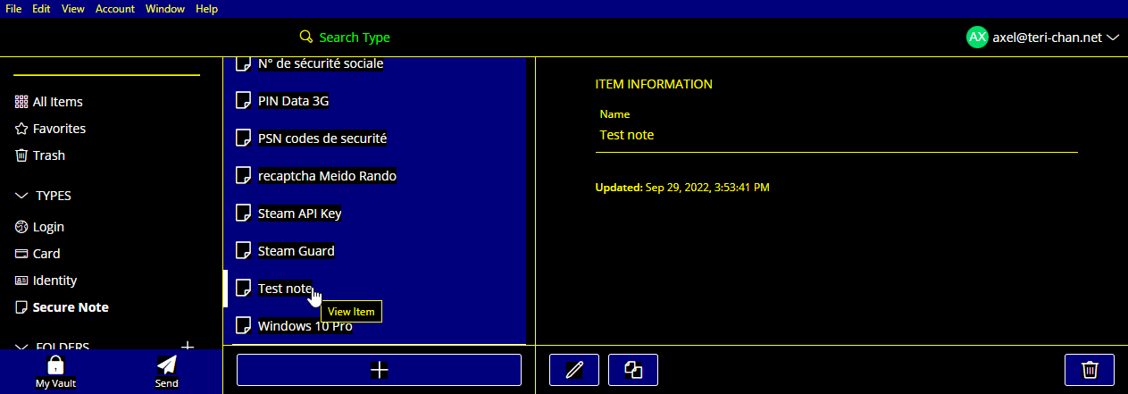
Example :
There are two ways to fix this for those who would like to enjoy Bitwarden how it was intended :
- Offer an option for the user to override some of the CSS. Some Electron apps like Tabby or Tweeten offer that in advanced settings.
- Offer an option called “Synchronize high contrast system theme” like Discord does it in its Accessibility options. Switching it off forces the app to use its own CSS and not Windows’ anymore.
In order to disable this behavior, you have to use this bit of CSS :
@media screen and (forced-colors: active) {
  body {
	forced-color-adjust: none;
  }
}
There’s also an existing workaround (which I use) which is to launch the app with the --disable-features=ForcedColors argument, but it’s not very user friendly.
Thanks in advance for considering this switch. I’m pretty tech-savvy so I did my research and found workarounds but it might not be the case for everyone.
