It seems, 2024.12.4 only added the optional old auto-fill behaviour:

2 Likes
In what started out as a joke in another thread, I may have just stumbled across the winning “autofill icon”:
1 Like
The Font Awesome stamp icons look like variations of this:
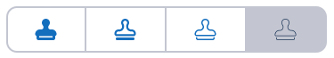
I don’t see it as necessarily better or worse than previous proposals.
Not so awesome in my mind. Those look like head-busts. Probably need to extend the handle a bit and square up the “shoulders”.


With the new design of the bitwarden browser extension, there is less space for the owner/folder dropdown list when creating/editing logins
This means there is not enough space to show the names, making it nearly impossible to use the dropdown list for longer owner/folder names
Here is a screenshot of what I mean for the folder dropdown list, but the same issue applies to the owner dropdown list: Bitwarden-browser-extension-folder-dropdown-list hosted at ImgBB — ImgBB
Please consider moving these two dropdown list to its own row, or some alternative solution so that the full name will show
3 Likes
You can increase the size of these two fields with:
settings → appearance → extension width → Wide
settings → appearance → extension width → Extra Wide
@DenBesten, those impose minimum size restrictions on the sidebar which render it unviable.
@casualsailo, this seems like something that might be worth trying at GitHub. I’ll give you a thumbs up there if you do. Otherwise, I might file it. It’s a real pain.
@rokejulianlockhart It seems, that being able to read all folder names, is seen on GitHub as a “feature request” - there was an “Issue” and it was closed:
1 Like
On my laptop, it is impossible to access the bottom of the ‘View - login’ window, so I can’t get to the EDIT and DELETE icons. (See image.) If the window was smaller, resizable, or moveable - it wouldn’t be a problem.
(As an aside, I wonder why Bitwarden windows are NOT resizable or moveable? Seems like it would be a desirable feature?) ![]()

1 Like
@chaslp Welcome to the forum!
The pop-out window is resizable and moveable. (at least on Windows and Brave)

1 Like
That would work too but I would prefer syncing over export/import.
Ideally, the sync would be for premium customers.
1 Like
Just tried 2024.12.4 on my work laptop (windows 11, Chrome browser). Ugh.
- Still excruciatingly slow when I click on it to unlock. Takes probably 10-12 seconds from the time I click on it to actually drop down so I can enter my master password. This is still probably the worst issue that’s present and it is a complete dealbreaker.
- Still doesn’t display my folders, instead it just displays all vault items by default. This is unacceptable.
- While the click-on-card autofill option is available, it isn’t on by default (which it should be, instead of being buried in the options).
- Now “view” is buried under another extra click instead of being a button on the card. This is not an improvement.
- Aesthetics are the least important thing to me in a password manager extension, and 100% subjective, but I also hate the overall look of the redesign still, for what it’s worth. I don’t really care though so take that as you will.
Uninstalling again. Since Bitwarden is still unwilling to roll this back to the last good version, I’m reduced again to doing so manually, which is also unacceptable. It has been weeks.
1 Like
Also, if you have to keep pasting this on negative reviews on the Chrome Web Store, you’re failing. That should be the default, not an option most users need to be pointed toward to “fix” this broken out-of-the-box behavior.
1 Like
Yeah. With this setting enabled yesterday I manually tried to make changes to 6 items. Clicking the three dots and “View” for each was a pain. In such cases I appreciate the solution when clicking on the item acts as “View”.
Probably I’ll wait for a bigger “Fill” button and until they accept the translation in my language on Crowdin which will make it even wider. At the moment I don’t know what to choose and whether I want to have click = autofill or click = view.
I think I’d like to personalize the icons and e.g. replace “Launch website” (which I don’t use) with a “View” button. Maybe someday.
2 Likes
just a general complaint - It’s a bit disappointing that Bitwarden has adopted the 2018 web styling of padding:50px on everything. Bitwarden is a utility and it’s always frustrating when utilities trade function for form.
2 Likes
Welcome to the forum! icymi, you can reduce the padding by enabling Compact mode in settings!
2 Likes
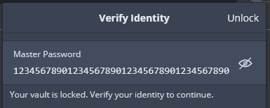
The so-called “Compact Mode” is really just a “Slightly Less Bloated Mode”.
In “Slightly Less Bloated Mode”, we still can’t see master passwords up to 40 characters in length (to correct typos), as we used to before all the “modernization” started:
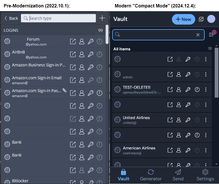
And “Slightly Less Bloated Mode” still isn’t able to display up to a dozen search results, as we used to before all the “modernization” started:

Those were the good old days (screenshots from 2022.10.1)!
3 Likes
… soooo… you don’t use the (not-as-)compact(as-it-could-be) mode with the new extension? ![]()
(PS: I agree to you, no need to argue… but my argument for the moment: better than nothing…)
I don’t understand your question/joke. Here is a side-by-side comparison (searching/browsing login items):
I do use the pseudo-compact mode (because it is a slight improvement over the default format), but I am unhappy with the fact the that amount of information visible in the extension has been reduced by 50% (approximately 33% in the vertical dimension, and 23% in the horizontal dimension).
This does nothing to increase the information density, and it comes at a cost of reducing the visible area of the open webpage. In addition, it does not solve the main problem: the increased need to use the scrollbar to get to the part of the UI that one needs to interact with. Perhaps scrolling is no big deal on mobile devices, but it is definitely a significant pain point when using a mouse to interact with the browser extension window.
5 Likes
I like the new updated UI. Yes, it takes a little getting used to but I do not understand all the negativity I have seen on this topic. It only requires a few tweaks to make it very good. I came from using LastPass one year ago after their last security breach. I started with the free version of Bit Warden and liked it so much that I upgraded to the paid version. I am also adjusting to the new UI but will adapt soon enough. Keep up the excellent work in listening to your users and making improvements to the program. ![]()
![]()
![]()
3 Likes