Ah, THANKS!!!
Why is there no consitency between the web browser extentsions and the (iOS) mobile app?
Example 1: Secure Note > Add Field
In the browser extension you have a choice of Text, Hidden or Checkbox.
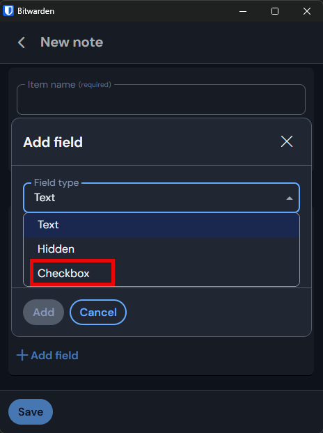
In the (iOS) mobible application & Windows Desktop application you have a choice of Text, Hidden or Boolean.
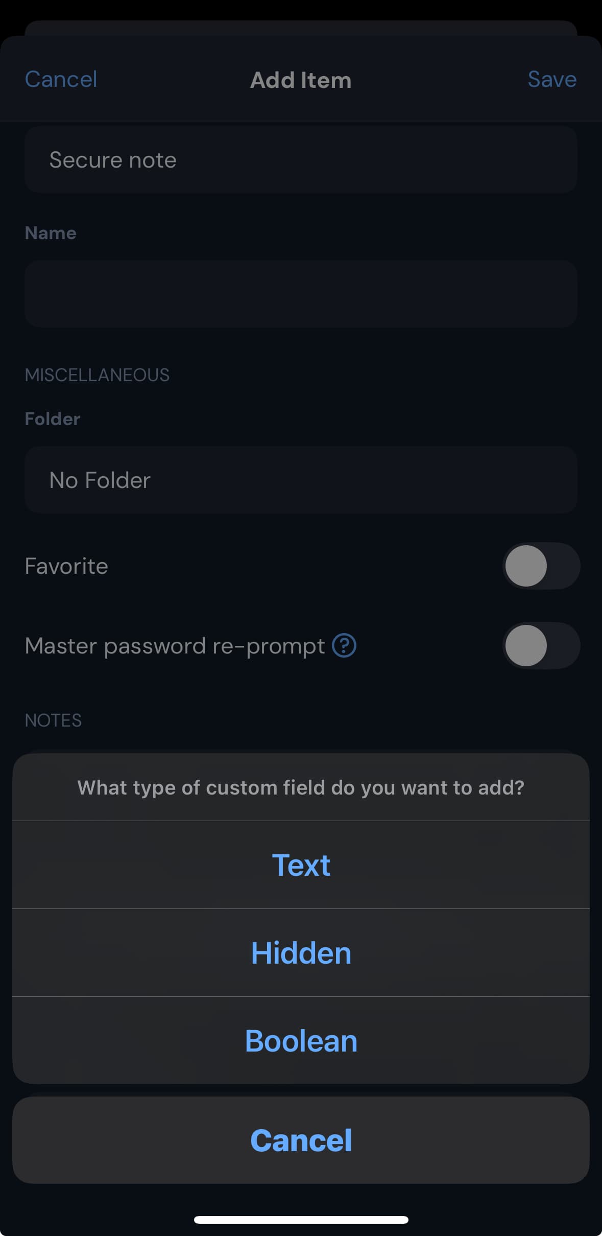
I know according to How to use custom fields KB Boolean is a checkbox, but again why isn’t this consitent acorss all clients.
Example 2: Settings
In the browser extension, you have a section called Vault and inside of this section, you have the ability to force sync.

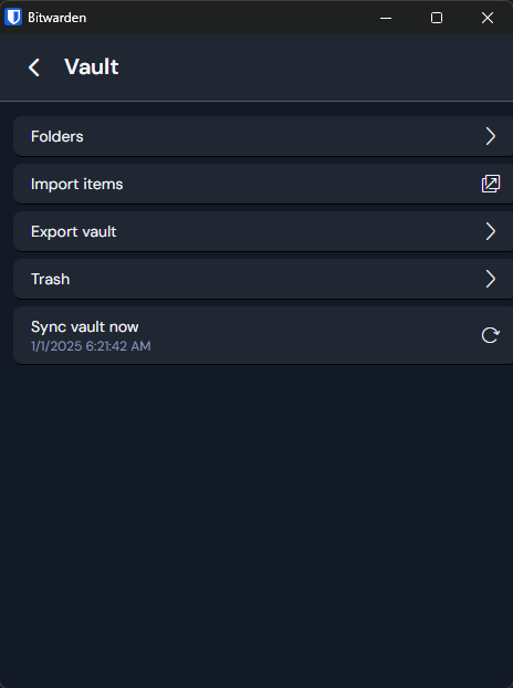
In the (iOS) mobible application, you have a section called Vault but the ability to force sync is not in this section. Instead, the ability to force sync is in the section called Other.
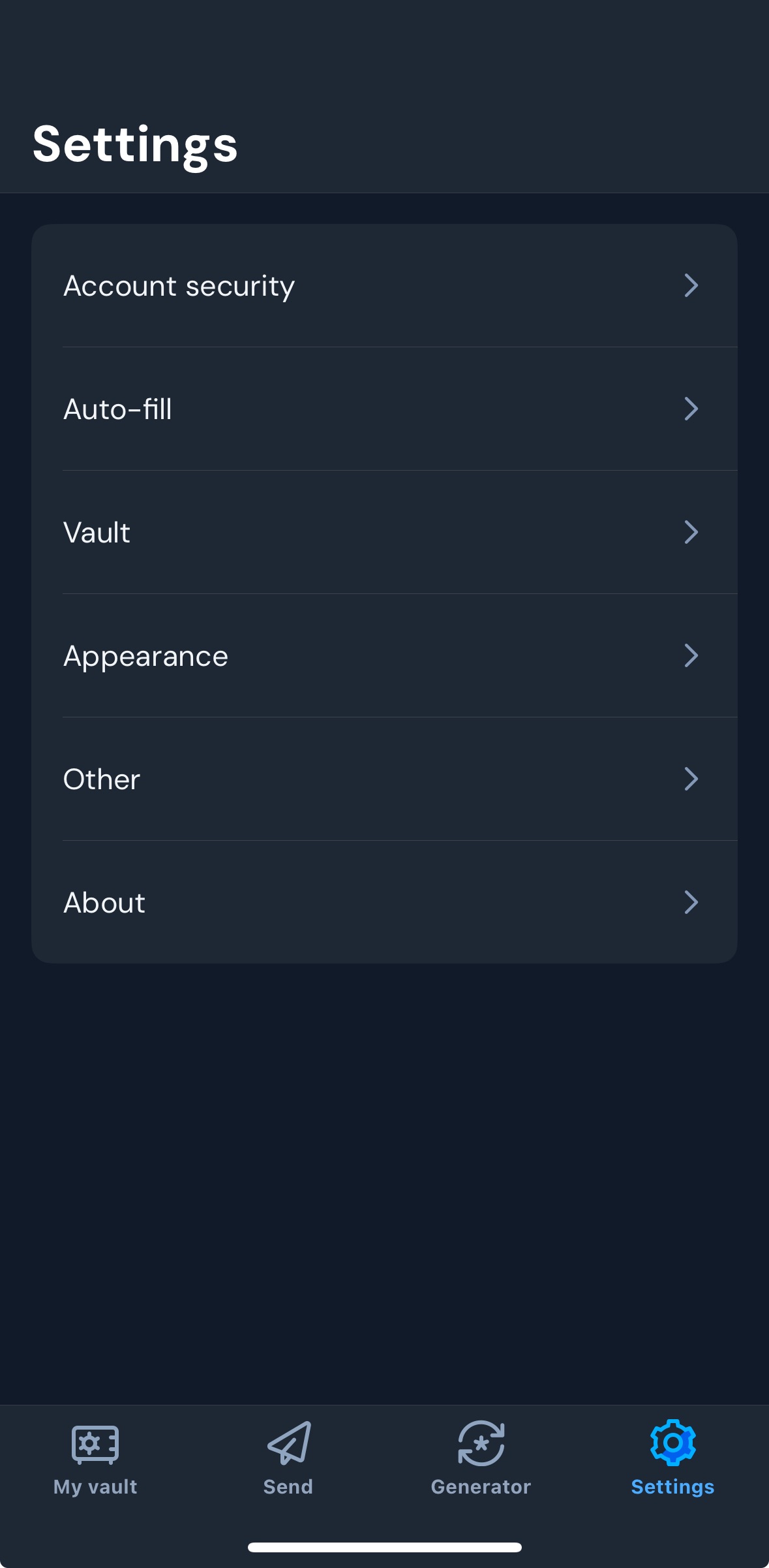
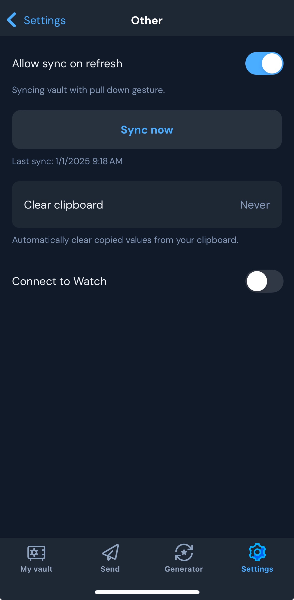
Again, why isn’t this consitent acorss all clients.
Example 3: Tab names
In the browser extension, the default tab is called “Vault”.

In the (iOS) mobible application, the default tab started as “My Vault” then when I switch accounts to my company’s accounts the tab got renamed to “Vaults”. I then switch back to my personal account and the tab remained as “Vaults” My personal account does have an organization created for sharing.
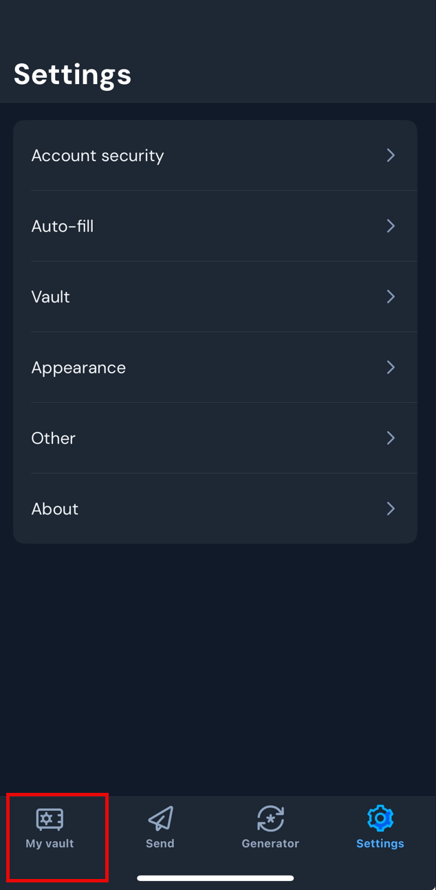

Again, why isn’t this consitent acorss all clients.
Thank you.
Most likely because the iOS, Android, and browser extension UIs were all redone this past year, by independent teams.
I assume that there will be an effort to consolidate the UIs, and I would be surprised if the new browser extension UI will not be the template for future UIs of the mobile apps.
Unfortunately, this mindset (making the browser extension and mobile app UIs as similar as possible) is detrimental to the browser extension UX, because there are fundamental differences between the ways that the different clients are used.
That being said, I don’t disagree with the notion that the label wording and menu structure should be consistent between devices, when possible.
@grb, you’d think, merely because of the translation overhead, that they would at least pull from the same strings. What a waste of effort.
@edelstone, those alternative offerings are merely at an even lower bar. It only takes one lad doing GUI QA per release to catch these kinds of issues.
My estimation is not that they’re not doing this (because that would be incredibly neglectful). Rather, I presume that they don’t utilize a centralised translation platform, but I’m not gonna trawl through the source markup for Crowdin URIs.
Irrespective, both possibilities don’t bode well.
Bitwarden does use Crowdin for localization. Can’t say if the new mobile apps leverage this repository, though.
@anon10321843, what else, then?
Are they all not using the product themselves too?
@edelstone, I presume that because it’s so obvious to us, it seems incredible that all their staff haven’t noticed.
Possibly… but it could also be a “strategy” to use products of competitors… ![]() (pure speculation of my part - I have no insider info here
(pure speculation of my part - I have no insider info here ![]() )
)
My thoughts were based on because some stuff (I agree not all due to complexity) as so obvious. @rokejulianlockhart even took the words (obviousness) I would have responded to this with.
Honestly I would hope this is the case too, you need some aspect of this to stay competitive and with trend, while also coming up with your own ideas. Would hope that their own product though is their primary daily driver and the others aren’t.
Bitwarden’s old UI was the the best. I have always appreciated it.
It drives me NUTS when people complain about something being outdated in appearance. The focus should be on readability and functionality, not glitzy/glossy appearance, which sadly seems to be the in-style now (until things change again in the future).
The old UI was matte and easily readable, totally functional. Same can’t be said for the new UI: what was achievable with a click or two in the old UI now takes 3 or 4 clicks in the new UI. And the readability of the new UI is way worse due to the glossy appearance and scanty font and space-hogging layout.
I also was a LastPass user but always HATED their UI. I left LastPass for Bitwarden in 2016. Bitwarden was like 0. version something (if memory serves me) and I ran into some functional bugs that were giving me problems. Eventually those got fixed and the way the UI kept getting shaped made me commit fully to Bitwarden because of how they did the UI.
I didn’t need to do any tweaks with the old UI. I have had to create a text file to record all the tweaks I need to make for the new UI before it is even usable. Definitely a step backwards, along with the readability problems of the new UI.
Same here. I was able to stop updates to Firefox extensions in time. Unfortunately I have to use Google Chrome for work and that got updated so I’m forced to use the new UI monstrosity.
Fair point here that many lay people confuse “looks good” (UI look and feel) with “works well” (actual usability / UX) and treat these two interchangeably which is the crux of the highly valid reasons for poor reception of this release.
Items like “2 clicks to copy” (thankfully have setting to revert) & “tiny fill target” & “shorter list” should easily have been spotted ahead of time.
What I would ask is that the Bitwarden product team learns from this round of feedback to be able to strongly separate the “look and feel” from actual “usability”. And please ![]() do not let graphics designers own UX design.
do not let graphics designers own UX design.
Hi everyone,
I think we need to change strategy because we are going to lose this battle.
Maybe we can start simple and see where exactly we agree or disagree. It seems to me that the vast majority of us don’t like anything about the new UI so let’s see if we agree and give Bitwarden something concrete.
Suggestions welcome.
Should the UI be reverted?
- I don’t like anything about the new UI. Bitwarden should revert.
- I like the new UI enough / more than enough. Bitwarden should not revert.
0
voters
If Bitwarden does not revert:
- I will move to another provider as soon as possible.
- I will wait for my subscription to end and then move to another provider.
- Good. Please go forward with the new UI.
- Undecided
0
voters
Don’t taking “sides” with my comment now - just keep in mind, that all discussions here (and on Reddit), regarding there are millions of Bitwarden customers, probably no “side” can claim to be truly representative for the vast majority.
That said, I think everything was and still is potentially valuable feedback - as long as it is “civil” and constructive.
PS: And speaking about “sides”… I would like to add, that there is not only “black” and “white”, but also “gray”… E.g. someone can - in general - like a / the new UI - and at the same time still be critical about many changes.
Agreed. Exactly why I thought the poll might be useful.
If I keep complaining and only see the complaints I want to, my perception of the vast majority might be completely biased. If it is, better to move on and decide if I want the product for myself or not.
P.S. It was the onslaught of negative reviews on the Firefox and Chrome stores that made me think this change might be truly unpopular.
One would think that there are systems in place so that releases cannot be released that differentiate from other applications.
So I would question if Bitwarden has a QA team and if so why didn’t they didn’t catch this? If they do have a QA team, is that team split so the same people only QA the same application and don’t have exposure to the other applications.
Out of curiosity, what is your role @grb at Bitwarden? I think I saw a post from you last week saying you are back working at Bitwarden.
I completely agree with the concerns raised here. The recent update has made Bitwarden much harder to use. The removal of the folder view is especially frustrating—having all logins lumped together in one big list makes it difficult to find specific entries, whether they were just saved or added a while back but aren’t showing up in search.
Additionally, the extra step added to the fill button (choosing username or password) feels unnecessary and slows down the login process. Please consider bringing back the old folder view and restoring the previous fill option behavior. It was much more user-friendly!