the placement of the icon looks wrong and should be revereted/siwtched opposite because i think i am clicking on copy icon but i keep clicking on regenrate icon. previously this was not the case if i remember. also this generator page not get closed so if i click the bitwarden extention to copy a site-specific password, the password generator page was/remain open.
I use Brave. Does that count?
From what I read, it’s mostly Chrome itself - but I think there were a few who had the same/similar problem with other Chromium browsers, too. So possible, but I’m not exactly sure. - If you have the same symptoms like in the thread I linked previously, probably the best thing you can do is, add your experience to this GitHub bug report directly (as bugs get tracked on GitHub):
Either you’re misremembering, or you’ve not explained your complaint clearly. Here is the old design (the icons are: check for compromise, toggle visibility, generate new password):

In contrast, here is the new design (the icons are in the exact same order):

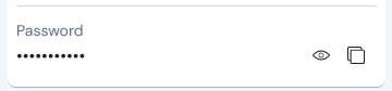
Neither UI has a copy icon for the Password field in the Edit Login view. If you want access to the copy icon, then stay in the View Login view, and do not click the Edit button:
Old UI:

New UI:
The only thing that has changed about the button/icon placement is that the new UI only shows the ![]() icon for checking password compromise when in the Edit Login view (not on the View Login view).
icon for checking password compromise when in the Edit Login view (not on the View Login view).
I did a search of this topic and can’t find any mention of issues experienced by users under the Families Plan 2019 subscription plan. In short order:
- TOTP functionality not working (i.e. OTP not being copied when the credentials are populated).
- Until the most recent update, it was not possible to manually copy the TOTP without ‘assigning’ the account (even though it was already assigned) as a workaround. Seems to be more consistently available as of the 12.4 update.
- When opening a record, the TOTP fields are disabled indicating that a premium subscription is required.
Please look into this issue, it may simply be a matter of the new UI code not recognizing the Families Plan 2019 as being a ‘premium’ subscription.
Many thanks
@JackS Welcome to the forum!
I searched for “2019”, and found the following thread: Families Plan (2019) lost attachment access, which also includes a link to a GitHub bug report:
I would like to quickliy access ids and cards without need of making it all favorite ![]()
With new UI I need 3 clicks instead of 1.
- Open Filter bar (want to hide because of space)
- Click on type
- Click on card
Please add custom quick filters.
The comment of mine that you responded to was only proving that the number of clicks was unchanged when it comes to accessing the contents of folders; I was not making a general claim.
FYI, the next release should have an option to make Cards and Identities permanently displayed subsections within the “Suggested Items” section (similar to how you could make them permanent sections on the old “Tab” view), as you can see here.
There is an interesting Feature Request about this that you might consider supporting:
Still no plan to bring back the old layout? I’ve been using local backup legacy version for weeks, but it’s not a longterm solution, eventually there may be some security issue makes the legacy version no longer safety.
Months of inaction towards community demand makes me reconsider should I insist on this product.
The developer team should be clear to one thing. Those who’re satisfied with current state won’t actively join the beta test. More like the “Cool guy” or people who change for the sake of change.
Dont miss the important voice developers, I don’t wanna see the password manager I used to love get ruined.
Hey @Darto, please see the latest thread to review latest changes based on community feedback. The team is still actively monitoring and making improvements.
Thanks for your advice and hint to the current features in development.
Although I still don’t like the new UI, I want to appreciate, that this community is very alive and responsive. And it seems that development take care of the user feedback as best as they can!
However it would be more easy to accept the new UI, if there would be some real statement why the change was needed an what the background of this decision was. Looking at this thread, it could NOT have been usability flaws for most of the existing users.
I am not in the technical details and may be wrong. But I wonder if the new UI was driven more by a technology change behind the extension? And changing that technology (to PWA?) would have required a new UI. So they would try to rebuild it as best they could. But of course some things are not supported by the new technology (e.g. having the search field in the title to save space) or limited (wrapping of text in buttons, spacing, …).
Could it be that the new extension has gone its own way?
No — this may be true of the mobile apps, but is not applicable to the browser extension UI redesign.
What is the problem(s) that are causing you the issue? I was not happy with the new UI/UX. However the changes that have been introduced in the last few releases have sorted most of my initial gripes. The only bit that still annoys me is why you have to go and enable the old functionality. While it is a one time change it is per extension/app which means it is not install and go but more install, customise and go.
I recently see issue with loading vault after login. I enter credentials and spinning thing shows up and never loads. I have to close the UI and reopen it to access vault.
PS: I am missing old UI
@michal1024 Welcome to the forum!
What you describe, seems to be a current bug - see here: Browser extension just spins after unlocking and/or here: Upon starting chrome the Vault tab keeps spinning forever. · Issue #13355 · bitwarden/clients · GitHub
Thanks! Looking forward for the fix ![]() If we get edit button back and few performance tweaks I will be supper happy
If we get edit button back and few performance tweaks I will be supper happy ![]()
Despite me complaining, I really like Bitwarden, I tried many other online and local password vaults and BT is definitely the best!
I signed up to the forum just to vent my frustration at the new UI. Used to be able to click the listing to fill, now I have to aim for the small fill button. Used to click once to copy username or password, now I have to click twice for both.
The redesign was a bad idea. Time to call it a failed experiment and revert.
Hey there, you can configure your experience from the settings menu:
- Copy actions: Settings > Appearance > Show quick copy actions on Vault
- Autofill action: Settings > Autofill > Click items to autofill on vault view