That’s an excuse, because the old version can be managed and updated as well.
1 Like
You’re funny. The ‘old’ version was fine until two weeks ago, so if they put it back, maintain and update it, nothing would be wrong. The comparison with Windows 7 is hilarious.
1 Like
@Gerben1 @FaviFake Now, in retrospect, I think we we had a little misunderstanding here.
I think @FaviFake and me understood you, @Gerben1 , as if you personally wanted to use the old app without updating it - and therefore we thought about the security concerns of that.
But now I understand, you @Gerben1 meant obviously, that Bitwarden should use the old app again - and therefore you thought, our answer’s were “excuses”. But they weren’t, I would say - we just meant something else. ![]()
But, then, as I wrote in another post before: my observation is, that there is no going back to the old extension, as Bitwarden not only changed the outer appearance and functioning of the extension, but also made changes “under the hood” (code changes). There is no way back to the old “technology”/code (the old extension) for Bitwarden, IMHO. But I think, the new design - as controversial as it may be - is flexible enough, to be further adapted. And they seem willing, to work on changes, reacting to feedback - among other things from here.
2 Likes
Indeed… Security updates have nothing to do with the UI. The UI is just a window into the system and any security updates can be done for evermore on the old version without changing the UI. The revealing of all your secure logins is a massive security break…
1 Like
See my post above your post - I think it was a misunderstanding.
You mean that all vault items get shown by opening the extension? - Yesterday there was an announcement, that there will come a possibility to collapse the view of all vault items (Usability issues (UX) in redesigned UI (2024.12.0) - #472 by dwbit).
They could switch back to the old version, meanwhile hire a few UX designers and work on the new version until that is mature enough.
1 Like
I wish I had taken a screenshot before posting the original message but that option was literally not there when I posted it. Because I had read this further up in the thread and tried looking for the option. Looks like the extension updated again between that and now.
And now that I’ve enabled it, I’m seeing another issue. The “copy verification code” button also seems to appear alongside the username and password buttons now, even though I don’t have TOTP saved in any login item in bitwarden.
Two steps forward, one step back…
1 Like
Hmm… I don’t understand one thing, is there some rule in the world that the more times you write about it in this thread it will happen and they will do it? If you want to use the previous UI, you can stay on the older version regardless of whether there are risks or not.
1 Like
@scimas Hi!
I think many (including me) would agree about font sizes (too small / worse readable), spaces, contrasts…
As far as I see, 1) the “Fill”-button will become a bit larger ([PM-16102] Add min width on interactive badges by vleague2 · Pull Request #12514 · bitwarden/clients · GitHub) and additionally the clickable area around it will get larger ([PM-16102] Increase clickable area for bit-item actions by vleague2 · Pull Request #12450 · bitwarden/clients · GitHub) and 2) yesterday it was announced, that the old auto-fill behaviour (clicking the whole item to auto-fill) will be coming back as an optional setting. (Usability issues (UX) in redesigned UI (2024.12.0) - #472 by dwbit)
You can get those separate copy buttons back:
Settings → Appearance → “Show quick copy actions on Vault”
I would say that depends. If you e.g. have longer vault item titles, use the new Fill-button (--*), have the separate copy buttons… it looks “crowded” and the item titles and usernames are barely readable.
(--* for now there is no alternative - but as I wrote before, with one of the next releases you can get rid of the new Fill button and switch to the old auto-fill behaviour)
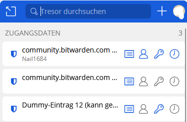
I must say, at the moment I like the wide or extra wide view, because instead of this:
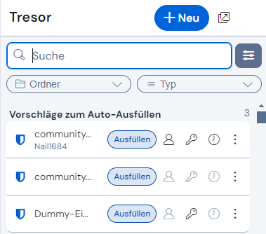
… it is really an improvement for me, to be able to have this (and I would have liked a wider extension window even with the old version before):

Yeah, the compact mode at the moment makes it only a bit better. ![]()
2 Likes
I think that quick copy action buttons option came with the latests version 2024.12.3, so can very well be it just came to you.
Hm, no, that all buttons are shown, but unused one’s are grayed out, was in the old extension exactly the same:
PS: And I think it is a good thing that always all those buttons are there - it would look only muddled if you would have varying number of buttons (1, 2 or 3) with the vault items… and if they are all there and fixed, they have a fixed location and you are more able to “know where they are” and where you can reach them…
5 Likes
@scimas The copy verification button has always been there for all logins which don’t have a TOTP attached. It has never been removed or reintroduced.
ICYMI, the Bitwarden team addressed features currently in development:
I also put together a list of tips and workarounds you can already use to make the new extension behave more like the old one, if you don’t want to wait (@Casjen, this includes suggestions for hiding all vault items): Usability issues (UX) in redesigned UI (2024.12.0) - #107 by FaviFake
@Gerben1, I believe you may have forgotten to read @Nail1684’s messages before replying to them.
They directly address the problems with the solution you keep proposing. Feel free to read them:
No need getting toxic
2 Likes
I asked looking at your posts here. A valid question, although it may be rhetorical.
1 Like
Yeah, maybe. - I also think, it would have been better, if they had worked another month on it. But on the other hand, nobody knows if that would have been better - or worse. ![]()
It is now as it is. And believe it or not - it actually is usable after all. ![]() (no, I won’t deny all open problems by writing that… but to do as if it was completely unusable is also not quite right)
(no, I won’t deny all open problems by writing that… but to do as if it was completely unusable is also not quite right)
2 Likes
Huh, I guess they were there indeed. Perhaps it was just less noticable because the buttons and surrounding space used to take much less space. In the default sized view the buttons and blank space consume about 48-50% space now. Whereas they used to consume barely 35-40% previously.
1 Like
This is what I’ve been saying all along. NOT doing so is a very clear choice by them, and as a paying customer that is infuriating.
2 Likes
If it were unusable, I would agree. But it is not unusable. All functions work (--*). They may not work as we would like them to work - and as we are accustomed to it - but they work.
And I never read something in the terms of use like “we guarantee to never change anything”. ![]()
PS: (--*): Okay, apart from a few bugs, that are always an issue, regardless of new, old, newer, older, … versions. ![]()
3 Likes
Hope I get a response to this.
-
Will there be an option to permanently pin ‘Identities’ in the vault tab? I don’t want the extension to guess on a web page if ‘Identities’ should be displayed or not. I fill out a LOT of forms and depend on ‘Identities’ to always be there reliably. Currently, you have to click the drop down menu, choose Identitiy then click the three dots to fill. Too many clicks to fill a form.
-
In the vault tab (under All Items), can we make each entry/account as a clickable fill button instead of a small ‘Fill’ button?
3 Likes
I’ve said this in other posts, I think on Reddit, but I would have of liked to see Bitwarden reach out to the community for the community to schedule a 30 minute session (via Calendly.com) with the product designers to get real world feedback. Filling out a survey, things can get lost in translation.
Doing this approach, Bitwarden could have implemented these changes 1 by 1. Then in the meetings ask the user, what do you think this does? What do you think of this design? What do you think of this function? What do you expect to happen? What actually did happen?
Doing user feedback like that will always be greater in value than surveys.
1 Like