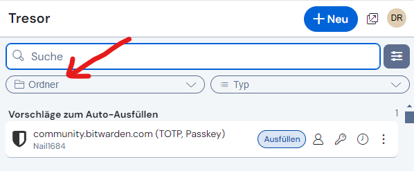
The elimination of folders is just infuriating to me. I put a fair amount of time into organizing my hundreds of items into a folder structure that made sense, only to have that all tossed aside. Why bother at all if they aren’t going to be used to organize how the Vault displays?
I don’t see a contradiction as the search function is still there.
I wouldn’t call it all “problems”. The inconsistency of what happens when you click on an item (auto-fill v. view mode) bothered me indeed from time to time.
And I can honestly say now the following: because of the feedback and then changes already incorporated, I think the new extension is more flexible now to set it up to your individual needs (setting aside for a moment all the things that have not resolved): the new wide / extra wide mode is interesting, you can turn the quick copy buttons on or off how you like it, the compact mode (or ugly mode @grb ![]() ) could be promising… And as I opened in Firefox the old UI a few hours ago, I can say that I really like the new “looks” a bit more now.
) could be promising… And as I opened in Firefox the old UI a few hours ago, I can say that I really like the new “looks” a bit more now.
(though I still find the readability less good in the new UI - font size, contrasts, spaces… whatever it is causing it exactly for me ![]() )
)
I hope this is a bug:
I have Identity set as a Favorite. But Identity moves around in the UI depending on what webpage I’m on. IT SHOULD NOT DO THIS!
On some webpages there is nothing showing but a login page. Yet my Identity is moved from Favorites and put under “Autofill Suggestions”. How do I park Identity so it stays in the same place (like it used to do in the OLD UI under the Tab view)?
Please bring back the TAB view, Bitwarden!!!
Thank you, I did find that.
Agreed!!! Real step-DOWN from old UI. What’s with all the little boxes??? Now I have to scroll up/down to see my information. LOVE THE PRODUCT!!! GREAT PRODUCT!!! But very bad redesign… there are other issues:
- Now everytime I login my cursor sits at “Search Vault” - NOW I get cache data which I have to “X” out of EVERYTIME. Never happend in OLD version.
- Old version had everything nicely “grayed out” for users that were “readonly” - NOW, no gray, looks like the can change things but I don’t think the can, it’s just not as intuitive.
- Loved how they told us the upgrade was coming, I never got an email or anything…
- Is there a way to go back to the old version???
I also find the readability worse on the new UI. The font is scanty, the appearance is glossy. Matte appearance is easier on my eyes and more readable (which is what OLD UI had).
The new UI is a downgrade on everything that matters to me so far.
Vault Hours 47 is happening in 15 minutes, and I think it’s another great opportunity to express opinions, especially since the Bitwarden staff are always present. Either way, they’ve received a lot of feedback here and on Reddit, and I believe they’re looking into it. Personally, though, I’d rather see improvements to the new UI than a complete revert to the old one.
That is a bug It was intended that way, but it get’s reverted - and as the Pull Request is already merged, I think it will be fixed with the next release: PS: Sorry, I didn’t read thorough enough here - obviously I misunderstood the issue. But I let the following link stay, as it has at least some connection to the issue. ![]()
This appears to be an intentional feature that is buggy in its implementation. The intent is for Identities (and Cards) to appear in the “Autofill Suggestions” area if and only if the open webpage contains an input form for identity information (or payment information, respectively).
This intended behavior does not work so well. Mostly, I’ve come across several situations in which Bitwarden fails to detect the presence of relevant fields, and therefore hides the required card/identity items (e.g., you can try it on the RoboForm test form). Your comment is the first evidence I’ve seen of a false positive (i.e., where Bitwarden detects an identity input field when none is present). If you don’t mind sharing what website this happens on, that information may be helpful.
@Nail1684 Thank you for your help. You got the points I mentioned right and the context menu is there as before. Sorry, I missed that.
For me, we need a better option for the “Fill” button. I can work with everything else.
It’s always hard to change from a running system. I really appreciate the responsiveness and transition help here.
Speculation: maybe it doesn’t move around with the page, but as the PR implys, with the last usage ?!
Perhaps you will find something of use in the thread linked below:
I also miss the tabs. But thinking in new possibilities with the new extension:
What about Custom Quickfilters? One Click and the list is filtered as I wish. This way no tabs would be needed any more.
No — as clearly stated by @eufnis, the Identity item moves from the “Favorites” section to the “Autofill Suggestions” section. This is not a sorting problem, it is a false positive detection of Identity input fields on the loaded webpage.
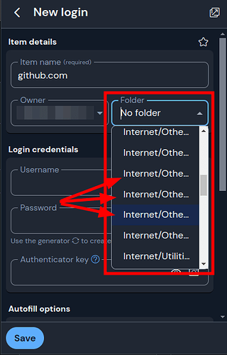
I don’t see this reported yet in this thread, but the browser extension’s redesign gives too little room for “Folder” when you’re adding a new Account.
In the previous design I believe the Folder dropdown was the entire width of dialog box instead of being crammed in next to the Owner. I’d like to see this Folder field expanded once again to take up the entire width of the dialog box, or when you click on it have it show a full-size dropdown, even if that doesn’t fit within the aesthetics of the size of the placeholder dropdown. Once selected it can go right back down into the shortened/truncated length of the field.
The current design’s field is too small and you can’t see the enter folder structure you created. This makes it frustrating to try and find which folder you want to put it into.
Workaround: Hover over the fields with the mouse. After a few seconds it will show a tooltip with the full folder name. This is very tedious and time consuming though because in a hierarchical structure with multiple folders you have to hover, pause for a few seconds, determine thats the wrong folder, move to the next one, hover, pause, etc etc.
At first glance I loved the redesign! However, after a few days of actually using it I like it less and less because of many of the frustrations expressed in this thread by others.
oh my, now i want to make an account here, just to scare more people when i share my screen =))).
Thanks for a wonderful idea!
When I click on “Vault” it does not display my vault items in folders. It simply displays them all alphabetically, from A to Z. I don’t care that folders are still a filter item, that is completely useless there to me.
So yes, folders have been eliminated as an organizational method for vault items and that functionality needs to be returned.
If you uninstall the current version of the extension, you can sideload the last working version of it to restore all functionality. Hope this helps!
You can get a UX closer to the old one by changing a few settings: Usability issues (UX) in redesigned UI (2024.12.0) - #107 by FaviFake

