@JoshAntBrown Hi!
Further down I saw that you are on MacOS. Even with the old extension, there were reports about significant performance issues on MacOS (Chrome extension takes forever to load UI after authenticating and is extremely slow and unresponsive) - so that bug might have it you also with the old extension… though loading all the vault items now in the new extension may contribute to that also.
To be honest, that button was larger - until the beta feedback was mostly “please make it smaller” (mainly because the vault item titles and usernames were barely readable - the button and the item text compete about space now). ![]()
There are already pull requests for that (here you can see it will get a bit larger: [PM-16102] Add min width on interactive badges by vleague2 · Pull Request #12514 · bitwarden/clients · GitHub and here you can see the clickable area around it will get larger also: [PM-16102] Increase clickable area for bit-item actions by vleague2 · Pull Request #12450 · bitwarden/clients · GitHub)
And here is a different idea on how the auto-fill button could be changed again: Usability issues (UX) in redesigned UI (2024.12.0) - #346 by Nail1684
But in the old extension, you had to open the vault item first, then scroll down, and there click (forced) auto-fill, if I remember correctly. Isn’t that easier now with the hamburger menu??
I agree, that there should at least be an option for that, to make it customizable. (for privacy and probably performance issues)
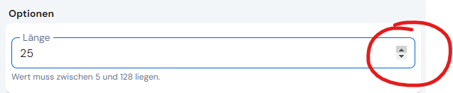
I can see the advantages of a slider. But you can adjust the length with the mouse by clicking here (it only is there, if you go there with the mouse - maybe also a bit unfortunate, to expect, that everyone searches for “hidden” elements in the UI ![]()
![]() ):
):
Yeah, there is a long standing feature request about that ![]() : Autocomplete default username (+random password) when creating new entries (or option in generator) It really would have been nice, to see some improvement here.
: Autocomplete default username (+random password) when creating new entries (or option in generator) It really would have been nice, to see some improvement here.
I also found the beta “unbalanced” (I actually used the same word). I agree, that it should be more harmonious (good word also!) - and especially better contrast and more use of colour are good ideas for me (of course without making it too playful or comic-like).
I’m not sure at the moment, but I think there are indeed reported bugs for that, and they are worked on and get a fix, hopefully soon for you and others.