Well, to be fair, the imperative to make the browser extension and mobile UIs as similar as possible evidently predated the 2024.12.x UI redesign; for example, this is the reason the navigation bar is at the bottom (so that it is easier to reach by the thumb of the hand that is holding the phone).
And to clarify, I was not stating that prototyping a new mobile app was the motivation for embarking on a UI redesign to begin with. I was just musing that the design philosophy that seems to have guided many of the decisions in the 2024.12.x redesign has apparently been to make the extension look like a mobile app (and I am quite sure that the ultimate intention is to have the mobile app and browser extension look as similar as possible).
Peer pressure from social media users or not, we now have had a taste of the new version and it seems a lot of additional work is going into adding settings to make it look and behave like the old version. BW has a list of all its users, so why not put it to a vote which look is preferred? Send everyone an e-mail BW with voting buttons, and that will give you a clear answer of what your users want.
Watching both the community and r/bitwarden for the past month has given me a pretty clear answer: The users are not a homogenous group. They do not all want the same thing.
Some like the new interface; some prefer the old. Some want click-to-view; others click-to-fill. Some want a copy-username button; others want more horizontal space for the name. Some prefer searching; others navigating folders. The list goes on.
As I see it, giving users the ability to enable/disable the individual primary features will ultimately result in greater overall user-satisfaction than a single binary old-vs-new choice.
Don’t disagree with you and I did suggest quite the binary choice, however, if BW really want to assess user needs, then they need to reach out to all users (or a statistically representative sample), and Reddit and other forums are neither.
As I mentioned in one of my other posts, the new version was rolled out without first addressing the hundreds of open issues on GitHub. The danger is that adding all these new settings to satisfy most tastes will result in a bloated complex extension more susceptible to issues going forward, and again, this could just be based on what people have said on Reddit or here. Are we confident this is a true representation of user needs?
By the time we end up with a version everyone is happy with…it’ll be time to make changes again
I don’t think it’s worth a revert yet. Certainly not until the features referenced in the note above /1 of this post are available to everyone (I’ve not yet received them on Firefox).
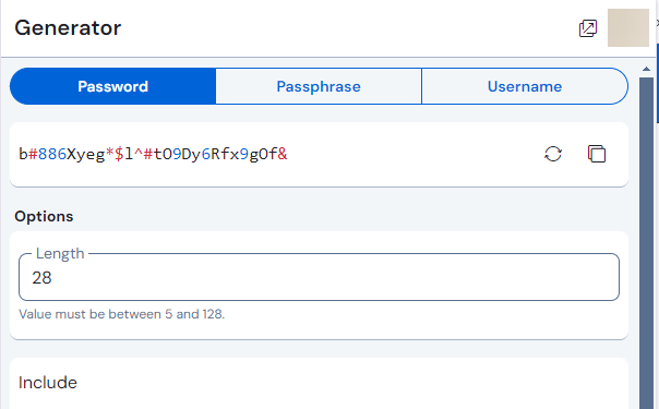
As an example of why, the new password generator GUI [1] replaced the length scroll bar with an <input type="number">, so that I can now type the exact length I want, instead of having to scroll one px per integer (something I would have not achieved with any movement disabilities).
@rokejulianlockhart … only, that the old design also allowed typing in the exact length (or clicking the up/down arrow buttons) - and had a slider / length scroll bar…
Damn. I never realized. Perhaps it’s at least an improvement in visual design in that specific respect then – since I noticed I could now enter an integer with the keyboard – but that is disappointing. That was the best defence of the new GUI I could conjure, too… XD
Thanks so much for adding the Click to Fill option in settings. Now I love the new user interface without even a small caveat. Thanks for the updated look.
You’re right. The “Fill”-button is only there for “auto-fill suggestions” and though that can be login items, cards and identities, the “Fill”-button is by default not there for ALL cards and ALL identities.
Therefore, activating the option to change to the “old” autofill behaviour, only works for the auto-fill suggestions where the “Fill”-button would be…
I think in my previous post, I answered most of it… here an addition: “Favorites” never had the auto-fill behaviour per se. Here: New extension: New (and only) "Vault" tab - Pros, Cons, Differences, Improvements?! right in the first post you can see, that in the old extension, the “Favorites” were in the “Vault” tab and by clicking them you got into “item view”.
So, favorites per se having “auto-fill functionality” would not be the “old behaviour”. - For cards and identities, there was autofill functionality before - and that maybe should indeed be restored (see the feature request in my previous post).
With passwords (login items) it should work. Autofill suggestions contain login items. Or can’t you auto-fill login items now?
Not a fan of the new UI. I don’t want my password manager to ever change without explictly opting in – this is a dealbreaker for me.
From skimming this thread, it sounds like there is no setting to revert to the old UI? Really unfortunate if that’s the case, I’ve been recommending Bitwarden for ages, but if the UI is just going to change under me, I’m going to move to a local-only solution that I have full control over.
@don_meetsummer.org, that’s impossible, especially for an online-only service. The closest you’ll get is KeepassXC, because even self-hosting your own Bitwarden Server instance wouldn’t be adequate unless you never update your device OSes either.
Do make sure you have a plan for addressing security vulnerabilities and interoperability issues with your clients if you elect to stay with older releases.