as i’ve been out of the game here for quite a while, just checking @dflinn if it would be ok for me to run through some basic #a11y check over the preview at this point, and if so where’s best to look/file issues/PRs? already have a few low-hanging fruit/small tweaks (some unlabelled controls, for instance)
3 Likes
Hi @patrickhlauke, yes it is absolutely ok for you to run through some #a11y checks. We’ve have had some accessibility testing during the project, but I expect there are items we missed.
Feel free to log issues/PRs in Github as normal, you can tag my GitHub username and I will categorize the issues internally.
If you decide to open a PR, note that much of this work is behind the extension-refresh features flag, so you will need to enable it to contribute to the update. Docs here: Feature Flags | Bitwarden Contributing Documentation. The design system component changes are also currently on a separate branch, but will likely be merged to main sometime in the next few days.
As always, thank you for your efforts to support accessibility at Bitwarden.
I don’t know if this also part of the new design changes or for other reasons, but that post from @grb right now: Has Bitwarden lost all in-house expertise on entropy/password strength? reminded me of two other things for the generator:
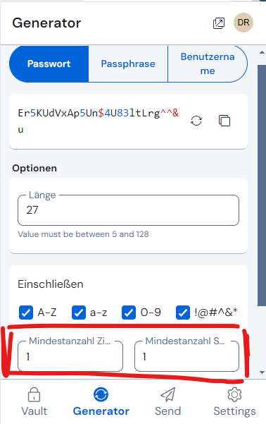
- Though it may be problematic, if people “manipulate” too much with the password/passphrase settings, it is at least inconsistent with the “numbers” and “special characters” settings in the password section, that with passphrases, you can’t choose the number of numbers:

It seems, it is always just one number that get’s added by that option. (though it says “Ziffern” which implies the plural - but that may be a result of the translation into German?!).
I would like to choose more than one number. (and yeah, I know, that “complexity” is not recommended with passphrases, but more flexibility - and consistency with the password section, would be nice)
But - if you really want it to be only one number in any given case - than at least remove the plural. 
- Similar thing with the username section - but here it is even more plausible, being able to choose more than one number (until recently, the default was four numbers, I guess - what happened to that?), because a practical problem can be that such usernames with only one number may already be used by another person:
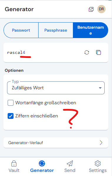
Here for comparison the password section again, where the “numbers” can be chosen:
With the added benefit that the truncated label “Zi…” can be interpreteted as either plural or singular! 
1 Like
… I don’t know if this thread here is still “active” - and maybe I should make a feature request instead (didn’t find one at first glance):
Today I needed the function to make a duplicate of a “Send”, because I needed the nearly identical one again. Was that ever possible, to make a duplicate of a Send? I thought I could remember doing that before… 
Anyway, neither the beta extension nor the current stable extension has a function for that. (PS: I guess the other clients face the same situation then…)
Besides, I think it is sometimes useful to be able to make a duplicate (example: some Sends to family members often have identical content…) and a bit inconsistent, to be honest, to be able to make duplicates of vault items but not of Sends. 
Please, if possible, give me some feedback if this can be considered - or if I should search for a corresponding feature request more intense or create one myself… @dflinn
PS: Just a comment on the passwords for “Sends”: wouldn’t it be useful to also be able to choose a password for a Send from an existing vault item? And the other way round: if you create a new password in/for a Send, it might be useful to be able to store that as either a login vault item or a secure not.
This was never possible, so it would be a feature request. There is an existing feature request on cloning Sends here. Another possibly relevant feature request is the request for Send templates to retain default settings.
For further feedback on the browser extension UI redesign, I would suggest using the more recent thread, linked below (although I agree that it is unclear whether @dflinn and/or @Kevin_Harris are still monitoring either of the two feedback threads):
1 Like
So I’m officially hallucinating. 
Thanks for the search I should have done myself - I will have a look at those threads.
When we’ll see update for this beta extension with fixes?
A post was merged into an existing topic: Usability issues (UX) in redesigned UI (2024.12.0)
The beta version is now in production (version 2024.12.0), so I am closing this thread. Any new feedback should be posted in the community forum feedback thread linked below (alternatively, create specific feature requests or post formal bug reports in the appropriate locations).
Hello Bitwarden Community,
Thank you so much to everyone who has taken the time to try out the preview of our new browser extension redesign and share your feedback with us. Your feedback has been very helpul in fine-tuning the experience. We’d like to share some of the key changes we’re implementing based on your feedback as we move towards the official launch.
Key Updates:
-
Search Field
One of the top requests we received was for the search field to be more accessible. To make searching quicker and more convenient, we’ll be auto-focusing the search field as soon as you open the extension. This change should make it easier to start searching your vault immediately after opening the extension. -
AutoFill Button
We heard your feedback that the “AutoFill” button could be more compact. We’re updating the button to simply “Fill,” which will free up space for displaying email addresses and item names, making it easier to identify items at a glance. -
Launch Website Button
Many of you mentioned that launching websites is something you do frequently, and that putting this feature behind a dropdown impacted your workflow. We’re moving the Launch Website button to the main item action bar, making it quicker and easier to access your websites. -
Compact Mode
We’re developing a compact mode for users who prefer to see as many vault items as possible at once. This will be a setting that you can toggle, allowing you to switch between standard and compact views based on your preference. -
Vault Filters
To further maximize space, we’re adding an option to toggle the visibility of the new vault filters. Bitwarden will remember your preference, so if you choose to hide or show filters, your setting will persist between sessions. -
Notes Field
We’re expanding the height of the notes field within the item view to make it easier to view and edit larger notes without excessive scrolling. -
Generator Bugs
Lastly, we’re fixing several bugs in the generator experience to ensure it’s as smooth and reliable as possible.
Your feedback has been very helpful in improving this redesign. We’re still listening, so please continue to share your thoughts on the preview. Stay tuned for more updates.
3 Likes
@Kevin_Harris Thank you for incorporating some of the feedback received so far.
This may be OK for users whose language is English, but will not be an effective solution in all languages (some of which have no short equivalent to the word “fill”). The best solution is to use an icon instead of a text label, and if you don’t wish to do so for the new UI, please at the very least consider using an autofill icon for the “Compact Mode” UI.
Using Icons should also allow you to put the four filtering buttons (“Vault”, “Collection”, “Folder”, “Type”) on a single row instead of having them occupy two rows, thereby pushing important information below the fold. Please, at a minimum, allow users to disable text labels in buttons by selecting the “Compact Mode”.
In addition, here are links to some unaddressed issues from the previous thread:
- Passkey bug.
- 2 bugs related to keyboard shortcuts, and 1 bug related to Settings.
- 2 more bugs related to keyboard shortcuts and unlocking.
- Field values are no longer draggable.
- Launching website from login item that contains multiple URIs requires scrolling.
- Master password field cannot show full master password.
- Ambiguous characters
O01lIare not distinguishable when displaying passwords. - No distinction between “URI” and “website”.
- Visually incongruous graphical elements.
- Dark theme uses colors that clash.
4 Likes
Hey Grb,
First of all thank you for being such an active participant in this community and sharing a lot of your feedback.
Our primary goal was to make autofill more discoverable as a feature. We explored using an icon early on but couldn’t really find a consistent or good enough metaphor that we felt like communicated the concept quickly.
All that being said, there are multiple paths to achieve this and we’ll continue evaluating and adjusting to make sure we are delivering the best experience for our users.
This concern is really only relevant for brand new users (within the first day or so of using Bitwarden for the first time).
A better solution to that particular concern would be to create an onboarding experience, in which new users are guided through the basic functions of the browser extension (and other apps), and perhaps use auxiliary text labels/popups for such users during the onboarding mode (which the user should be able to disable/dismiss when they are ready).
For most users, the text labels are unnecessary, and for power users, the text labels are a pain point. Please, at the very least, switch from text labels to icons when a user has enabled the new “Compact Mode”.
If you want a suggestion for a skeuomorphic autofill icon, there are many possibilities:
etc.
You can even use the Bitwarden shield icon, which is literally described as the “autofill icon” in the settings for inline autofill menus (“Show autofill menu on form fields: when autofill icon is selected”).
I highly disagree, I believe the autofill icon should at the very least be bigger and more colourful than any other item button. One of the principal of UX design is to make the most used action the easiest to use; the previous version was so unclear that even some technology reviewers couldn’t figure out how to autofill an item without using the right click menu. Imagine what a normal user could think!
I personally enjoy the bigger button as a power user-ish, as it’s much easier to click, since it’s bigger. the only thing I agree with you on is using an icon in place of the label for the compact mode. if a user goes out of their way to find a setting that is meant to save space, I believe each the icon should still be more recognisable than the other buttons, but It doesn’t need a label.
I don’t think we disagree that much. I agree that it makes sense for the autofill button to be the first button, and to stand out visually (being brighter and/or slightly larger). The point I’m making is that the autofill button should not have a text label, because this will lead to a monstrosity like Ausfüllen or Συμπληρώστε in non-English languages.
The original version had a problem in that clicking the item name sometimes autofilled, but sometimes opened the item for viewing, so that there was no consistency in the behavior. Having the first icon consistently do autofilling will solve that problem.
Slightly bigger than the other buttons is OK, but I would hazard to guess that you are happy with the text button mostly because the English language allows for shorter words than do other languages:
I would argue that it doesn’t take a power user to prioritize seeing more than 7–8 characters of the item name and username over having an auto-fill button that takes up over a third of the available horizontal space.
On my screen, " " is about twice as wide as “fill” and is much less meaningful (light-to-dark???).
I encountered an app today that used this icon  . How does that clearly communicate “save” to the up-and-coming workforce who have never even seen a floppy?
I have no objections to “arbitrary” icons in compact mode, but when it comes to non-compact (spacious?) mode, we should strongly favor instant recognition/clarity and translation-ability.
This was just to convey a basic visual idea (“empty to full”), it was not meant to be taken literally as a proposal for what the icon would look like. If you want, I could draw something that is more compact. The icon is not meant to be self-explanatory, it only needs to help the user determine which of the three icons (autofill, launch, and “more”) will perform the autofill function.
Personally, I’ll be happy as long as a user has the option to turn off text labels.
How would you suggest dealing with non-English UI languages? Is your position that it doesn’t matter how much of the UI is obscured by large text-buttons, as long as a suitably short word can be found for buttons used by English-language users?