Its more than the compact mode. I highly recommend doing some usability testing. The UI is not functional at all.
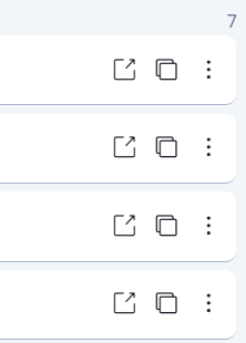
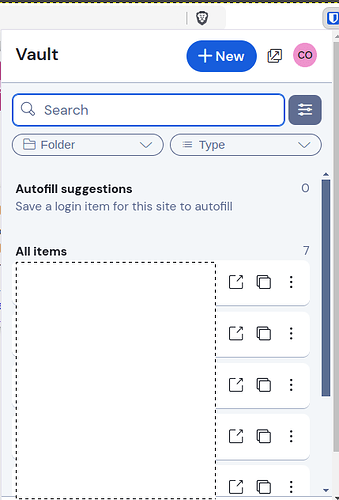
Just discovered yesterday that two icons are missing at the far right in my Bitwarden browser extension:
I assume this change was made to reduce clutter, but those two icons for copying a password and copying a TOTP are things that I use on a regular basis. Now I have to make more clicks to access these functions.
Please provide a setting to configure the visible icons.
Settings –> Appearance → “Show quick copy actions on Vault” (introduced with 2024.12.2)
That was fixed, and can be changed from the appearance settings
I have been very vocal on this thread about the new experience, specifically the copy buttons. This morning, I feel like I can breathe. I’ve checked this thread every day, and I want to extend sincere thanks to the Bitwarden team for hearing the community on this topic. Also to @FaviFake for posting the instructions of how to get the old functionality in the new look. I hope the remaining issues are eventually resolved, but for now, the updated extension, at least for me, is way more usable. Thanks again.
Can’t view entire password anymore
Not sure if this is good to add to this post or a separate one, but I love the redesign overall, and really appreciate the ability to move the quick autofill buttons back up to the main page, I missed that when that was gone at first!
My main feedback so far after using it a while is to show the whole password when making the password visible. When I make the password visible, with most of my auto-generated passwords that use passphrases, they easily go off the screen, and when I make a password visible, I am no longer trying to go the route of copy-paste or autofill, I am now down a path of wanting to see the password (personally, for cases where I can’t copy paste as the “password” is going into another device or similar that can’t have BW. So the old functionality of being able to see the whole password without needing to scroll or similar where I can only see partial at a time (and the scroll functionality is difficult, I have found that keyboard arrows are the best typically, but that isn’t the fundamental issue), is problematic from a UX standpoint.
TLDR;
Problem: Can’t view entire password when toggling visibility
Proposed solution: Only when visibility is toggled, make the password field large enough to encompass the whole password so it is visible.
If this is better somewhere else or on it’s own thread just lmk ![]()
Great! Thanks to all who responded for pointing that out.
The little “fill” badged button is really unpleasant and uncomfortable, and clicking it is way less intuitive than autofill by clicking entire row… very disappointing
So the one thing I was hoping would get fixed is the bottom menu bar not being visible without scrolling. I still have to deal with 2 parallel scroll bars, in order to see the bottom toolbar (Vault, Generator, Send, Settings) as well as the “go back” button at the top, which disappears when you do scroll down to view the bottom toolbar.
Sure would be nice if that had gotten fixed. So far, nothing here in this update is floating my boat.
Extension version 2024.12.2. On Brave.
Thank you - I teach an intro to UI/UX design module, and I’m always looking for case studies to analyze. While there are arguably some worthwhile changes, this redesign is unfortunately also a good example of several usability anti-patterns.
One pattern broken several times is to make the most common operations easiest to do.
For example - what’s the operation most people do when they open the extension? I can’t imagine that it’s not to select the credential to autofill the web page. Previously, autofill action was triggered by clicking pretty much anywhere on the credential listing. Now, if you click on the listing, you get the ‘view’ view. You have to click on the specific ‘Fill’ button to get the action you want 95% of the time.
This is not only a real head scratcher, it’s actively infuriating, as you then have to click back to get the action intended. That’s 3 actions to autofill.
Sure, I’ll eventually learn to go directly to the Fill button. But its bad UI design to make the most common actions require more work.
The buttons should be reserved for less-used actions - like viewing/editing the credential.
Overall, I’ve been happy with the underlaying technology. At the end of the day, I’d rather you spend your effort on making sure that’s absolutely secure. If you’re going to ‘twiddle bits’ in the UI, perhaps investing in workflow analyses would help ensure your changes are valuable, and don’t actually degrade the usability of the tool.
Folks, I have an idea about the auto-fill button.
First, some personal comments:
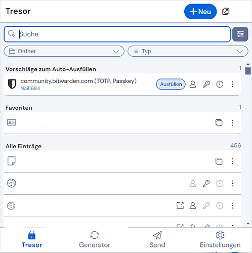
In German, the button is larger than in English, because “Ausfüllen” is longer than “Fill”:
And I must say, I have zero problems, to land on that button now.
But, of course, you may have more auto-fill suggestions than one - and you may first have to read, which entry is the right one. So your eyes go to the text first, and then to the button. (So that takes time in and of itself, so to have the text and the button separate is really not ideal, but read on…)
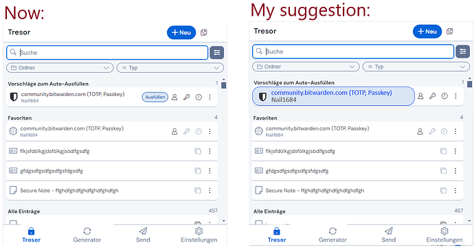
So it just came to me, if it would be possible, to make the whole text of the entry (for login items it is: title and username) like the button itself. I lack the design skills to manipulate my screenshot to illustrate it, so short description (if at all possible): the text would get the same design as the auto-fill button now has (blue background, blue “frame” etc.).
(I could imagine, for a not-too-cluttered-view, to always use the same size of that “button”, reaching to the symbols on the right, because if every button had different width, depending on the numbers of characters of the entry, that would be… cluttered)
That would (potentially) kill two birds with one stone:
- that button would be larger again - and actually working like before the UI change
- and it would visually be different from the other vault items, so that the “perceived inconsistency” might still be gone as well (because all other vault items would not be in “button-design” and therefore indicate different effects by clicking them: “button-design” of the item = click for auto-fill // “normal design” of the item = click for view mode)
Could that be a solution - or am I completely missing something here?
PS: Maybe if that sounds interesting and someone has the design skills, someone could illustrate my idea?
PPS: Maybe one downside: that design would not be completely self-explanatory. ![]() But not too complicated to get used to it either, I think.
But not too complicated to get used to it either, I think. ![]()
PPPS: And maybe another downside: I don’t have any idea, if that would look totally ugly in the end, having those big “auto-fill-buttons”, probably with the website icons in it… ![]()
PPPPS: I said I have no design skills - so an “ugly hot-shot”, to at least transport the general idea (I added some dummy entries as favourites to see the comparison between the design to my “auto-fill item-button” idea):
Maybe I am the one missing what you are saying, but aren’t you just suggesting that the behavior should be restored to the way it was in 2024.11.2 and earlier?
There is one action associated with clicking the item itself (the item name, etc.), and other actions associated with clicking various icons, buttons, and overflow menu options.
Previously, clicking the item name would either open the “View Item” details (in the Vault view or search results), or autofill the stored information (in the Tab view). In the redesigned UI, clicking the item name consistently opens the “View Item” view, independent of context.
IMO, the new consistency in behavior is an improvement in UX, although it can be debated which specific action should be the primary action associated with clicking the item name — either opening the “View Item” details or Autofilling the information stored in the item. One could make a case that this should be the most commonly used action.*
I don’t think design decisions should be based on one user’s imagination — as a counter-argument to the above, I could claim that many (most?) users do not autofill by opening the browser extension popup UI. If a user routinely autofills using Bitwarden’s inline menus, or the keyboard shortcuts, or the right-click context menu, or via the automatic “autofill on page load” function, then the most frequent operation when actually opening the extension window is likely to be something other than autofilling (e.g., modifying an existing item, adding a new item, or looking up some piece of information). For this group of users, having the default action be opening the “View Item” view makes more sense than having the default action be autofilling.
But I’m just speculating about which action is most common (as is @jsperry!). The solution is to make data-driven design decisions, based on quantitative usability studies, A/B studies, telemetry, etc., and the problem is that such evidence-based design methods are not part of Bitwarden’s design process.
*The above argument is based on the premise that the default action (action triggered by clicking the item name) should be the one that is most commonly used. But there are also other considerations:
For the autofill action, there is a problem in that for some items (e.g., secure notes), autofilling doesn’t make much sense. So should the action assigned to clicking the name of a secure note now be different than the action assigned to clicking the name of other items? That seems like a reversion to the inconsistent UX of the old design.
If Bitwarden makes autofilling “too easy”, and especially since the UI would not have any affordances or labels to inform the user what action will be taken if the item name is clicked, users could be exposed to security risks. I foresee that by making the default action (upon clicking the item name) an autofill action, there will be frequent instances of users inadvertently autofilling confidential information by mistake — which could create serious problems. In the old UI, the risk was mitigated by the fact that clicking the name only triggered autofilling if there was a URI match, but this still results in the UX inconsistency discussed above (which would be even more confusing now that there is no longer a separate Tab view and Vault view, so the behavior of clicking an item name would differ even for different items shown in the same view).
For the above reasons, I personally feel that assigning the “View Item” action as the primary action associated with clicking an item name was the correct decision (even though it may take some getting used to).
Well, yes and no. The behaviour would be as before - but the item would become the button. To have everything in one place, I just added an amateurish image of the idea in my previous post.
Well yes - and that may be “new” here, that my idea would neither be “text” nor “button” separated, but “button + text” integrated.
Yeah, I understand that. And as written before, I concur, as “text and button” would be integrated, the inconsistency might not be gone 100%. But probably “gone enough”. ![]()
I agree.
PS: I guess my idea would only work, if those “auto-fill buttons/items” (that auto-fill by clicking on them) would be designed differently enough (distinct / clearly distinguishable) from the other items (that open the item view by clicking), that it would be clear enough, that clicking leads to those different actions.
Same here! I’ve been pushing to implement Bitwarden in our org to move away from KeePass, but I am really glad it hasn’t happened yet. There’s no way I could recommend it now unless they revert these changes.
I think we’re in agreement that it’s problematic to do UI/UX design in the absence of at least semi-quantitative use analyses. Telemetry can yield a wealth of data (and issues). But, there were perfectly acceptable approaches to these analyses before telemetry. It’s a red flag, though, if we start a point with “I personally believe…”.
That said, is there really a question that the predominant use of Bitwarden in a browser is to fill credentials?
If it’s not, I’ll jump off this thread and apologize ![]()
If it is, you make an interesting point that using the context menu is the ‘preferred’ path to fill credentials - which I think supports the point that design should support use.
Here’s that scenario on my browser…
- Right-click
- Scroll down to get to about the 11th item in the menu
- slide right to expand the Bitwarden menu
- No, wait! Slide left because the browser window’s too close to the right of the screen
- Hover over the Autofill login item to get the next menu
- left-click on the matching item
Was that really the primary UI path intended, or was it…
- Click on the extension shortcut
- Click on the credential you want to use from the list.
I get your point about the potential for inconsistent behavior when clicking a row, considering the different entry types (credentials, digital secrets). But, there are other UI/UX ways to resolve the inconsistency, other than making the default consistently the less common action. That seems a false optimization.
I’m not sure I understand the risk you’re concerned about making autofilling ‘too easy’. Could you give an example of an unsafe scenario when clicking on the Bitwarden extension and selecting a credential item from a list? Or, was that not what you were worried about?
Overall, and back to the original point of making sure UX/UI design is informed by use / workflow analyses, this was just one example where the new design seems to regress in terms of usability. There seem to be plenty of other examples in this thread that support the original point
I love Bitwarden. When Authy decided to destroy their Desktop version, I jumped 100% onto Bitwarden and became a paid user for TOTP access. I’ve sang it’s praises constantly to those looking for a password manager. I’ve been pushing to implement the business version at my workplace. But today has been beyond frustrating.
This morning I tried to get into one of my work systems that required a TOTP code and was stumped - I pay extra for this functionality, why is the one click copy button gone? I work in IT - I work with systems that require me to sometimes manually copy and paste usernames and passwords and TOTP and having the buttons one click away was perfect.
The new extension UI looks like it’s designed to be everything to everyone on every device and as a result, is bloated with odd padding and font choices. While I am glad they gave the quick actions back, the fact that every account still shows up every time you click the extension is a crazy security issue. I share my screen. I often have others over to my desk to show them something and use BW to get into one of their systems. Why do all of my personal accounts show up? If I wanted something outside of the current site I’m on with the previous version, I would just use the vault search box OR open the full app!
Was the previous UI beautiful? No! Does it NEED to be? No. It was functional. It’s a tool. One that I use many times throughout the day and built muscle memory for.
I’ve manually installed 2024.11.2 extensions for now, but that is not a long term solution. If Bitwarden wants to double down with this direction, I seriously hope for the community to fork it. Until then, I sadly have to start looking for alternatives. I hope everyone else frustrated with these changes votes with their wallet and cancels their subscription. Unfortunately mine is paid up for a while, but I just turned off my auto renew. I will also no longer push for BW implementation in my org as I do not want to be associated with this user interface.
Yesterday, with extension version 2024.12.1/.2, that “quick copy buttons” were brough back to us: Settings → Appearance → Check “Show quick copy actions on Vault”
Why has the Fill button been made small? Under an “Autofill suggestions” heading, Fill is the primary function. It worked intuitively before; UX is now wrong.
Also, icons for Copy (User, PW) were one-click functional before. Now two clicks. Not helpful.
I have a déjà vu, but: Yesterday, with extension version 2024.12.1/.2, that “quick copy buttons” were brough back to us: Settings → Appearance → Check “Show quick copy actions on Vault”
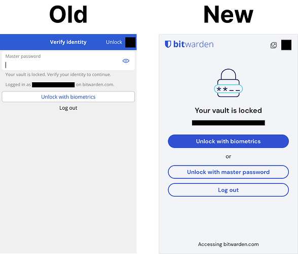
Having to click an extra button when trying to unlock the browser extension with your master password now is inconvenient.
Previously, the password input was exposed and focused when opening up the extension when the vault was locked. This means when using the keyboard shortcut (CTRL/CMD + shift + L) to autofill, the extension window would open and you could immediately start typing your password and hit enter to unlock and autofill. It was a very streamlined process.
Now, when you go to autofill and the vault is locked, you must click a button (or tab several times to it then hit enter) to input your password. This seems like incredibly unnecessary friction to unlock your vault via password.
