Folks, I have an idea about the auto-fill button.
First, some personal comments:
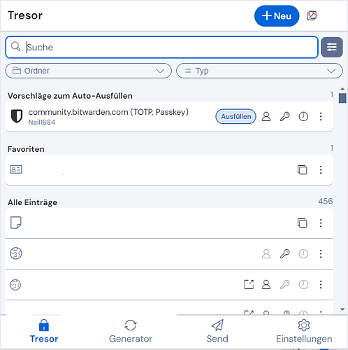
In German, the button is larger than in English, because “Ausfüllen” is longer than “Fill”:
And I must say, I have zero problems, to land on that button now.
But, of course, you may have more auto-fill suggestions than one - and you may first have to read, which entry is the right one. So your eyes go to the text first, and then to the button. (So that takes time in and of itself, so to have the text and the button separate is really not ideal, but read on…)
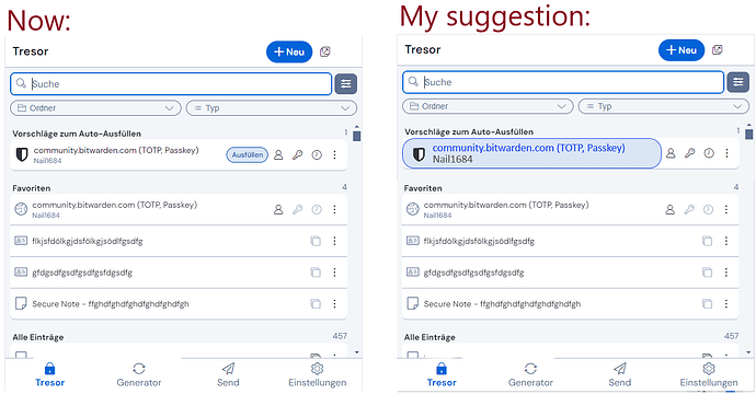
So it just came to me, if it would be possible, to make the whole text of the entry (for login items it is: title and username) like the button itself. I lack the design skills to manipulate my screenshot to illustrate it, so short description (if at all possible): the text would get the same design as the auto-fill button now has (blue background, blue “frame” etc.).
(I could imagine, for a not-too-cluttered-view, to always use the same size of that “button”, reaching to the symbols on the right, because if every button had different width, depending on the numbers of characters of the entry, that would be… cluttered)
That would (potentially) kill two birds with one stone:
- that button would be larger again - and actually working like before the UI change
- and it would visually be different from the other vault items, so that the “perceived inconsistency” might still be gone as well (because all other vault items would not be in “button-design” and therefore indicate different effects by clicking them: “button-design” of the item = click for auto-fill // “normal design” of the item = click for view mode)
Could that be a solution - or am I completely missing something here?
PS: Maybe if that sounds interesting and someone has the design skills, someone could illustrate my idea?
PPS: Maybe one downside: that design would not be completely self-explanatory. ![]() But not too complicated to get used to it either, I think.
But not too complicated to get used to it either, I think. ![]()
PPPS: And maybe another downside: I don’t have any idea, if that would look totally ugly in the end, having those big “auto-fill-buttons”, probably with the website icons in it… ![]()
PPPPS: I said I have no design skills - so an “ugly hot-shot”, to at least transport the general idea (I added some dummy entries as favourites to see the comparison between the design to my “auto-fill item-button” idea):

