Upcoming improvements to the extension preview based on your feedback

Hello Bitwarden Community,

Thank you so much to everyone who has taken the time to try out the preview of our new browser extension redesign and share your feedback with us. Your feedback has been very helpul in fine-tuning the experience. We’d like to share some of the key changes we’re implementing based on your feedback as we move towards the official launch.

Key Updates:

  1. Search Field
    One of the top requests we received was for the search field to be more accessible. To make searching quicker and more convenient, we’ll be auto-focusing the search field as soon as you open the extension. This change should make it easier to start searching your vault immediately after opening the extension.

  2. AutoFill Button
    We heard your feedback that the “AutoFill” button could be more compact. We’re updating the button to simply “Fill,” which will free up space for displaying email addresses and item names, making it easier to identify items at a glance.

  3. Launch Website Button
    Many of you mentioned that launching websites is something you do frequently, and that putting this feature behind a dropdown impacted your workflow. We’re moving the Launch Website button to the main item action bar, making it quicker and easier to access your websites.

  4. Compact Mode
    We’re developing a compact mode for users who prefer to see as many vault items as possible at once. This will be a setting that you can toggle, allowing you to switch between standard and compact views based on your preference.

  5. Vault Filters
    To further maximize space, we’re adding an option to toggle the visibility of the new vault filters. Bitwarden will remember your preference, so if you choose to hide or show filters, your setting will persist between sessions.

  6. Notes Field
    We’re expanding the height of the notes field within the item view to make it easier to view and edit larger notes without excessive scrolling.

  7. Generator Bugs
    Lastly, we’re fixing several bugs in the generator experience to ensure it’s as smooth and reliable as possible.

Your feedback has been very helpful in improving this redesign. We’re still listening, so please continue to share your thoughts on the preview. Stay tuned for more updates.

3 Likes

@Kevin_Harris Thank you for incorporating some of the feedback received so far.

This may be OK for users whose language is English, but will not be an effective solution in all languages (some of which have no short equivalent to the word “fill”). The best solution is to use an icon instead of a text label, and if you don’t wish to do so for the new UI, please at the very least consider using an autofill icon for the “Compact Mode” UI.

Using Icons should also allow you to put the four filtering buttons (“Vault”, “Collection”, “Folder”, “Type”) on a single row instead of having them occupy two rows, thereby pushing important information below the fold. Please, at a minimum, allow users to disable text labels in buttons by selecting the “Compact Mode”.


In addition, here are links to some unaddressed issues from the previous thread:

4 Likes

Hey Grb,
First of all thank you for being such an active participant in this community and sharing a lot of your feedback.

Our primary goal was to make autofill more discoverable as a feature. We explored using an icon early on but couldn’t really find a consistent or good enough metaphor that we felt like communicated the concept quickly.

All that being said, there are multiple paths to achieve this and we’ll continue evaluating and adjusting to make sure we are delivering the best experience for our users.

This concern is really only relevant for brand new users (within the first day or so of using Bitwarden for the first time).

A better solution to that particular concern would be to create an onboarding experience, in which new users are guided through the basic functions of the browser extension (and other apps), and perhaps use auxiliary text labels/popups for such users during the onboarding mode (which the user should be able to disable/dismiss when they are ready).

For most users, the text labels are unnecessary, and for power users, the text labels are a pain point. Please, at the very least, switch from text labels to icons when a user has enabled the new “Compact Mode”.

If you want a suggestion for a skeuomorphic autofill icon, there are many possibilities:


  :black_square_button: :arrow_right: :black_large_square:


        :arrow_down:
  :asterisk: :asterisk: :asterisk:


      :potable_water:


etc.


You can even use the Bitwarden shield icon, which is literally described as the “autofill icon” in the settings for inline autofill menus (“Show autofill menu on form fields: when autofill icon is selected”).

I highly disagree, I believe the autofill icon should at the very least be bigger and more colourful than any other item button. One of the principal of UX design is to make the most used action the easiest to use; the previous version was so unclear that even some technology reviewers couldn’t figure out how to autofill an item without using the right click menu. Imagine what a normal user could think!

I personally enjoy the bigger button as a power user-ish, as it’s much easier to click, since it’s bigger. the only thing I agree with you on is using an icon in place of the label for the compact mode. if a user goes out of their way to find a setting that is meant to save space, I believe each the icon should still be more recognisable than the other buttons, but It doesn’t need a label.

I don’t think we disagree that much. I agree that it makes sense for the autofill button to be the first button, and to stand out visually (being brighter and/or slightly larger). The point I’m making is that the autofill button should not have a text label, because this will lead to a monstrosity like Ausfüllen or Συμπληρώστε in non-English languages.

The original version had a problem in that clicking the item name sometimes autofilled, but sometimes opened the item for viewing, so that there was no consistency in the behavior. Having the first icon consistently do autofilling will solve that problem.

Slightly bigger than the other buttons is OK, but I would hazard to guess that you are happy with the text button mostly because the English language allows for shorter words than do other languages:

Image 019

I would argue that it doesn’t take a power user to prioritize seeing more than 7–8 characters of the item name and username over having an auto-fill button that takes up over a third of the available horizontal space.

On my screen, " :black_square_button: :arrow_right: :black_large_square:" is about twice as wide as “fill” and is much less meaningful (light-to-dark???).

I encountered an app today that used this icon :floppy_disk:. How does that clearly communicate “save” to the up-and-coming workforce who have never even seen a floppy?

I have no objections to “arbitrary” icons in compact mode, but when it comes to non-compact (spacious?) mode, we should strongly favor instant recognition/clarity and translation-ability.

This was just to convey a basic visual idea (“empty to full”), it was not meant to be taken literally as a proposal for what the icon would look like. If you want, I could draw something that is more compact. The icon is not meant to be self-explanatory, it only needs to help the user determine which of the three icons (autofill, launch, and “more”) will perform the autofill function.

Personally, I’ll be happy as long as a user has the option to turn off text labels.

How would you suggest dealing with non-English UI languages? Is your position that it doesn’t matter how much of the UI is obscured by large text-buttons, as long as a suitably short word can be found for buttons used by English-language users?

In Italian, autofill translates to “riempimento automatico”, but the button we use is labelled “Riempi”, barely longer than the English version. Both the French and German translations you provided can also be shortened to Füllen and Saisie, which are also about the same length, and the reason the longer version is used is because the translators haven’t translated that string yet. Nothing that can’t be fixed or won’t fix itself with time.

I do still believe a label is much better than an icon, because it’s not only MUCH clearer to understand (and doesn’t require a tutorial), but the button is also much bigger and therefore easier to click, which is important given the button is by far the main function of the entire extension.

To me, it doesn’t make sense that the button size should depend on language. Not every language has short word options for every button label. And I already agreed that the autofill button could be larger than the other two buttons, but I think that the button width should be the same for all languages.

Even in English, if the “Collection” button and the other filter buttons weren’t so wide, it wouldn’t be necessary for them to take up two rows. These have an icon and a text label — would be nice to allow the user to disable the text.

But we evidently disagree, which is fine. As long as this gets fixed in the compact mode.

It seems to me that the previous situation where you had icons and the corresponding text by hovering over the icon was a good compromise.

2 Likes

@Kevin_Harris

In case you’re restricted to Font Awesome icons, here are some options of icons to evoke “filling”, which I think would work:

image

image

image

image

image

image

image

image

image


Then, if you must, give these a distinctive color, and/or enclose in a box (with rounded corners, natch!) to make a button.

@Kevin_Harris @dflinn

Glad to see some the initial implementation of some improvements in the updated version 2024.11.999! However, compared to the “Key Updates” described in the top post of this thread, all promised changes have not yet been implemented:

The Search field autofocus is not working in version 2024.11.999. One still needs a mouse click or four presses of the Tab to focus the Search field.

This does not appear to be available in version 2024.11.999.

Also not available in version 2024.11.999.

In version 2024.11.999, the Notes height is still limited to 2 lines of text (approximately 32 characters per line).

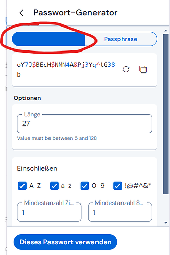
The two bugs mentioned by @Waith2044 have been fixed, but a new bug has been introduced: there is now no longer any limit to how small of a number can be specified for the length (e.g., it is possible to specify a value smaller than 5 for a password — even 0 or a negative number like -999999999999999999 — although the actual password length is limited at 5 characters).

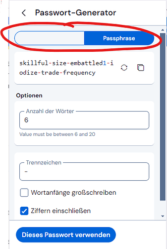
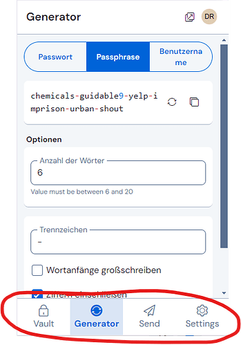
Furthermore, the passphrase length has a minimum length of 6 words, which is too high; this would be equivalent (in entropy) to a 12-character password — so if the minimum password length is 5, then the minimum passphrase length should not be greater than 3 words (equivalent in strength to a 6-character password). Having inconsistent length limits for passwords and passphrases (i.e., not equivalent in terms of entropy) signals to advanced users that Bitwarden developers do not actually have a good understanding of password strength/entropy (which would be worrisome if true!).

Personally, I don’t think there should be any length limits, or if limits are enforced, then they should be low. There are legitimate use-cases for wanting to generate, say, a 4-digit PIN. Thus, if length limits are not going away, the minimum password length shouldn’t be greater than 4 characters, which means that the minimum passphrase length (equivalent in entropy to a 4-character password) should be 2 words.


In addition, there are a few other loose ends that related to statements made by @dflinn in the previous thread:

  • Persistent UI: This is only partially working. Unfortunately, this does not work for the most important use-case: when creating or editing a vault item, all work (new or modified information) is lost if the browser extension is closed and re-opened. Furthermore, the view shown in the browser extension is only remembered if one does not switch the active tab in the browser; it does not persist if one switches to a different browser tab before reopening the extension (this always opens to the default “Vault” view). Moreover, even if staying on the same browser tab, the UI does not remember the state of the Vault/Collection/Folder/Type filters, nor does it retain the scrollbar position, field focus, or any search terms that may have been entered into the search bar.

  • “Edit” option in Overflow Menu: This has not yet been added in version 2024.11.999.

  • Drag & Drop: The regression that caused this important functionality has still not been fixed in version 2024.11.999.

2 Likes

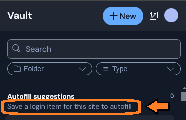
In the compact mode, please eliminate unnecessary text clutter like this:


I think that likely users of the compact mode will not need any explanation for why no matching logins exist. At the very least, make this text significantly shorter in compact mode (e.g., “No matching logins” would suffice).

@Kevin_Harris @dflinn In case you’re still collecting feedback on the UI design:


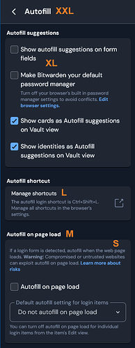
:one: Using 5 different font sizes creates an overall appearance that is chaotic, and difficult to parse.


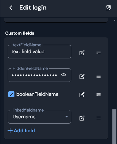
:two: One of these is not like the other. When editing custom fields, why is the formatting of the name of a boolean custom field not consistent with the field name of other custom field types (small font, gray), but instead uses the formatting that is associated with the field value of text, linked, and hidden fields (extra-large white font)?


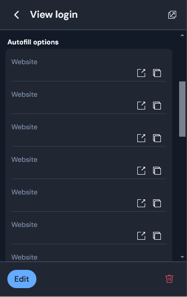
:three: An oddity. When viewing a login item, why is the list of URIs labeled “Autofill Options”? There is no autofill functionality available for any item in the list, so the label wording for this section is inexplicable. In addition, if you instead label that section “Websites”, then you would be able to omit the redundant “Website” label displayed above every URI (unnecessarily doubling the height of each URI item).


As before, if you are reluctant to implement such a change for the main UI, please at the very least consider it for the Compact Mode.

totally agree that the minimum passphrase length of 6 words is excessive and should be within the user control, not dictated by the application. Forcing a minimum of 6 words then requiring the user to delete extraneous words to comply with password length requirements of some applications/sites is a backwards step.

1 Like