Presence of an icon in the item.
Photo of NordPass on iOS:
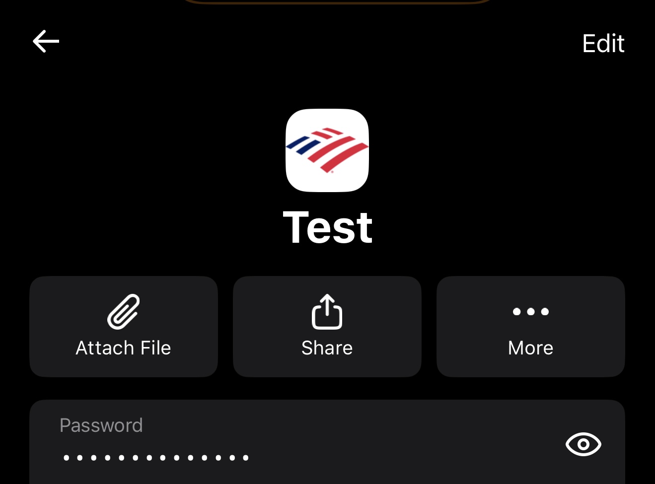

Photo of Bitwarden on iOS:


NordPass presents the website icon in the center, with the title scaled differently from the password field and URL field. This design enhances the item’s recognition and legibility at a glance.
Bitwarden does not. The icon is only visible in list form outside of the item:

If you also desire the text scalability (that I mentioned), refer here to vote on it: