UI Design Critique 1: Scaleability of text

Scaleability of text.

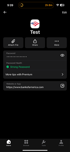
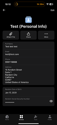
Photo of NordPass on iOS:


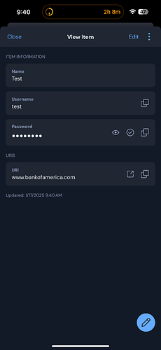
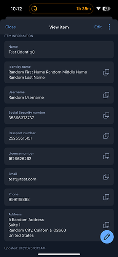
Photo of Bitwarden on iOS:


NordPass presents the title in the center, with the title scaled differently from the password field and URL field. This design enhances the item’s recognition and legibility at a glance.
So, you are proposing that on View login, “Item Name” be displayed in larger text and that it be centered, to make it stand out relative to the other fields?

This could also apply to the text itself, as “Item Information” is prominently displayed. For some reason.

I fail to comprehend the purpose of the “Item Information” at the top. Everyone who clicked/Tapped on the item are familiar that, that is the item’s information. NordPass and 1Password neither emphasize nor highlight this fact.

Bitwarden iOS “Item Information” is prominently displayed:

NordPass iOS no “Item Information” prominently displayed: