As per my conversation with Kyle on Crowdin, it seems like the Bitwarden mobile app does not support RTL layout for their respective language. It would be great if support for RTL is added.
Stale
I’d like to suggest a UI improvement for Bitwarden’s input field icon placement. Currently, the icon always appears on the right side of input boxes, regardless of the page’s text direction. This creates a usability issue on right-to-left (RTL) pages, where the icon overlaps or obscures the beginning of the input text.
Proposed behavior:
- For left-to-right (LTR) pages: Icon remains on the right side of the input box.
- For right-to-left (RTL) pages: Icon should appear on the left side of the input box.
Adapting the icon placement to follow the text direction would greatly improve the user experience for RTL users.
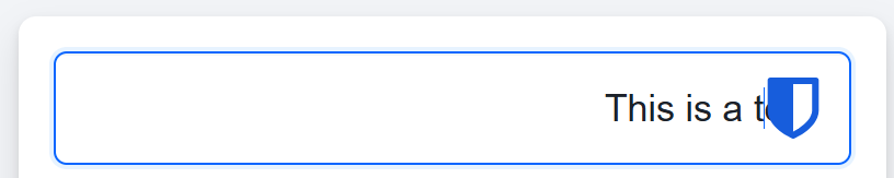
As you can see, the last word test is almost invisible
Thank you.
2 Likes
@ariksa I moved your post into this existing Feature Request to the same topic.
1 Like
The Bitwarden Icon appears on the right for right to left input boxes and hides the text.
@Bar_Vinograd Welcome to the forum!
Though you posted this in “Ask the Community”, I moved your post into this corresponding feature request. – If your post was meant as a “bug report”, the right place for that would be on GitHub (“New issue”). Though I’m absolutely not sure, if this would be seen as a bug. If you try it, don’t describe it as a missing feature…
+1 to this feature request please.
There is an open Github issue here:
When Bitwarden displays its icon in an RTL-formatted field (such as Hebrew), the icon should remain on the left so it doesn’t obscure the typed text.

@Avi Welcome to the forum!
I’ve merged your request with this existing one on the same topic.