We use Bitwarden for projects but also for our internal administration.
To discern between the credentials for projects and for internal things, we prefix the collection name with “Project”. Furthermore, we prefix it with the name of the client. If a client has two projects Intranet and API, the total name is Projects\Clientname\Intranet and Projects\Clientname\API.
It looks like this:
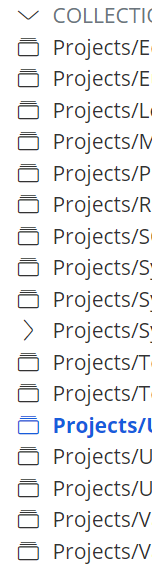
The issue is that the names are getting cut off in the list of filters. The sidebar is too narrow for the names, and this is apparently the primary (and only) navigation mechanism we can use. The collection names don’t display their full name on mouseover either.
This means that we’re usually clicking a few times until we have the right one, and the only way to recognize this at the moment is to create a fake credential with the full name that’s all the way on top. This seems a bit silly.
Of course the website has to work on several resolutions, so I understand the limitations involved. Of course, we could be using it incorrectly - but what would the “correct” way be in this case? Or is a full-width interface perhaps an option?