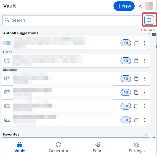
Before the new version, all I needed to do was click the Bitwarden icon in the Chrome browser bar and right below it I could click the button for the site I was on and the info would be autofilled. Now, the info is way down below the search bar and the folder suggestions and the autofill button itself is tiny. Autofilling passwords has become a lot less efficient this way.
Would love to see the old layout again.
@AnakhaS Welcome to the forum!
A large number of users have already voiced this concern in the UI redesign feedback thread.
If Bitwarden chooses not to modify this aspect of the new UI, or while you’re waiting for this to happen, I would highly recommend that you read the tips in the following thread:
Thank you for the welcome and for guiding me to that thread. I hadn’t spotted it. I also appreciate the link to the “How to easily…” thread.
1 Like
Closed as main parts of the request seem to be implemented:
- “having back a button the entire width” for autofill is possible with turning on: Settings → Appearance → Click items in autofill suggestion to fill
- not quite “right below the extension icon”, but in the meantime, at least the filters can be toggled on/off, so that the autofill suggestions are within reach
Please feel free to create a new specific request based on the current implementation, if you see the need for it.
