I’ve been using Bitwarden and I like it, but I have noticed something that it’s uneasy for me of it. The location of the Unlock, Log In buttons, it’s easier to do click in Log Out or Get Your Master Password Hint and I tend to tap them constantly.
Generally, I have experience developing some Android Apps Designer, and this location of the buttons is mostly related to Full Screen Dialog in Material Design, and these are not exactly dialogs, therefore, I’d suggest to create something like this:
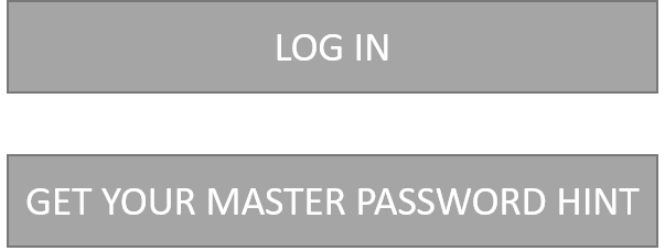
Also, sometimes I press the “end session” button, because is below the password text input, so I mistakenly think it as the unlock button. Is that a intentional design? If not, switching unlock button position to the “end session” position and vice-versa would be better.
Excelente idea!! El botón “Desbloquear” debería estar abajo del nombre de usuario y contraseña. Actualmente está en la barra de Títulos, arriba, a la derecha, y eso es muy incómodo y poco intuitivo.
A small thing, I know, but it gets me often. On Android, when you’re on the “Verify Master Password” screen, the “unlock” button, the thing you almost certainly want, is small, not a separate button, and in the top bar. The big full-width button that you’re likely to hit next after typing your password is “Log Out”, arguably where the “Unlock” button ought to be (to me anyway). True, it’s gray, but most dialogs work top-down and I naturally go to it.
(It’s sort of the same in the Chrome extension but not as bad there because “Log Out” is not a full-width button-looking thing, just a centered blue link.)
I agree. I regularly hit Log Out for the same reasons. The Log Out button is also in the right place for your thumb to easily reach (which to me suggests a primary button), compared to the smaller Unlock button in the upper-right hand corner (difficult to reach when holding with one hand).
I would be interested to hear from someone with more knowledge of UI about how this could be better laid out.
Perhaps the Log Out button becomes the Unlock button, and the Log Out button is positioned in the upper-left hand corner as per the “back” or “cancel” button in other parts of the UI.
EDIT: this has just been merged with some older threads that raise the same issue and suggest a similar solution. I’m going to have a poke around in the mobile code and I’ll post an update if I think I can make a contribution here.