I started using BitWarden and as a new user, I noticed a little thing that is quite tiresome when using your amazing software on Windows 10 - desktop version.
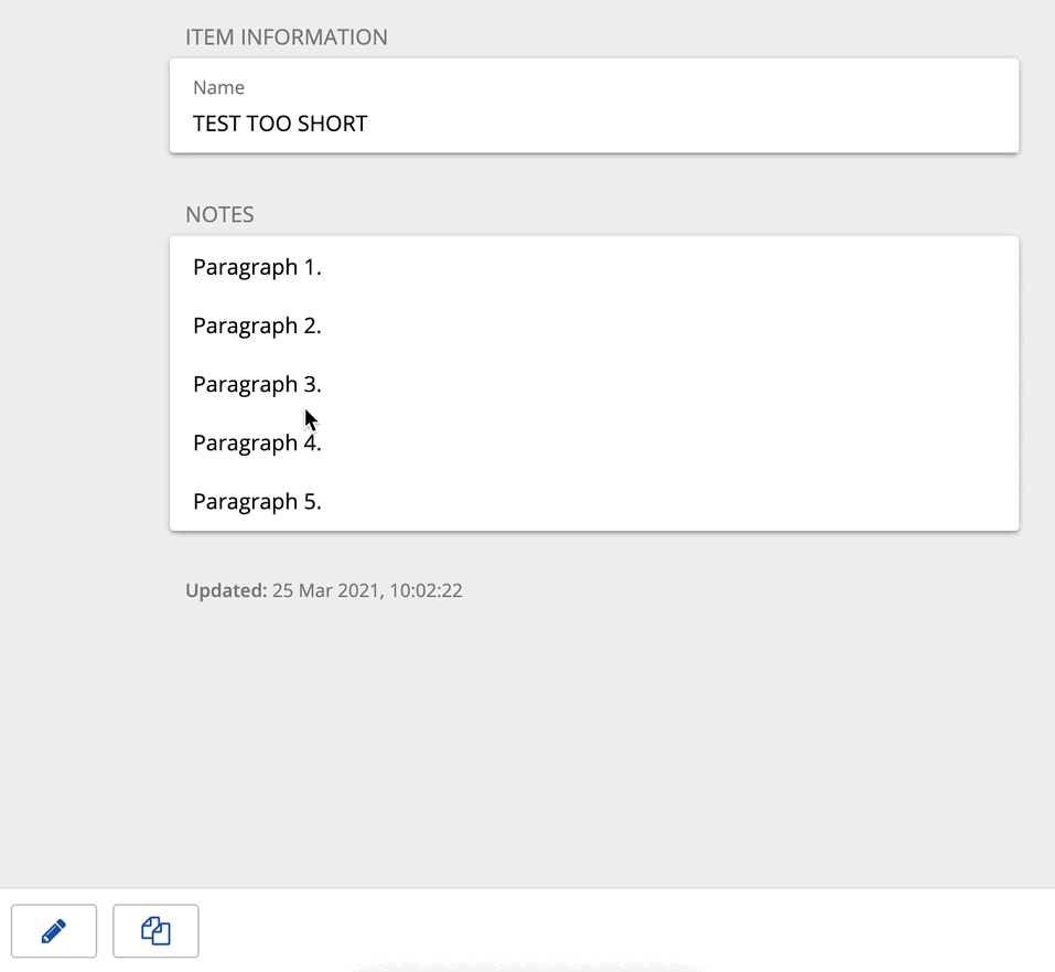
Too small size of fields for security notes - view and edit mode
The default view is too narrow, and this is very uncomfortable when you have bigger text notes
Can you by default automatically stretch horizontally and vertically?
BTW it looks great on Android, but not on the Windows desktop
An option would be useful do not to wrap long lines (security notes). For example a check box for notes like:
do not wrap lines
Then an additional horizontal scroll bar could appear on the screen for the text field. Vertically, the box could extend to the size of the screen.
Three years later and I still have to manually enlarge the text area to read its content comfortably. Even both the Windows Notepad and the built-in Apple Notes beat Bitwarden in the simplest user experience test you can think of — make a note readable without extra effort to manually enlarge the reading area that was artificially reduced in size with no legitimate reason.
Guys it seems like you are focused on enterprise features and can’t get the basics right for your subscribed-for-many-years users. Come on, fix it! If it is a note, I want to be able to read it in full — that is the purpose of a note! To hide it inside a small scrollable area is absurd! Get to common sense
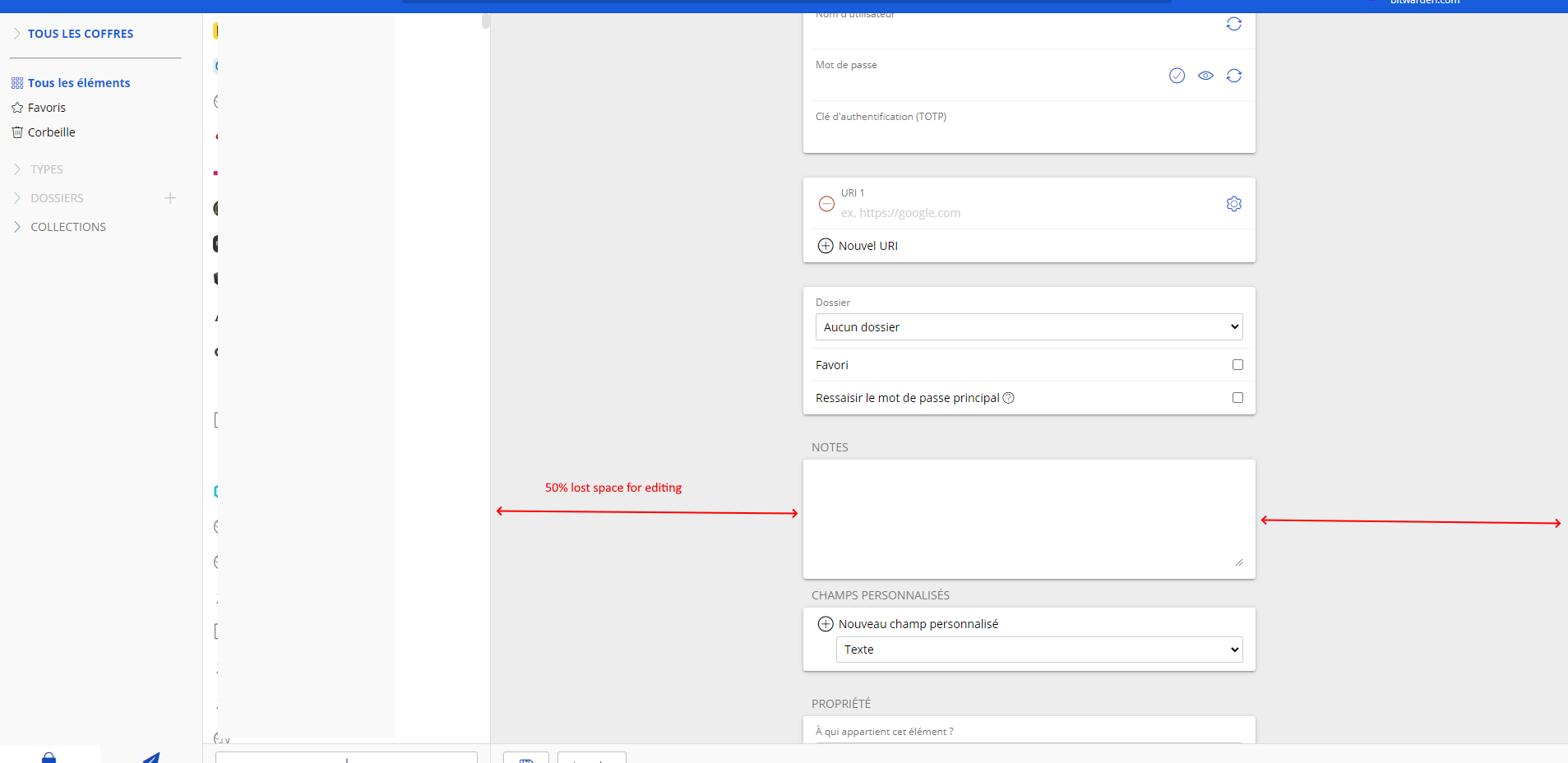
Maybe this panel could use some reponsive grid display with 3, 2 or one column according to viewport, instead of one fits all narrow column.
That would help a lot when editing content on wide screen
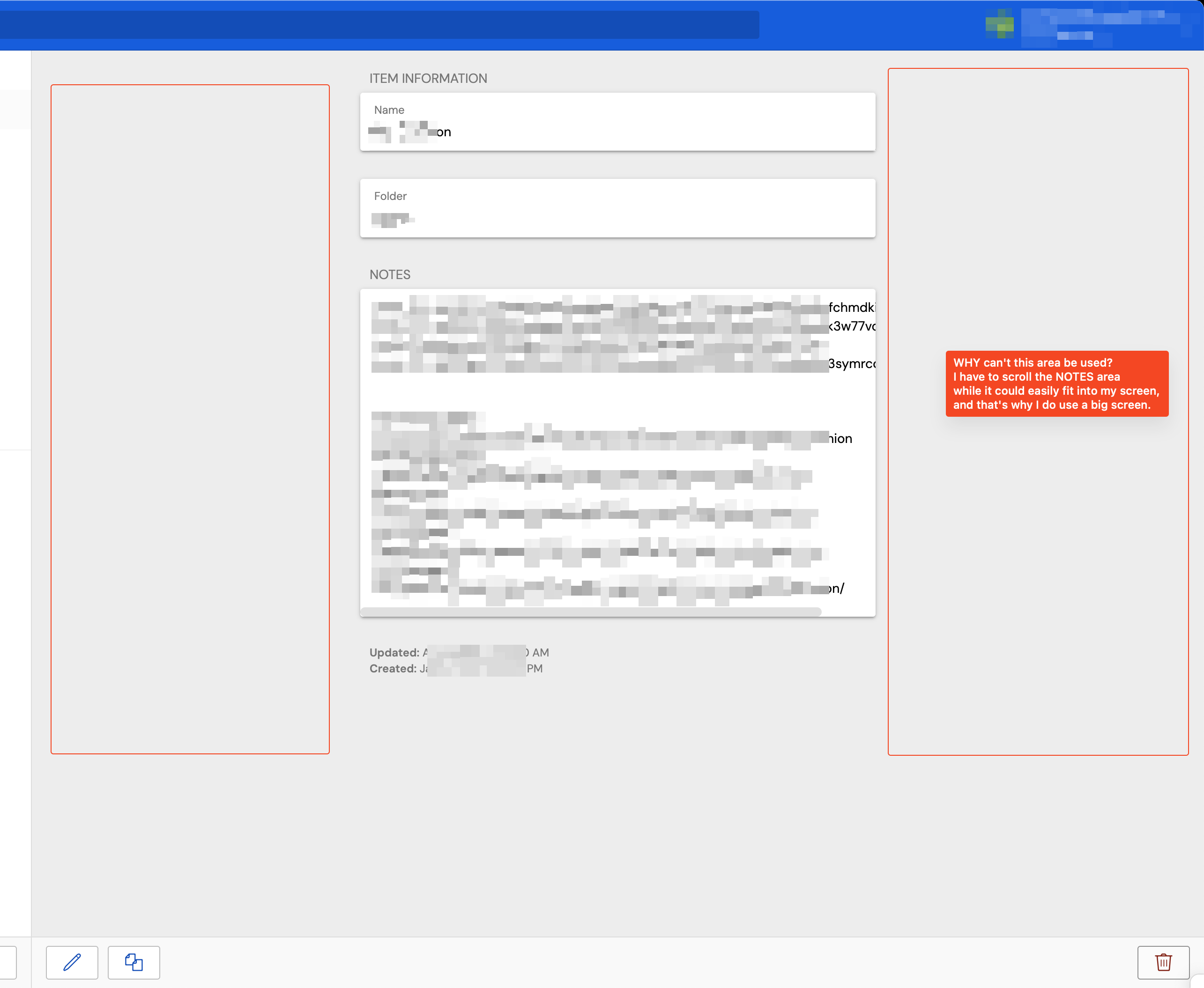
Please see the screenshot. I have lots of space availalbe and unused. Yet your current UI makes me scroll horizontally! This is so unpractical, please make me use the space available and avoid scrolling.