Make an complet User Interface redesign , especially for browser extension, i moves from lastpass few days ago for safety concerns about it being hacked again in 2019, I am more or less satisfied with BW features compared to it, But falls short In comparisson design wise with nor only LP but all the main competitors
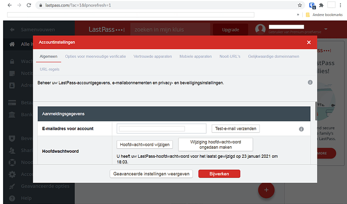
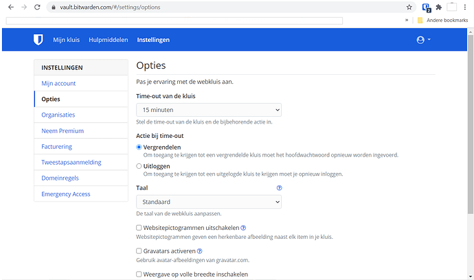
I guess one can not argue about taste and everyone has a different point of view, but one of the major points why I like Bitwarden considerably much more over Lastpass is in fact the UI/UX of Bitwarden. Which is excellent. I don’t know about Lastpass browser extension (never used it), but when it comes to the webversion (which you’ve posted a screenshot from), here’s a comparison (from the settings menu (in Dutch) in both) :
Lastpass
Bitwarden
Pictures say more then words. I think the winner in clean crisp modern UI design is obvious ![]() .
.
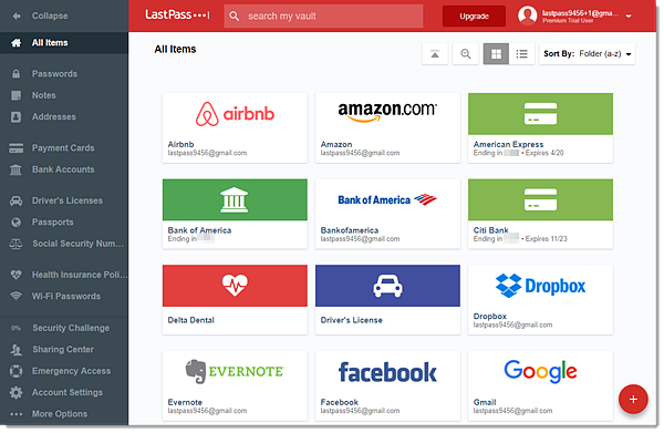
the screenshot is from LP browser extension main menu, I like that design pattern of a left sidebar with menu, and vault visible in the center, all major passwords managers use something like that , i just posted LP as an sample , but ive tested keeper, nordpass, theyre also employ that style, yes LP some other screens are very cluttered , that`s why I di not post them, I only want Bitwarden to take the best out of it no copy and paste everything
Bitwarden UI is sure its sure below main competitors , but I guess its due to their limited income and resources available since it´s a mostly free oriented project, therefore the main goal is to develop new features and security improvements, so despite suggesting it in the past now I realize UI redesign is not on top of any to do list and is most likely not happening anytime soon. But Bitwarden Desktop app have an significantly better ui , so I suggest going for it when managing your credentials.
@FOSS_Lover There is actually another feature request for updating the UI design in the Bitwarden Mobile App. You might want to take a look at that, and if you like it, vote for it!  Bitwarden Mobile App Redesign
dont fix what aint broken.
Bitwarden is so easy to use, its actually it-illiterate usable.
While there are some specific areas where some improvements would be nice, the overall design is very clear. The WebVault uses the whole display space for scrollable areas.
LastPass vs Bitwarden
Heres a fun idea: measure the time it takes to setup 2fa from the vault home page. Ideally of someone who has never done it.
In bitwarden it takes three clicks: settings/two-step-login/manage. After a password promt the last button displays the qr code or other binding mechanism.
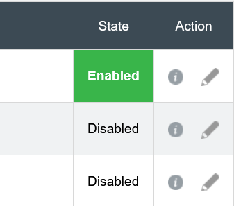
In lastpass, you go to the account settings/multifactor-option/[the tiny pencil icon]/view barcode.
At a first glace, it seems not so bad, but its actually not very streamlined and actually quite poorly designed for a commercial product with such a large userbase.
I mean what do you click first? The big “disabled” box or the small icon?
Yes, theres a “state” header, but that is nothing compared to the giant green box below.
LastPass might look nice at a first glance, but its definitly less functional. On my display, the LastPass vault can display 12 entries in maybe 1-2 folders. Bitwarden Web displays 18 entries and most of my folders at once.
My point is: LastPass is poorly designed.
Please dont use it as a example for good design.
@lenowac You forgot to say that to manage 2FA , account import, data reports, emergency acess and others in Bitwarden you need to be in the web vault, there’s no way to do so locally in the desktop app, that’s bad for people who don’t like relying in web apps to much.
Also no one here is suggesting bitwarden copy & paste LastPass UI (that is illegal I guess lol) we only want the team to take inspiration in the overall market standard design that all major managers are using in its front page for organizational purposes.
@Nat sure I did it a long ago
I personally LOVE the NordPass UI, but bitwarden’s free offering has better functionality so cant be too greedy! haha.
EDIT: maybe ill be a bit more constructive: Id like a more pastel-like blue and use of cards with slight shadows (maybe rounded corners) to make it a bit more modern?
Feel free to ping if you want this feature request reopened.


