I updated to
Version 2022.5.1
now I get this
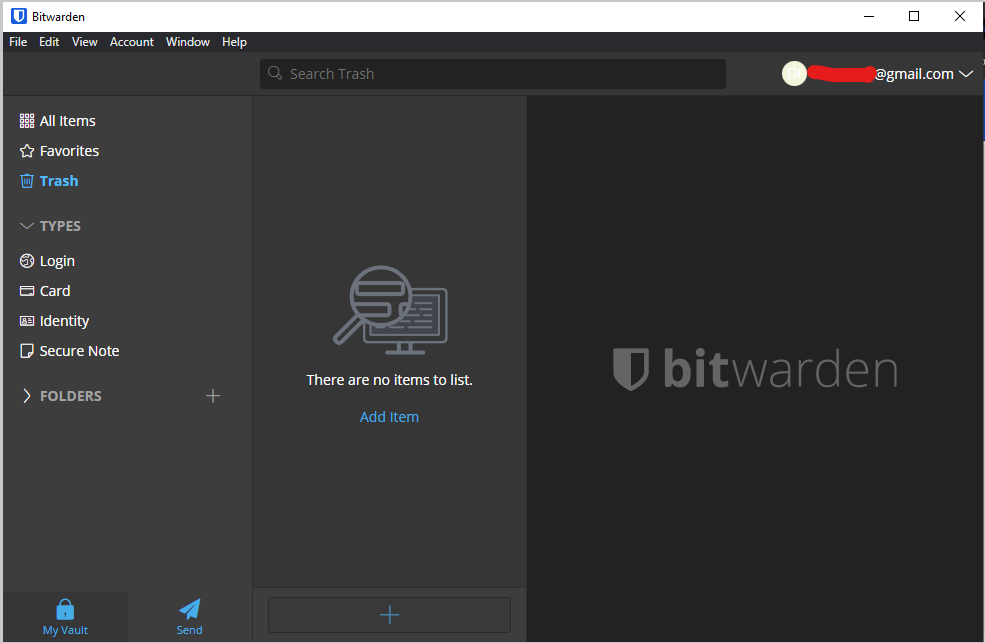
The whole email thing at the top-right.. not a big fan of it… It’s nice for sure to be able to switch between emails or something but why not put this in a menu under “View” or “Account” so it’s out of the way. It just doesn’t look rather eye-pleasing. It’s like if I draw a beautiful picture with nice colors and all these cool things and then I ruin it with a random spot of red or something. I feel there’s a better way to implement this though for sure.