Let the browser extension icon be determined by browser
This colour looks a bit off and contrasts the other extensions, especially in dark mode
It would be nice if it would follow suit with the rest.
Let the browser extension icon be determined by browser
This colour looks a bit off and contrasts the other extensions, especially in dark mode
It would be nice if it would follow suit with the rest.
I noticed this myself as soon as I installed the extension on my Mac. It looks awful compared to all my other 3rd party extensions. And as you say, in dark mode, it goes from being ugly to almost invisible!
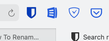
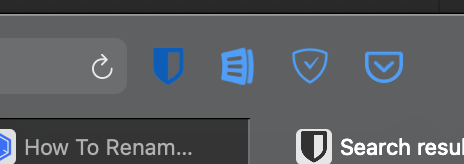
Check out the way it appears on my Safari. Definitely looks off compared to all other buttons. It makes it a bit of a hurdle for user acceptance. Especially since non-tech-savvy users tend to stay with Safari as the default browser on Mac.
![]()
I’m a tech-savvy Mac user but use Safari over Firefox and Chrome! It’s the most private major browser out of the box, has the best integration with the OS, drains the least amount of battery and syncs seamlessly with other Apple devices. Plus the UI is polished clean. There are plenty of reasons to stick with Safari even if you know what you’re doing with computers, so I hope Bitwarden can make their extension icon a little less incongruous ![]()
Yes please. In Safari 14 the logo is even more prominent, and the drop-down sits over everything and can’t be moved. Also I can’t import any of my stored logins. I used Safari because it can sync across my other apple devices. BW is highly recommended - but not great if I have to transfer every login by copy and paste. C’mon BW. If you’re only pretending to offer Safari support - please don’t.
Seconded, the BW Safari extension has some rough edges, the icon being the most prominent. Would love to see more polish down the road.
The worst part about the icon for me is the bright red circle with a number in it that tells me the number of credentials stored for the site I’m viewing.
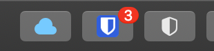
It makes me feel like I have something urgent to attend to. It’s even more absurd that it remains after I’ve already logged into the site. It’s a useless distraction that I can’t escape from.
Why can’t it be the same as the Chrome extension’s icon, which has a gray background around the number?
I came here to ask about this issue, red should be reserved for warnings in the UI.
Is it possible to simply submit a pull request to browser/src/images at master · bitwarden/browser · GitHub? I’ve never done a PR before, so I’m wary of messing something up.
Hi @xurc - it’s possible to do PRs, absolutely. We do have this taken as feedback though. Some items (i.e. red notifications) are a limit of the web extension framework for safari as far as I am aware.
Hi Trey, thank you for the clarifications!