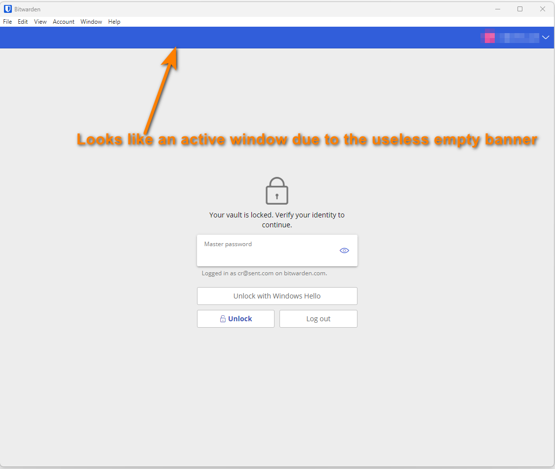
Furthermore this banner is very to confuse with the window toolbar. This is even more confusing when this window is off focus, since you could think it is still in focus due to this useless blue banner:
Sorry, I kinda miss understood. After you log in, there is a search bar and organization drop down on the blue bar. As a developer, I can understand why BW did this. One template for before and after login.