![]()
I’ve always felt the red lock on the blue logo was wrong for some reason.
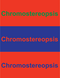
Turns out, there is something called Chromostereopsis
Does this bother anyone else ![]()
![]()
I’ve always felt the red lock on the blue logo was wrong for some reason.
Turns out, there is something called Chromostereopsis
Does this bother anyone else ![]()
Me too !
Thanks for mentioning that
This will be fixed in the January release: [A11y] Fix contrast on extension icons by eliykat · Pull Request #2203 · bitwarden/browser · GitHub.