-
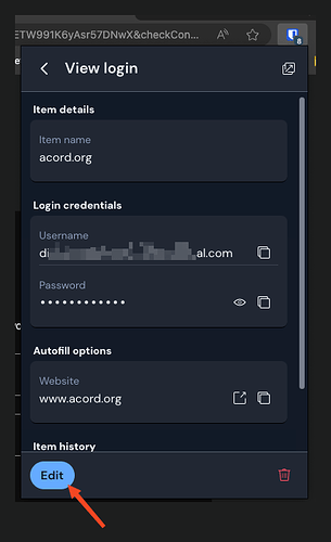
Combine View and Edit mode - It is so annoying to having to click the edit button to update the password or username. When you are viewing the details you should be able to edit them as well.
Recommendation - Replace “Edit” button with “Save”
-
Add “Edit” option to quick actions
-
Inconsistencies - Clicking the item in the vault should have the same behaviour - Right now some opens up the site and other shows the details. All vault item should have the same clicking behaviour.Recommendation
- When clicking the item in the vault should always autofill the username and password. When cannot find the fields simply display an error saying unable to find the element.
- Use the quick action to view the username and password details. (the 3 vertical dots)
Could you please provide more information about what you’re describing in Item #3? It seems you are implying that clicking an item name would launch the webpage (from the URI stored in the item). I have never seen such behavior, either in the old UI or in the new UI, so an explanation (with screenshots, if possible) would be helpful.
As much as is wrong with the redesigned UI, one thing that is actually an improvement (in my opinion) is that clicking the item name in the browser extension now no longer has inconsistent results (depending on the context). Prior to version 2024.12.0, clicking the item name would either open the “View Item” details (in the Vault view or search results), or autofill the stored information (in the Tab view).
Now, it’s debatable whether the action chosen to be associated with clicking an item name was the optimal one (one could argue that the action should always be autofilling, or as you’ve suggested, editing), but I don’t think it is accurate to say that the new design is inconsistent when it comes to the behavior associated with clicking the vault item name.
Could you please provide more information about what you’re describing in Item #3? It seems you are implying that clicking an item name would launch the webpage (from the URI stored in the item). I have never seen such behavior, either in the old UI or in the new UI, so an explanation (with screenshots, if possible) would be helpful.
Regarding #3 - Sorry for the confusion. It no longer seems to be an issue in the new UI. I distinctly remember having that issue in the old UI. Anywho, that is not the case anymore. What I stated is wrong. The behaviour is consistent from what I see - it opens up the details screen now.
As much as is wrong with the redesigned UI, one thing that is actually an improvement (in my opinion) is that clicking the item name in the browser extension now no longer has inconsistent results (depending on the context). Prior to version 2024.12.0, clicking the item name would either open the “View Item” details (in the Vault view or search results), or autofill the stored information (in the Tab view).
I agree. This is definitely a huge improvement.
Now, it’s debatable whether the action chosen to be associated with clicking an item name was the optimal one (one could argue that the action should always be autofilling, or as you’ve suggested, editing), but I don’t think it is accurate to say that the new design is inconsistent when it comes to the behavior associated with clicking the vault item name.
I agree 100%!! this is debatable. I would perform some usability testing to figure out the best approach. It also depends on where you coming. If you have been a lastpass user, you would expect clicking an item would take you to the site. Probably worth, letting the user pick the behaviour by providing some configurable settings for this.
For UX consistency, launching (opening the associated website) when clicking the item name should be disqualified from consideration. This would introduce the following problems:
- For many vault items (secure notes, cards, and identities, as well as passwords for encrypted files or other resources that do not have an associated URI), there is no webpage to launch.
- For items that have a URI match to the open webpage (i.e., “Autofill Suggestions”), launching the website doesn’t make sense, because it is already open.
So, perhaps one lesson is that Bitwarden should not take design notes from Lastpass… ![]()
Absolutely agree. Bitwarden described their design process here, and it doesn’t seem to include any quantitative usability studies other than simple surveys. They seem to rely almost exclusively on community feedback from social media and feedback forms, and do not appear to use any kind of data-driven or evidence-based approaches in their design process.
And here we are… ![]()
