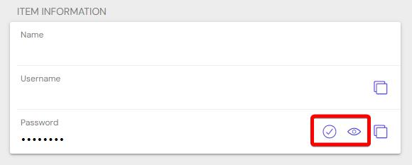
Hi there, can this 2 buttons be standardized between desktop and mobile apps please? My muscle memory is always tapping the wrong one.
In my opinion “reveal password” should always be the first button.
Windows app
iOS app
Reveal / Copy / Check would be better I think, from most used to least.

