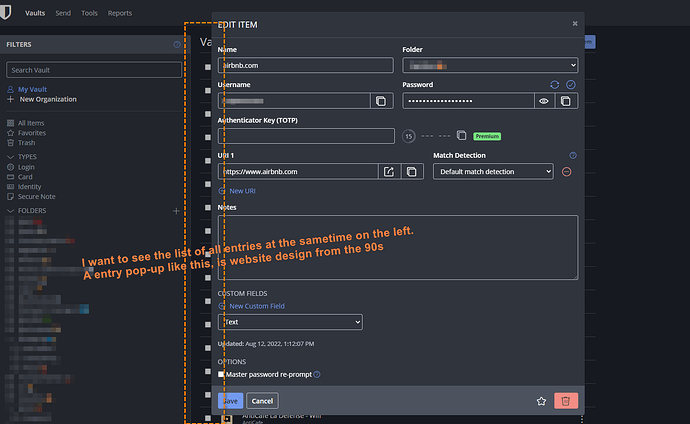
Hi, Why is Bitwarden website looking so different from Bitwarden for Windows application UI ?
Only very old website, used to display an entry in an internal pop-up window, why is Bitwarden still doing this in 2022 ?
It would be much better to have an interface like in Windows on Bitwarden website. Furthermore this would facilitate introduction of Bitwarden to new users. By design, similar concept, should be displayed in the same way.
