I was kindly told to move my GitHub issue here, so my feature request is rather in the form of an “issue”. ![]()
Basically, I would like to improve the UX by moving the quick copy actions to be visible in the web view, and not hidden behind a menu, as there is plenty of space.
Thanks!
Steps To Reproduce
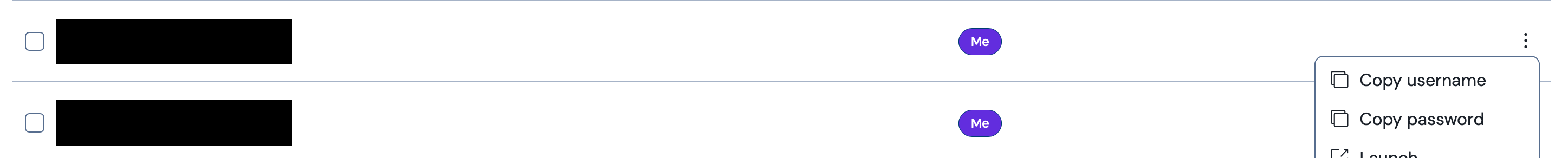
View a vault using the web app. Find the item you want to copy & paste the username and password for to log in to a site. These actions are inside of the small vertical three-dot menu. This makes it difficult and slow to access. Requiring 2 clicks to copy each, plus navigating back to the site/app where you are logging in between. Additionally, the click target is very small as it is an icon only, making it more difficult
Expected Result
The most common actions of copying the username, password, and TOTP should be top level buttons in the list of vault items.
Actual Result
It’s slow, difficult (especially for people with pointer mobility issues), and annoying to dig out the most used functionality.
Screenshots or Videos
Additional Context
The design is not responsive or created for small screens so it is expected that there is plenty of real estate. In fact, at a moderate size, most rows are half whitespace (checkbox, icon, name, owner, three dot menu). There is so much space to put buttons in the main row. This is done (I think a preference?) in the browser extension where there is far less space, so there is precedence.
Additionally, the Owner row disappears when the screen gets smaller, so there is also precedence for hiding elements when there isn’t room. On small viewports, moving the buttons back to the menu makes sense.