Manually resizable sidebar / columns in bitwarden/desktop app

Hello,

I searched the community feature requests but did not find anything. I found this old issue in bitwarden/desktop, though: bitwarden/desktop#19

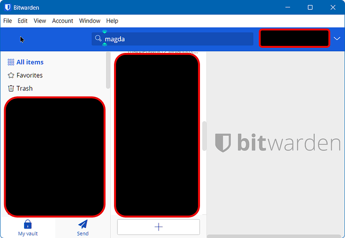
As I commented in that mentioned issue, I’d like to be able to manually resize the dividers in the desktop app.

Quoting myself from here:

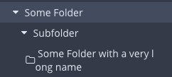
I stumbled across this issue today as well. The two columns should be resizeable. A lot of screen estate is wasted on the third column on normal widescreen monitors. I have some folders and shared collections with long names and would love to actually resize the first column so that there is no line wrap. I was able to do this in KeepasXC which I used prior and that’s the one feature I am really sore about. :frowning:

image

(there is also some more valuable input in that issue)

IMO this is expected behavior in desktop apps. Please, keep in mind that I’m no UX designer or expert. I’m open for a healthy discussion, though. :slight_smile:

Cheers!

After I’ve imported my database, in the first 2 minutes of using the app, I’ve struggled with the same issue. I hope somebody will take this into account even it is an old request, it is almost common sense to have this feature nowadays.

Thanks,
M.

We also have this problem after importing our password database with around 400 collections. Many of the collection names are too long for one line and break into a second (or even third) line which makes it very messy and difficult to read.

The problem could be solved or defused a lot with a very simple adjustment of the max-width value in the .vault.groupings css class. Currently that is set to 250px. Setting that to 500 or 600px would help a lot for us. And it wouldn’t hurt people with shorter folder names since it’s only a max-width so it gets smaller with shorter names.

Based on your suggestion, I created the following PR: Widen the sidebar to 600px max by Rabattkarte · Pull Request #1503 · bitwarden/desktop · GitHub

Let’s see …

4 Likes

Thanks! :pray: We’ll have a look!

Thanks again! Just mirroring the comments from Github:

Thank you for your contribution.

After seeking feedback from our product and design team, this is good to merge.

We are considering this a temporary solution until adding the ability to scroll horizontically or a UI refresh.

1 Like

Hi,
Is there a timeline to this?
Its really becoming difficult to use the app the way it is now, not scalable at all with basics missing and taking so long to get fixed.

Thanks

Is this the line to request being able to resize the columns in the desktop app? Please add this. Or at least fix it so that it expands to fill the entire width. Right now it’s only taking up about half the width and then there’s some icon that says “Shared” when I hover over it.

1 Like

See here: Version 2022.10.0 shows truncated titles (bug fix on the way)

1 Like

When will the left column be either a bit larger or flexibly movable?

Pull request is merged, but haven’t seen a realease yet. @bw-admin

Thanks a lot

Does anyone know why after 1,5years a single line of CSS does not make it into production? Is there another vote anywhere or what can be done to make it happen?
Thank you!

Probably because in the new Repository (bitwarden/clients/) they used 350px as maximum width:
1f6eec4dd5caecb817448eadf0ebb369235eeaf2/apps/desktop/src/scss/vault.scss#L33

Compared to 600px in the Original Pull Request on the old Repository (bitwarden/desktop/): commit 55b301c267896b716788480ccece2e3a59e9fa06

Showing the History of that File:
28bc4113b9bbae4dba2b5af14d460764fce79acf/src/scss/vault.scss

If we do a “blame” we don’t see anything for the vault.scssFile:
bitwarden/clients/blame/main/apps/desktop/src/scss/vault.scss

But it was in a previous location at src/scss/vault.scss instead of the newer apps/desktop/src/scss/vault.scss.

I’m also not sure if the commit got actually merged in the end.

A commit occurred 3 days after the max-width was increased to 600px.
Commit
`0396d682b1be44799ace65e8c3930749e45addbb#diff-33307cd14740ab48c570cd1a9ad3e48754c3d4819eb3850ff5aae497a73d80de

Width details of the File:
0396d682b1be44799ace65e8c3930749e45addbb/src/scss/vault.scss

The > .groupings section is still correctly set at max-width: 600px; at that time.

But it seems the File/Folder got restructured quite a bit since then, ince the > .groupings { Section cannot be found there anymore.

I think that the issue is that the sidebar has been moved to ./apps/desktop/src/scss/left-nav.scss with the following contents for max-width:

.left-nav {
  order: 1;
  display: flex;
  flex-direction: column;
  width: 22%;
  min-width: 175px;
  max-width: 250px;
  border-right: 1px solid #000000;
  flex-grow: 1;
  justify-content: space-between;

  @include themify($themes) {
    background-color: themed("backgroundColorAlt");
    border-right-color: themed("borderColor");
  }
}

Cloning the Repository and doing a quick grep shows that these files might be responsible for it.
Result of grep -riF "max-width" ./apps/desktop/:

./apps/desktop/src/scss/vault.scss:    max-width: 350px;
./apps/desktop/src/scss/vault.scss:      max-width: 550px;
./apps/desktop/src/scss/modal.scss:    max-width: $modal-md;
./apps/desktop/src/scss/modal.scss:    max-width: $modal-sm;
./apps/desktop/src/scss/modal.scss:    max-width: $modal-lg;
./apps/desktop/src/scss/left-nav.scss:  max-width: 250px;
./apps/desktop/src/scss/header.scss:          max-width: 168px;
./apps/desktop/src/scss/pages.scss:    max-width: 100%;
./apps/desktop/src/scss/list.scss:      max-width: 20px;
./apps/desktop/src/scss/box.scss:      @media (max-width: 875px) {
./apps/desktop/src/scss/box.scss:        @media (max-width: 875px) {

Not sure if it’s possible to recompile the Client ourselves easily.
For me on Ubuntu GNU/Linux AMD64 I guess it would be doable:

Otherwise maybe the Portwarden Bitwarden-Compatible Client ?

I cannot post more than 2 links as a new User unfortunately, so it’s not going to be super helpful the Description here …

For those that feel adventurous I made a semi-automatic script to try this wider sidebar. The wider sidebar works, but the build process is an absolute nightmare.
I had to switch from musl to glib because the cross-compiler wouldn’t work no matter what (worse still … when cross-building for musl, it was linking against glib libraries installed on the System).


Looking Forward to polishing these old windows app. Most needed

  1. The ability to resize the three panes horizontally
  2. The ability to sort vault
1 Like

@billsolomon Hi!

Just a general comment and information on that request, that you may not have heard of (I guess you are relatively new to Bitwarden, so I mean that in a very polite way):

@billsolomon Welcome to the forum!

The four feature requests topics that you posted today have all been merged into existing feature request threads. For future reference, before posting a new feature request, you can/should use the search function :mag: (in the upper right corner of the forum site) to check if your idea has been proposed previously.

Also, each new feature request topic should contain only a single proposal. Your second idea (sorting) is already addressed in a separate feature request thread.