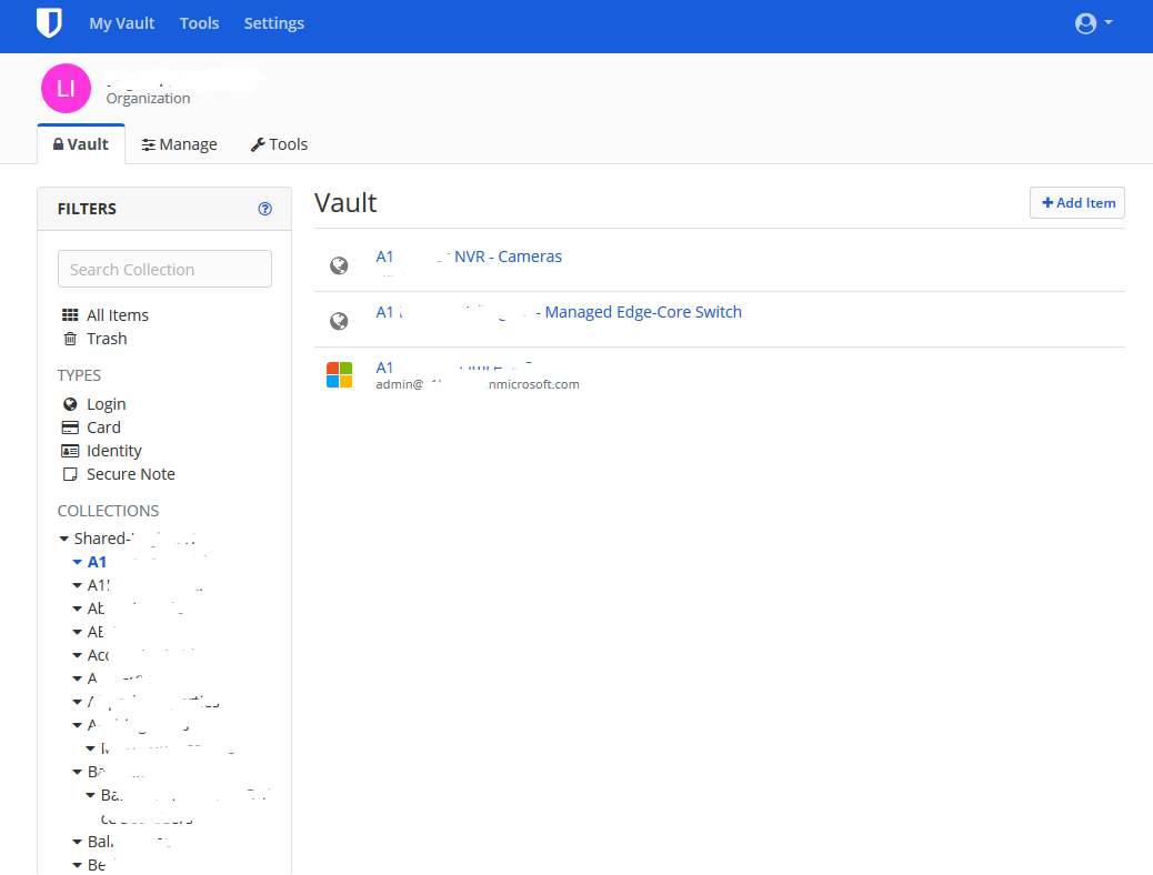
When you have a list of collections over 30-40 (we have nearly 100 to manage separate customers), when scrolling down the collection list you are unable to see the vault contents without needing too scroll back up. If the Collections list was separately scrollable from the vault contents, or perhaps something similar to how you can freeze cells in Excel.
It’s the same problem with too many top level folders. I have to pack them all into sub-folders to avoid this problem but this is not always ideal. I hope this gets implemented because it is a daily usability annoyance. It would also be nice to be able to change the order so Collections could show up first & then folders. Some sorting/drag & drop function could solve this.
@cerrius maybe edit the title so it says Web Vault since this is not a problem via the app as far as I can tell.
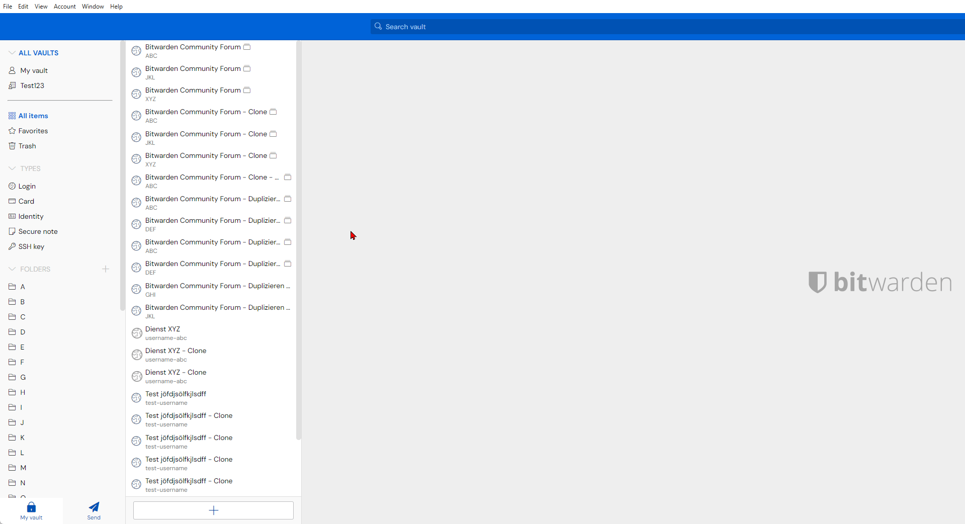
this absolutely needs to be made a thing asap. We have hundreds of accounts in our org and having to scroll up all the time is just ridiculous. this is a huge design oversight
In the WebUI, when navigating the vault and you have a large number of collections, you have to scroll down to select your collection then scroll all the way to the top of the screen to see the contents of that collection.
Could we investigate making the filter box have its own scroll functionality or effectively make it floating so the WebUI is less tedious to navigate?
To gain the ability to vote, your forum account status must be promoted from “new user” to “basic user”. This happens automatically after you have spent a little bit of time reading different threads on the forum.
With a long list of passwords, notes, etc. it’s challenging when we need to scroll all the way back to the top to click another, folder, organization or collection.
It would be nice if that navigation stayed fixed when we scrolled down.
I know that using the search box is a workaround and that’s what we do, but it would still be nice to still see the Vault information even when we scroll.
I join the request - It is uncomfortable and cumbersome that the “system menu” gets scrolled up and out of display when scrolling down in a list of entries.
I “re-awaken” this thread hoping this’ll gets fixed soon
Bumping is not an effective way to get feature requests implemented. Instead, spend about 30 minutes browsing various community topics and you will be granted voting privileges. Then, come back and click the blue “vote” button at the top of this screen.