CeeBee
June 20, 2024, 12:21am
1
So far I’m loving the iOS native app beta. I haven’t run into any issues so far, other than a small visual issue.
Right now the navigation tab icons at the bottom are very small. They don’t fit in with the size of Apple’s apps: Tab bars | Apple Developer Documentation
Apple’s Phone app:
And just one feature request… now that the app is native, it’d be really nice if we could get the “A-Z” scrolling feature like in the Contacts and Apple Music apps. It’d make it faster to get to the password we’re looking for, without having to search.
Thanks and keep up the great work!
2 Likes
CeeBee
June 20, 2024, 6:13pm
2
I just noticed that the screenshot on the Bitwarden blog doesn’t have this issue. The navigation tab icons are the correct size: Bitwarden releases native mobile apps | Bitwarden
On my iPhone 15 with the beta, the navigation tab icons are much smaller:
1 Like
I like the new UI from the Beta but i miss the Nord Theme from latest final build.
I don’t miss it. It was a strange combination of dark and light which appeared nonsensical when separate themes exist.
altuser
July 20, 2024, 12:12am
5
When searching for a vault entry, the keyboard doesn’t hide after clicking search and if there are more search results than can be displayed, it won’t allow you to scroll them to see the hidden entries.
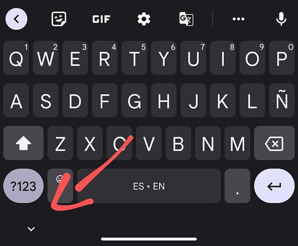
@altuser , does i(Pad)OS not have an equivalent to Android’s “hide keyboard” button, like this Reddit post describes?
RobA1701
October 29, 2024, 7:34pm
7
Latest Beta can’t open vault. Get message : Error Has Occurred after sign in.
morganee:
It’s great to hear that you’re enjoying the iOS native app beta! The feedback about the small navigation tab icons is really valuable. Aligning their size with Apple’s guidelines, as seen in their apps, would definitely create a more consistent and polished user experience. As for the feature request, adding the “A-Z” scrolling feature would be a fantastic addition to improve accessibility and navigation, especially when dealing with long lists like passwords. This would definitely enhance the speed and ease of finding specific items. Thanks for sharing your thoughts, and it’s great to see such detailed and thoughtful feedback! Keep up the great work!
@morganee , was that written by one of OpenAI’s LLMs? I don’t see any indication that you’re involved in the development of the client.
1 Like
… and the iOS native app is not in Beta anymore since a few months now…
1 Like
@morganee , I advise that you don’t utilize an LLM to rewrite your comments, because it’s unfortunately quite obvious to anyone who has used one: the tone is always unnaturally jovial, even for such inherently dull topics.
1 Like
I find that message everything but clear.
2 Likes
grb
December 20, 2024, 4:23pm
15
Please do not post AI-generated comments in this forum, and refrain from attempts to impersonate Bitwarden staff.
1 Like


