I autofill much more often than I do anything else with my passwords. Therefore, it should be the main action and thus the most area clickable must lead to it.
The old behaviour was the correct one: click anywhere to autofill, but if you want to edit, then click on a specific area/button/context menu item.
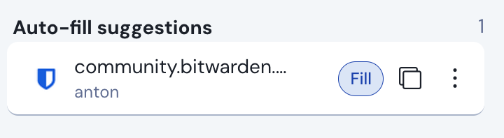
the new behavious is super annoying: now I have to position my mouse over the Fill button every single time, and that’s 99% of the time with my stored passwords - I autofill them into web pages.
So why did you make it more difficult to me? This “new design” is an absolute degrate in usability.
There were some reasons for that change… but nevertheless: your request is already planned now - the old auto-fill behaviour will come back with one of the next releases as an optional setting:
First, I can also only speculate, as I’m just another user. But it was already often discussed here and there on the forum - as far as I understand, the main reason was, that there was an “inconsistency” in the old extension, what clicking an item would result in.
If you clicked on any item shown in the “Tab” tab we had in the old extension it would auto-fill on the current site.
If you clicked on any item in the “Vault” tab we had in the old extension, it would either open the item view or open a folder, the types or the trash.
That confused many (or just some?) users, including me. To this day, I hesitate to click on an item in the new extension, because I’m still not sure what will happen. Slowly I get back the trust, that just the item opens every time.
A second reason may be the general change from two separate tabs (Tab and Vault) to one tab (Vault). Maybe the thought was even, that in one single tab this inconsistency would be more detrimental. I don’t really know…
Yes, the app stores have to approve it - and Firefox is always… not the first one to do that.