Hello! I’m Kevin, the Director of Product Design at Bitwarden

Hello Bitwarden Community!

I’m Kevin, the new Director of Product Design at Bitwarden. I joined Bitwarden late last year, and I’m thrilled to join this amazing community and team.

My Background

With 16 years of experience in product design, I specialize in gathering user insights and turning them into delightful solutions. I love learning about users to create products that solve real problems.

Exciting Improvements Coming

We have been listening closely to your feedback on improving Bitwarden’s user experience. Thank you for the creativity and passion you’ve shared - it’s very insightful. We’re now working on a project to improve Bitwarden’s UX, making securing your passwords, passkeys, and sensitive information even better.

We Need Your Help

We believe the best way to enhance Bitwarden is by collaborating with you, our users. We want to hear what you love and what needs improving. Your perspectives will directly guide our design process.

Become a Bitwarden Product Tester

I’m inviting you to join our user research program and get hands-on with our new UX. You’ll get an exclusive peek at what we’re building and can share candid feedback to help us create the best product possible. It’s easy to sign up via this Google Form link or this CryptPad link. We welcome both new and existing users from all backgrounds.

We’re committed to building the best experience we can for you. Please reach out in the comments - I look forward to your thoughts and to working together!
10 Likes

Hello Kevin. Thanks for a great product. As a user on Linux, it would be great if fingerprint authentication could be made to work. There’s even an open PR for it: [PS-2370] Unix biometrics unlock via Polkit by quexten · Pull Request #4586 · bitwarden/clients · GitHub so the actual coding is done and awaits dev approval.

What about the implementation of tags? It’s been on the roadmap for a while now…

3 Likes

Hello, this amazing product.

Now about the improvements:
The most important for me is to make the settings of the web extension modifiable by group policy. It is very important to be able to modify information such as clipboard cleaning time for all of a company’s computers without going to each computer.

Secondly I would say that if you have an “organization” chest it is easy to make a mistake and record personal information in your “organization” chest and information intended for the “organization” chest in your “personal” chest. This system could be improved.

Concerning the chest organization, I find it restrictive to have to select a collection for each new entry, it makes the task more difficult for the user. From now on we use the search option a lot rather than classifying the data into collections.

Some settings are modifiable by enterprise policies, although the clipboard clearing setting is not one of the available policies.

Hi, Kevin! I’m a security and data analyst.

In response to a user suggestion involving TOR, I wrote the following, which you may find both interesting and applicable:

I thought much the same. After all, secure services such as Proton Mail have an onion address.

HOWEVER, Proton Mail runs their own TOR exit node! Would Bitwarden be willing to run their own TOR exit node?

If not, then using TOR to access Bitwarden would post a significant security risk.

Introduction: I’ve been designing, configuring and using information and networking security since the mid-1980s. I’ve written for leading IT publications around the world. Here’s my 2 cents:

Yes, Bitwarden’s implementation of TLS is correct. Thus, when you access Bitwarden over a normal Internet connection, Bitwarden and your browser establish a secure Internet connection between them.

Or do they?

Yes, they do, but man-in-the-middle and evil twin attacks can represent each side to the other while standing in the middle and recording all information, which is WHY you should NEVER use WiFi, whether it’s in the airport, a coffee shop, or even your own, without a good VPN.

Even so, when you access Bitwarden over the regular Internet, you’re hidden in a sea of others.

Here’s the security issue with TOR: The last node in TOR, the “exit node,” applies the first layer of TOR encryption. As such, it also decrypts the final layer of TOR encryption and has access to your data stream, unencrypted by TOR, but still encrypted by TLS.

If the TOR network remains completely secure, then it does indeed secure and anonymize your traffic from your computer to the last node in the TOR network. Even so, bad actors can listen in on TOR exit node traffic, so you’ve highlighted yourself simply by using TOR.

Furthermore, the Internet is alive with reports of various government intelligence agencies and bad actors establishing TOR nodes. If one of their TOR nodes happens to be the final TOR node, then what’s to prevent them from conducting man-in-the-middle or evil twin attacks, thereby stealing your Bitwarden login credentials?

Well, nothing. This is WHY Proton Mail runs its own TOR exit node, and that’s the only way I ever access Proton Mail, along with a VPN and a third-party DNS SEC provider to maximize Zero Trust.

Recap:

  1. Yes, Bitwarden should indeed run their own TOR exit node.
  2. Users should always use a good VPN installed on their computing devices.
  3. Users should always use a good security suite, or at the very least, a good anti-virus/malware program.

The VPN secures your data stream before it ever leaves your computer. TOR adds additional layers of security and anonymity. Using a company’s own TOR exit node in conjunction with your VPN ensures mitigates the likelihood of any successful man in the middle or evil twin attacks.

Love the product, but please give us options for downloading attachments when we export our vaults…

Not sure if this is where you want suggestions, but my biggest suggestion for BitWarden deals with how vault sessions are handled and the options for users to add additional layers to accessing the vault on a device.

Right now on Android 14 with Biometrics (Facial & Fingerprint), the app has the option to terminate a session after X (settable) time and it can either be Lock or Logout with very little (user) difference between them if you have biometrics enabled.

On competing apps the Lock or Logout states can be configured separately – allowing for a user to have the “Locked” state be their easier-accessable setup and “Logged Out” be their hardened state.

Example config:

Lock Vault After: 5min
Logoff Vault After: 60min
Logoff Vault On App Close: True

Locked State:

  • Allow Biometrics: True
  • Allow PIN: False
  • Require Masterpassword: False
  • Require Secondary PIN: True (this would be in addition to entering via Biometric or Password, as a local 2nd factor)

Logged Out State:

  • Require Masterpassword: True (disables using Biometrics for this state, false would allow Biometrics to be used)
  • Require Secondary PIN: True (this would be in addition to entering via Biometric or Password, as a local 2nd factor)

Hi, Kevin!

I’m glad to hear your plans and hope for the changes I need.

I’m writing as a designer to a designer. I try to move to Bitwarden from another password manager (1Password). After several tries, I am sure that Bitwarden deserves a more polished and accurate UI design than Bitwarden has now.

Please forgive me for my words, I don’t want to offend or to be impolite. It’s some kind of a professional bias because I’m a product designer.

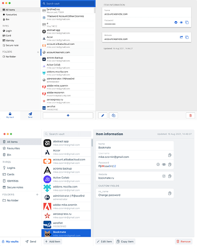
I thought if it’s possible, I could help a bit. So I made some sketches to show what I’m talking about. I saved all the text, buttons, icons, etc, because I’m talking about the visual language / look and feel of the UI. It’s just a couple of visual tweaks:

1 Like

I’m sure that Kevin will appreciate your suggestions, but personally, I don’t see any improvement over the current design:

  • The most prominent change made is that you increased the size of the listed vault items, which cuts the information density in half (–25% in the vertical dimension, and –25% in the horizontal dimension).

  • You also added English text to the action buttons at the bottom, but this does not take into account the fact that the Bitwarden UI must be translated into 62 different languages, which will result in inconsistent widths of the buttons, or worse, button text that has been truncated.

  • You moved the metadata (timestamps) from the bottom of the item to the top of the item. It is not clear why this infrequently needed information should be afforded such a prominent location in the UI. Furthermore, the metadata section will include up to 4 lines of information, which cannot cleanly fit into the title bar of the item information display (your example only shows one line of metadata).

  • You changed the icon font from FA to your own preferred font, but surely you’re not suggesting that matching your own personal taste in fonts would somehow represent a universal improvement? Unlike your chosen font, FA is among the top two most popular icon fonts for websites that use third-party font scripts.

1 Like

Hi Kevin,

I thought I should say that one of the key features of Bitwarden that made me choose it was its current user-interface design.

In the year 2016, I was using KeePassX but wanted to have a more convenient way of logging in to accounts via web-browser. I got a recommendation of LastPass from a tech friend. So I signed up for LastPass and HATED the user-interface. I am very fond of list-views and LastPass would continually default to an icon-view and it made it very difficult to obtain a larger view of the organization of my passwords. Also trying to find a setting in LastPass was impossible.

I did a lot of research on my own and I value open-source a lot so that led me to Bitwarden. On trying Bitwarden, the appearance, layout, organization, etc were great. So I signed up for Bitwarden but this was in late 2016 I think and ran into some technical bugs that made using Bitwarden problematic. I went back to KeePassX for several months and then returned to Bitwarden and had no more bug encounters. And the UI was even better (more refined). Been using Bitwarden ever since.

Upon hearing that Bitwarden is planning a UI refresh, I have grown concerned that Bitwarden will ruin a good thing. Frankly, I’m wondering why anyone thinks a UI refresh is even needed. (I only use Desktop/Web-browser apps so Mobile might be different).

Anyways, wanted to leave word on how much I love Bitwarden’s current UI design. I think Bitwarden’s UI design choices aid work flow and usefulness.

1 Like

The changes you suggest are what I do NOT like. For example, by making each icon entry larger you are necessitating more work on my part to scan and select entries because I now have more scrolling to do. I value list-views. Your design approach is more of an icon-view. I’m not spending large amounts of time staring at Bitwarden. I am finding something and executing it. Or looking for an account number. Lists with not too small and not too large an appearance are ideal. Your design is too large an appearance.

Bitwarden’s current UI is streamlined and very functional. Adding more glitz, blowing the size up, etc only causes usability annoyances IMHO.

3 Likes

But it’s very important for an organization and and it should be for security software. If this cannot be modified by entreprise policies, at least the default value must not be “never” but “30sec” or “1min” or more but not “never”.

I agree with everything you wrote. The current UI works very well for my use. I don’t want big icons and a lot of scrolling. I want quick access with minimal scrolling.