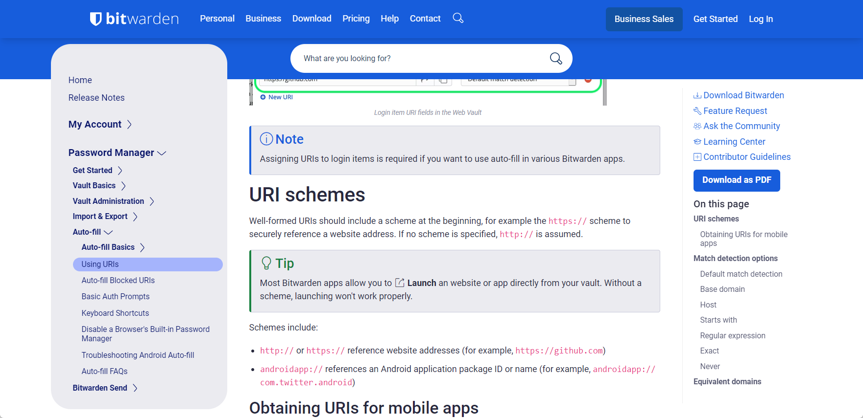
Given how polished and beautiful the web vault is, I was totally not expecting the Bitwarden Help Centre site to look like this:
I’m no professional web designer, but think there are a few main problems with it:
- The double website top banners occupy too much space. Why is there a second search bar if the banner above also has a search button?
- There is too much information on the screen at once, you could consider collapsing some into expandable menus. For example, I don’t think I’ll ever need to download a PDF of a support website, even though the button to do that is one of the most eye-catching ones
- Is the Contents sidebar on the left supposed to go above the second banner at the top? I think the page would look much cleaner if the sidebar didn’t have a background, like Wikipedia