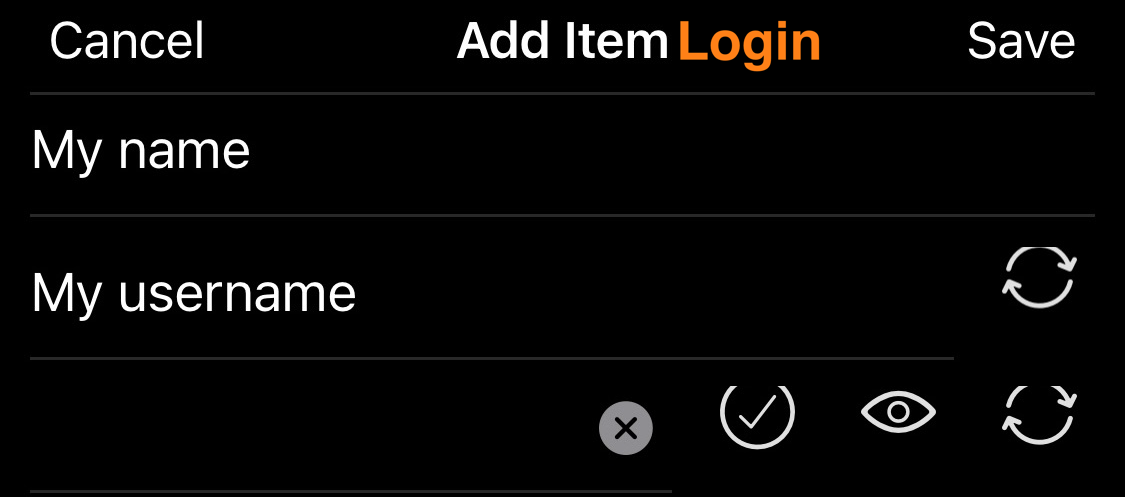
Currently there’s too much precious vertical space wasted in the iOS new item creation dialog
You could save at least 50% at the top without losing any info.
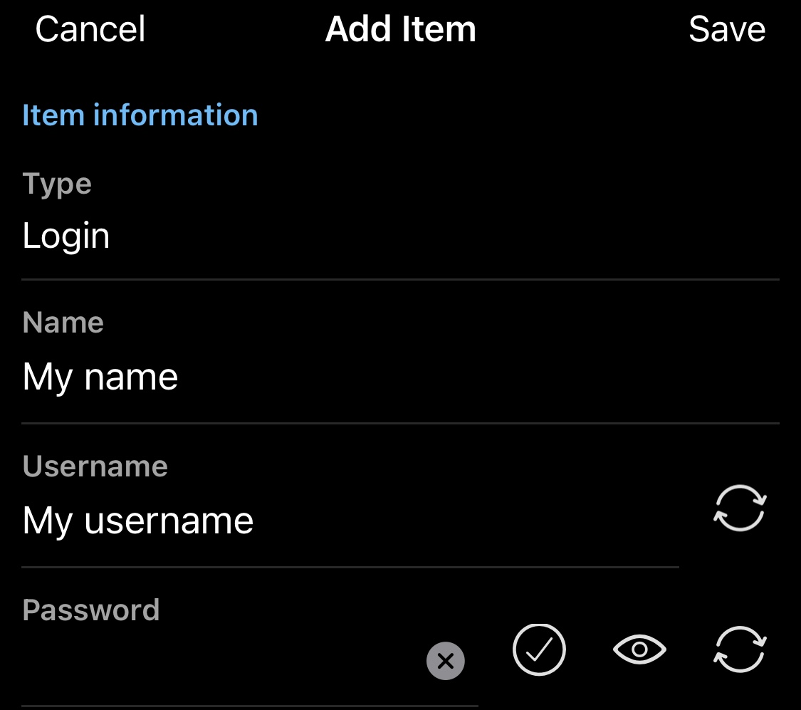
For example, instead of wasting 3 lines for the “item info, type, login” you could simply make the top title more informative and allow picking your type by tapping on the orange login text
(by the way, that “delete all input” cross at the right is a common design misfeature since it makes selection error-prone, can’t click at the end of the text input as you might delete your text, it should be moved out below the line)
Similarly, you don’t need “name/username/password” titles at all as they are obvious. And even if not, add a side button
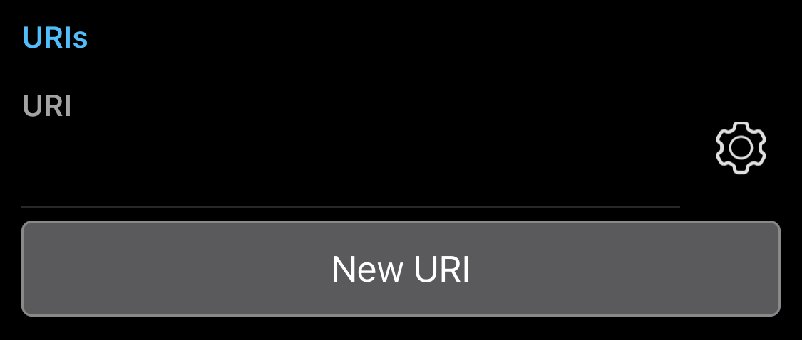
Similarly, what’s the point of saying “URI” 3 times? There isn’t really any meaningful section to warrant a section line, a single input field is fine. And the huge "new uri " button could be a small plus sign or even hidden in the option icon
UX and UI are tough topics because one must simultaneously cater to newbies and old-hats. And also, one must balance between those who want “just the facts” vs those who prefer a bit more detail.
I do concur with “tightening the spacing up a bit”. But I do not really think that eliminating field labels (e.g. “Username”) is the right approach. The reason being that the hint (“My username”) disappears as soon as data is entered in the field. If someone were to inadvertently put the password in the username field and the username in the password field, there would be no visible clue as to the mistake.
there would be: the buttons are different for these fields. Also password is hidden, which it’s a very intuitive hint. And if that’s not enough, you can some icon for the password and for the user.
And then there is always this safer option: configuration. You could make eliminating all the dup/triplicates (which doesn’t add more detail, but repeats the same detail) and reduced padding an “advanced/dense” config (only let the newbies suffer from needing to scroll around to find how to add custom fields and notes)
By the way, another example of more details being compatible with higher density: the description could fit on the same line (though I’d argue that “ownership” is redundant)