Hello,
I find there is a lot of useless strings, most can very easily replaced by icons and tooltips. After few minutes of use, what might have been confusing is now known with the tooltip (or manual/help).
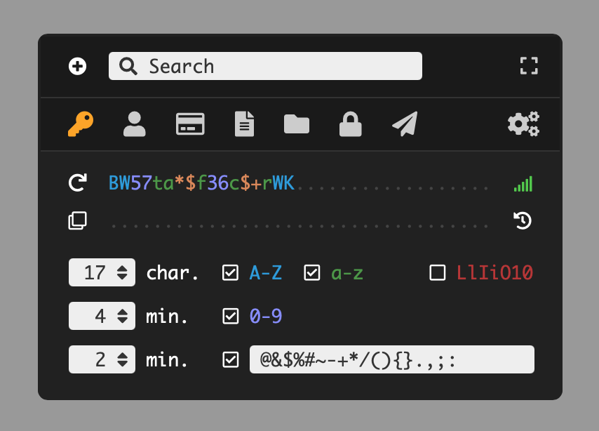
Here is a quickly made ascii-layout, don’t pay attention to spacing/alignments.
All tabs are visible, no need of second level tabs.
In this capture, we are on the password tab.
History on the right clock-in-round-arrow icon
Password field on 2 lines, regenerate and copy icons on its left.
It can be also manually edited, so you can for example remove unwanted char or add some kind of small mnemonic chars.
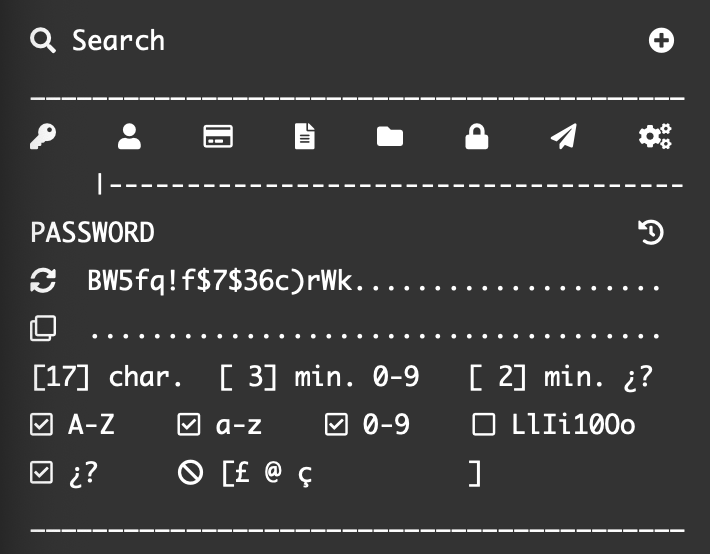
Its width can be very small, minimum would be something like the [x] LlIi10Oo ambiguous characters option. All tab icons become a single burger-menu icon.
Everything can be set/unset via keyboard without having to use the mouse at all.
New forbidden characters field at bottom right.
On this matter, it would be far simpler to have only 1 checkbox with authorized special characters:
[x] [ & ( ) [ ] $ * -+*/ ]