Here the logo on the left looks great. The logo on the right on the other hand doesn’t exactly fit into the box. There’s some areas bleeding around the sides.
That misfitting logo on the right is the is the Community Forums logo.
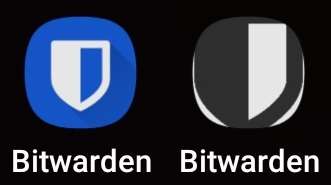
These are screenshots from my cellphones’s launcher.
Hey there, are you talking about when you add app to homepage from a website? I think it is pulling the icon from the sites favicon as this is setup by Discourse, but I’ll do some digging to see if they have any other options for PWAs.
1 Like
FWIW I actually have the opposite issue, in that icons are far smaller.
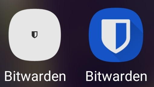
Though this is the same behavior with other PWAs on my mobile device, and the logo for others shows similarly small.
So I suspect it may have to do with the phone’s screen size/resolution more so than anything.
1 Like