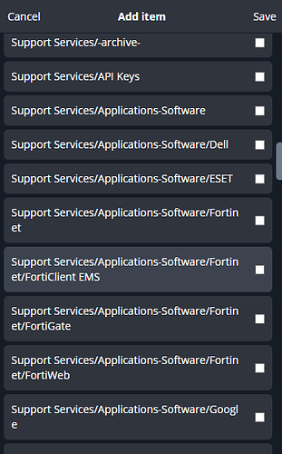
When creating and saving items to a collection or moving an item from one collection to another or adding an item to multiple collections, it is very hard to find the exact collection you are trying to find especially when you have collections within collections and collections within collections within collections.
I would like to see a UI redesign similar to when you are manaully navigating through the collections to a specific item. Meaning, when you click on a collection it slides to the left to show the collection(s) inside of the previous collection.
Take my organization’s collections below. When creating a new item and trying to save it in a collection, it becomes a pain to make sure you are saving it in to the correct collections becasue of how the collections / collection names are displayed.
