I’m a huge fan of Bitwarden as it’s opensource and forever free. Due to this ditched dashlane and fully on bitwarden.
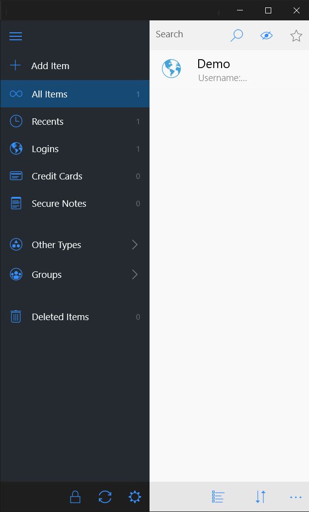
As a product design, I can see user interface is decent and dark mode is there too but UI looks outdated and needs to refreshed to compete with other market players as its open-source would love to help improve overall user experience and modernizing interface.
What do you guys say?
We’re looking at some UI and element updates that are now possible due to updates in our development platforms as well as sunsetting support for legacy OS code (i.e. Android 5.x) which open things up from a backwards compatibility scope.
But, having said that - we’re happy to take any feedback you have. Specificity is greatly appreciated as well.
If you’re thinking about making contributions to this code-wise, I’d definitely encourage you to post it here and start the discussion
I was thinking to work on updating UX and UI of bitwarden as im product designer, not a coder so cant help in there.
If any UI/UX related project is there would love to work on it. I’m sure you guys must lot of data on user’s behavior and improvement needed there.
I am fine with the existing design of BW. The UI does look a little old for some reason. I think it’s because of the grey icons.
Also the items in list view looks too small when compared to other password managers. Most of the other managers have this neat card design or tile view.
I would love to see the credit card look like a real card in the app.
I am not a coder or designer but these are some suggestions. You may not agree with me. I hope more people will suggest changes.
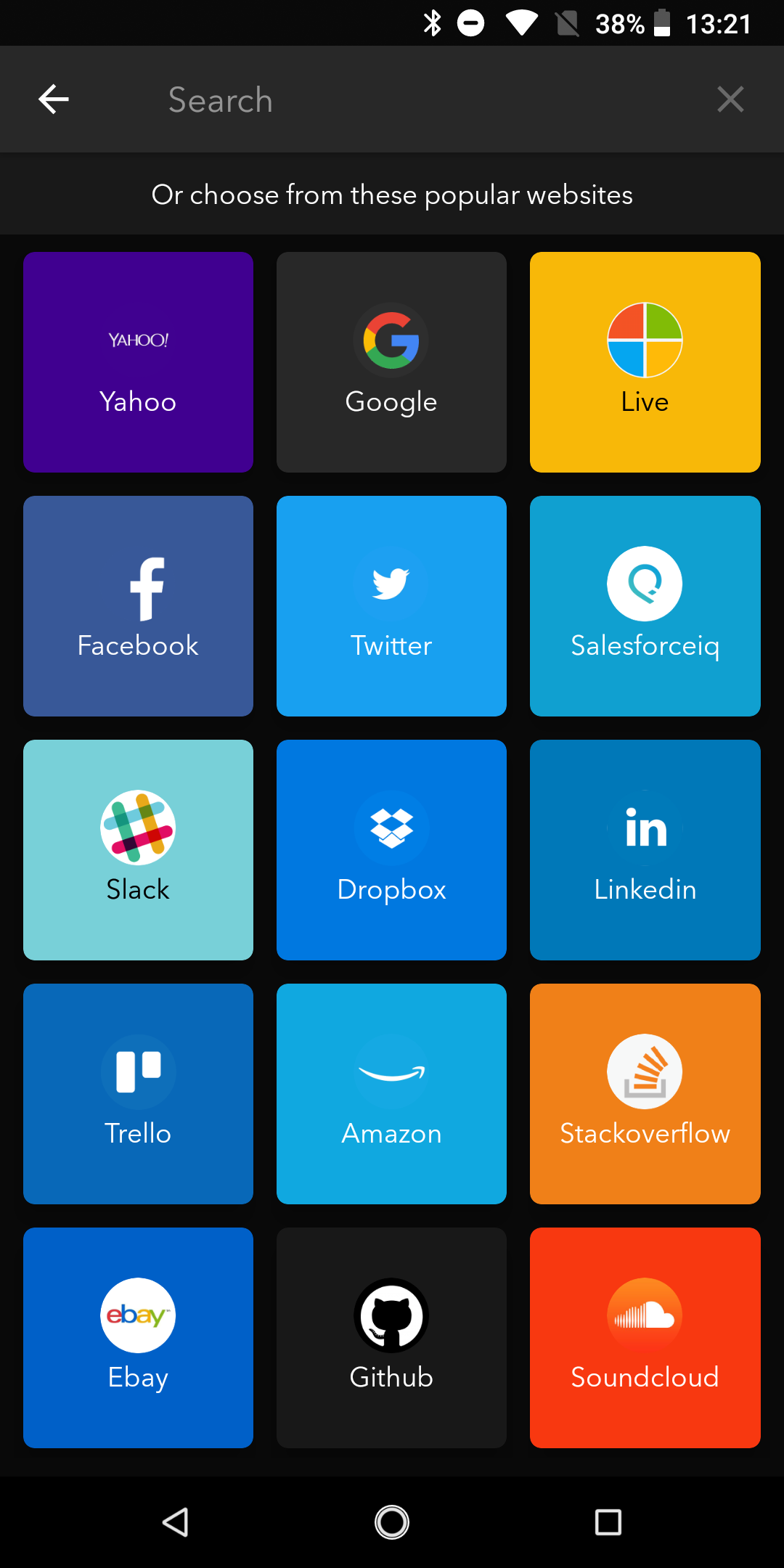
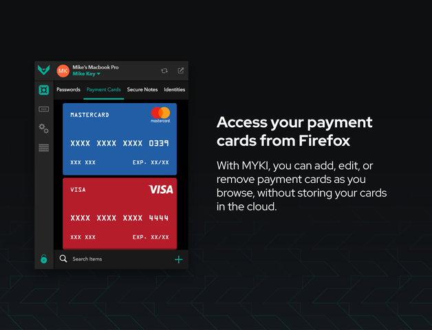
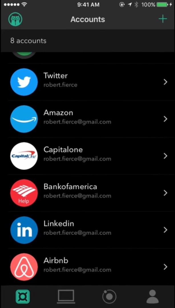
Some images. I am not trying to promote this password manager. These are just examples
I agree with @vachan that’s why started this thread, there is lot of room for improvement in bitwarden UI and user experience in general.
Even the browser extension dropdown and desktop app ui needs to improved.
For me, the UI/UX issues relate to the placement of buttons at the bottom rather than at the top, which is where I often see action buttons placed.
Also, the layout for creating a new Item is difficult for non-technical users and could benefit from some simplification. An Item-creation Wizard? An easy-to-find random password generator? A different skin for newbies? I’m tech security lead at my company and I need something people will be willing to work with.
Lastpass, KeepassXC and others give some examples.
That said, I think Bitwarden is in the process of being better than these.
Hi there! Just joined Bitwarden and I am enjoying every bit of this amazing password manager. However, I noticed one thing and that is the design of the UI both in mobile and desktop. The interface doesn’t feel modern and it is too plain for me. A redesign would be a fresh breath to all users. Also, I noticed that the icon thumbnails in Bitwarden for mobile (android) is blurry and low quality while in other password managers they are high quality and highlighted. That is why I feel like the UI is a bit outdated, but this is not that of a big deal. Just one of my observations of a password manager that is nothing short of amazing. Keep going!
Since UI elements can vary widely across frameworks, it’s best if you can provide specific feedback about what should change in the UI. This allows us to evaluate the best ways to implement those changes and even break them into phases, etc.
Giving users the ability to do very limited color changes solves a great deal of the need to change the UI. People just want the illusion of control. The illusion of something shiny and new.
I’m just curious if Bitwarden is going to ever do an interface Refresh? it looks a little outdated to me not very colorful it’s a great password manager.
It looks a little outdated to me not very colorful it’s a great password manager never an issue but a refreshed design with some neat features would be welcomed some cool features would be
multiple vaults, so I can keep different people’s password separate and different vaults.
Design something so that you can’t lock yourself out by mistake if you lose your master password.
i feel almost bad requesting this too since bitwarden works really well ticks all the right boxes and is really affordable compared to the other moneygrabbing competitors out there with their bloated shit products and dubious practices but it would be nice to see a UI refresh on the roadmap because it is quite dated to say the least.
We are working on some UI items (namely iconography at the moment) and will be working a slower process for change. Wholesale change can sometimes backfire, like when we changed the color or added another button to the menu
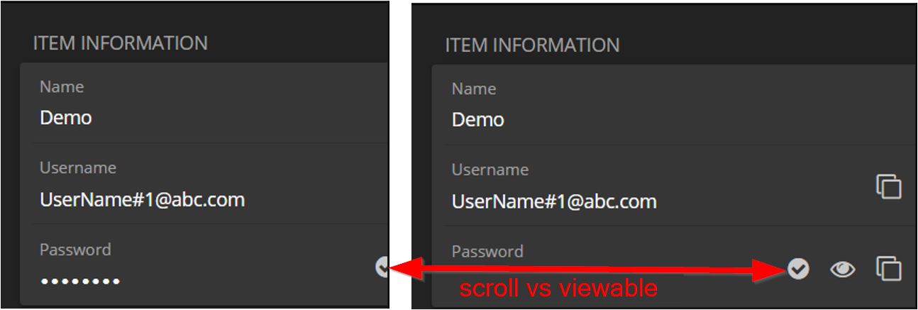
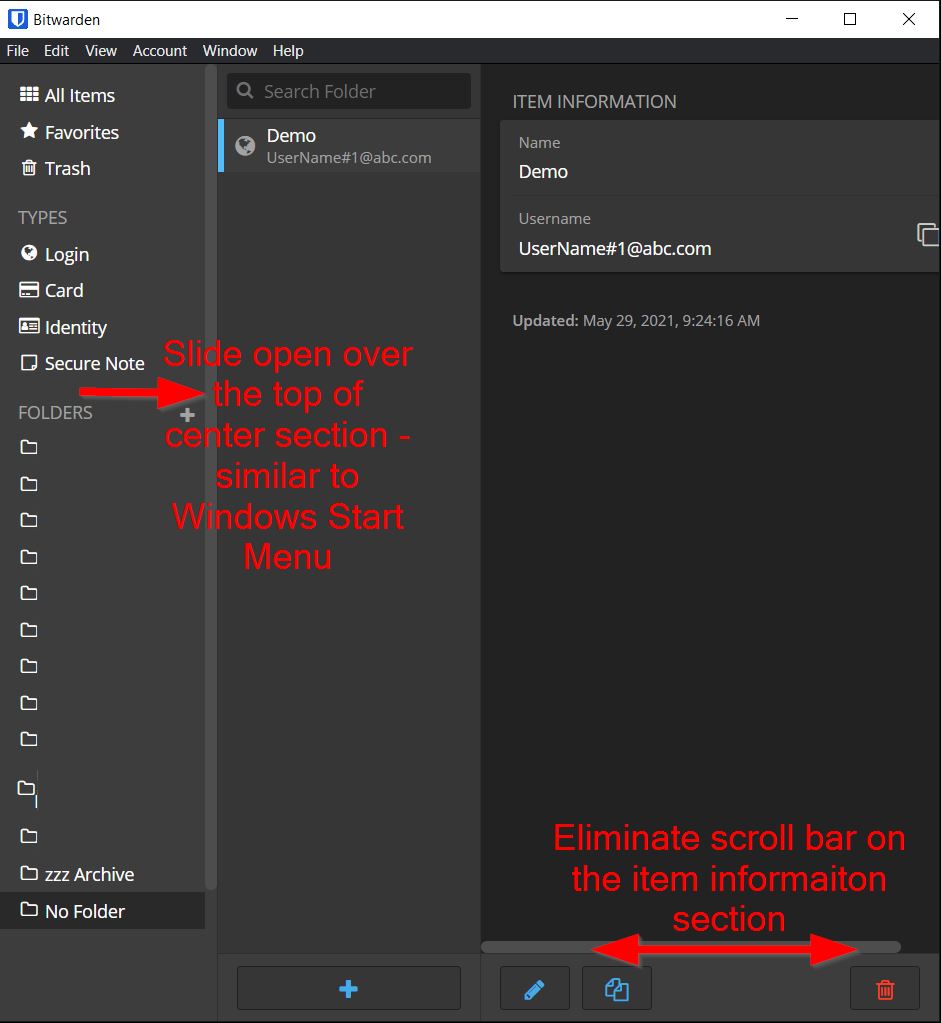
Some ideas to add for a future revision. Try and keep the item information on the right viewable and the options to copy/view by making the sections on the left more dynamic in sizing. Far left section could resize to just icons, see example images below.
I just updated the mac app. The logo refresh was awesome. Now the logo has a smooth gradient and looks 3D unlike how 3D it was looking previously. Here is a comparison that I took too late while the app was updating. Old logo on the top vs new logo on the bottom.
Great job! Thank you to the design team. Now its turn to update the logo of browser extensions. A blue gradient in the drop down interface will also be great instead of the plane old blue. Thank you.
Here’s a super simple change that would improve the UI. Instead of the folder icon and the right-pointing triangle (▸) which makes it look as though it’s a child to the preceding folder, use two different types of folder icons. To show that a folder has child folders you could put three dots inside the folder. When the user clicks the folder open, you could change it to an open folder icon.
Then apply the same concept with the collections icon, but use something other than the cube, which makes no sense.
I find this so annoying I would gladly have my graphics designer create these icons for you in an SVG format.
My feedback is not specifically about UI but UX instead. I would be happy if there’s a way to quickly access passwords without having to use browser extension, so a keyboard shortcut or menu application to quickly launch a spotlight like search popup where I can search for a website and copy password or TOTP code. I know this will probably not be something to be implemented in near future so here’s another suggestion: add an option to make close button on mac behave as minimize to menubar (taskbar on windows) (there’s already similar option but it’s for minimize button not close one). Or just a way to keep app open in background so I don’t have to login each time to get a password.