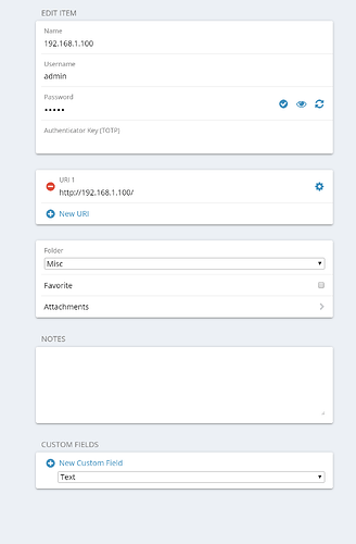
In both the desktop app, and the browser extension, when you choose to edit a credential, you’re presented with the existing URI with a big red circle with a minus sign in it, displayed to the left of it, along with a blue ‘new URI’ button.
This is always jarring to me. I see a uniformely low contrast interface with numerous textual dialogue boxes, and right in the middle, what to me signifies a warning sign. I understand that it’s a warning that the red button will delete the URI. But visually, at first glance, it signifies “there is a problem here” to me.
I think a more common/uniform symbol set to use is a simple checkmark, and an ‘x’, and not in a bright color. ‘x’ means delete. checkmark means ‘save’ if a change took place - in which case, the moment a character is typed into an existing field, it goes from non-clickable greyish to clickable black checkmark.
anyway, thems my thoughts and I’m sticking to them.
