I’m new to Bitwarden, coming over from on-and-off usage of Lastpass. I’ve seen 1Password keyboard navigation in action and think Bitwarden can undergo some seemingly minor changes to improve Keyboard navigation.
Looking over elements in the Bitwarden Desktop app, I see that most interface elements are <a> tags, which don’t offer a whole lot of functionality out of the box. Seeing all the requests for keyboard navigation, I think it’d be possible to create a fairly simple keyboard navigation scheme with much less tabbing involved if those elements were thoughtfully switched over to well-styled <input>s and wrapped in the right markup.
This would create 3 “sections” that you could tab between - the left column, the middle column, and the right column. Navigating within a column would use arrows.
This type of solution would leverage the benefits of using an HTML renderer, which includes lots of functionality and accesibility features out of the box (Styling too, but we’d me largely ignoring that in this case). Finally, a counter to the endless woes of people complaining about Electron apps.
This would be a cleaner and more reliable alternative to keeping the tags and adding a key listeners, associating logic, etc. It would react as expected by most people accustomed to navigating forms and other UI site elements with a keyboard.
It would also dramatically improve accesibility for those that need things like screenreaders, if I’m not mistaken.
Clients / Repos Affected:
Desktop
If this works out, I might be able to try my hand at the browser extensions as well.
Timeline to completion (estimate):
Would prefer to hear what the devs have to say about this before I start doing any work.
Can’t seem to edit anymore, so I just wanted to add, after some experiences today:
Could also add some accessibility modifications to modals, like the “delete folder” modal, so that focus is properly assigned and reassigned during popup and fadout, respectively.
A lot of these (and many other) accessibility features were initially made for people who need screenreaders and the like, but keyboard navigability comes for free and I have a fair amount of experience implementing things like this. Just trying to get a feel for how the devs feel about these kinds of changes.
When it comes to accessibility we would certainly be open to areas where we need improvement. Outside of screen readers, keyboard accessibility/usability is probably the most common, however I would also encourage any changes should follow WCAG, ADA and Section 508 guidelines for compliance.
I also have a few concerns over using non-standard elements for navigation, the <a/> tag is universally accepted as a navigational element and the use of arrow keys across blocks and semantic specificity is key for assistive technology (and can receive focus by keyboard as long as they have an href attribute); so perhaps those can/should be cleaned up with href attributes to allow focus (or explicit tabindex). Also the use of non-standard semantics can cause other issues with different user agents/browsers regardless of styling applied (some of our views and markup are shared between desktop, web, and browser).
I would love to see proper focus for modals, etc. as if that’s not happening today that means we’re not wholly compliance with recommendations for accessibility.
Finally, we would be open to some work being done in this area so if you want to knock out a PoC initially before investing too far down any given path that would be ideal.
So, I think I understand what you’re saying about the <a/> tag and why it’s preferable to styled <input>s.
This part, however, confused me:
As I’m using it, the only way to get to the different elements is Tab. So, to reach the top password entry in the desktop UI, i have to tab through all the categories and folders, then the search bar. I can’t use arrows anywhere, it seems.
Am i understanding correctly that you’re saying screen readers and the like would use arrow keys? And that we should use tabindex and the like rather than the styled non-traditional elements I mentioned?
Right, screen readers often times, like JAWS for example, use arrow keys to move across both text and tab context on the page (like paragraphs, block text, etc.), but tab navigation is the utmost importance in these cases and for that to work <a/> tags would need href attributes, which with Angular and our current markup I’m sure are missing on several/most. I would prefer to keep semantically correct markup vs. using non-traditional elements with clever styling (i.e. hacks )
Hm alright. I’d have to do some more research on how this could improve non-screenreader navigation (sounds like we’d still have to Tab through every item on the screen) before putting together a PoC. First, though, I’d like to understand your point about semantically correct markup.
I’d like to say right off the bat that I’m not here to argue, since you seem to have a better handle on a11y standards than I do. I trust that you’re right, but at my current level of understanding I’m not sure I agree <a> elements are more semantically correct:
I haven’t gotten to dive into the code yet, but if these menu items don’t correspond to actual URIs, it’s much easier for me to conceptualize this as a form of sorts.
The left hand menu is essentially a set of multiple-choice filters (Radio buttons)
The middle column can be thought of another set of multiple-choice filters (website entries)
The far right column is represents the actual “node” and values you wanted to navigate to (passwords, usernames, etc).
To me, this feels like a much easier way to conceptualize the UI given my typical use case - I’m just trying to find a given password or OTP. I can understand the technical limitations of styling that you’ve described (standard elements make for easier compatibility across DOM implementations, consistent styling, etc) but I don’t understand why a really long list of <a>s, which in my mind represents a “pointer” /anchor to another page/destination, is better in regards to semantics.
Especially since the anchors all lead to different kinds of destinations. Even if the elements are categorized by a wrapper element, it’s still just many long lists, holding anchors to different kinds of places, no?
I guess my uninformed intuition is that this huge list (or lists?) of styled <a> elements that manipulate other lists to appear (or be reduced by a filter) is a bigger hack, semantically speaking, than the form alternative. If all the CSS were stripped away, I would think that the form would be more easily usable/understandable than the current list of <a> elements (href attribute or not).
At the risk of asking for too much of your time, can you explain where that’s not the case? I’m having a hard time finding online resources about this - would be totally satisfied with some links.
Normally expand/collapse sections in navigation, at least in web, should be <ul><li></li></ul> OR <dt/><dd/> as appropriate with the necessary included action buttons/options to effect navigation (which already appear to be in place).
Our primary navigation on the left pane is a general definition of a menu (see: https://www.w3.org/WAI/tutorials/menus/structure/) and is currently structured properly. The desktop application, however, doesn’t really have any navigation, so I could see these being buttons vs. anchors.
All of that being said, however, if the primary concern is having to tab through all of everything vs. the general 3 primary sections…
I believe you’re explicitly asking to change each section to a radio-button-list/group (I think I finally understand what you’re asking ). I would have the following questions on that approach:
How would expand/collapse for folders work (I actually don’t think this works w/ the keyboard today)
What impact to the UI would there be (I know you said you’ve not looked at the code yet)? A lot of the display/code may be shared with other repos from jslib so it would need to be potentially overridden to accommodate
Without being as much of a change, perhaps there’s a way a different keyboard shortcut could be implemented instead that simply “skips” the user’s focus between sections of the app vs. death-by-tab? I would be open to that as well and would seem a bit more straight-forward. And for the those with screen-readers could be announced and read by the form’s aria-label or help-text.
@kspearrin, would like your opinion on the above as well when you get a chance.
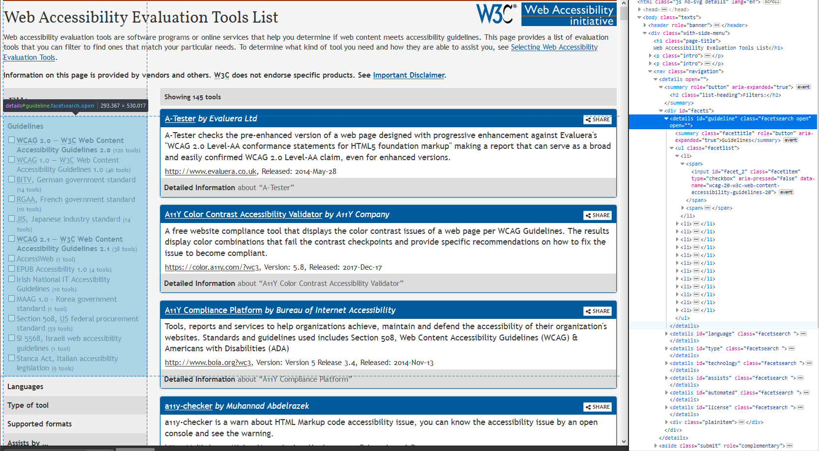
Took the liberty of checking out the w3 site to see how they handled their filters (though I know it’s not a perfect analogue). Seems they used <details> and <summary> for their dropdowns, allowing for Spacebar to toggle them:
This kind of stuff right here is precisely the sort of bullet I meant to dodge by asking here first - will have to get a little more familiar before I could even begin to have an idea. Thanks again for responding
A quick-and-dirty idea for a solution I had was to implement the ubiquitous ctrl-k and the like to skip straight to the search bar. From there, you can tab down the list, or hit enter to go to first hit? Could probably implement similar shortcuts for other sections.
This should probably be another post, but keyboard shortcut hints in the UI would also be really nice
Still chewing on the rest of your response, will opine in turn. Thanks again for the reply - exciting!
AaAand I just realized I completely missed the fact that there’s already ctrl+f implemented. Could be improved upon a little, with enter going straight to first hit, but this does help significantly.
 )
)